Build the configuration UI
To give merchants a more seamless action configuration experience, and to allow them to manage resources that are external to Shopify Flow, you can embed a page from your app in the Shopify Flow editor.
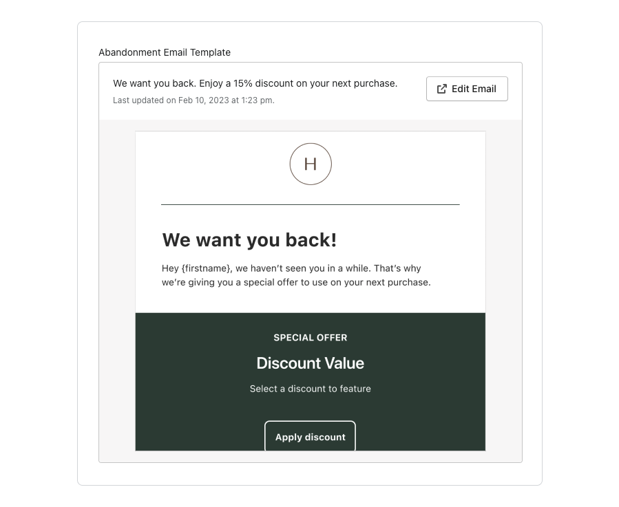
In your Shopify Flow action configuration, merchants see a preview with an image and text that's fetched from your custom configuration page preview URL. Merchants can click the button to access the custom configuration page.
Your custom configuration page is then displayed in a frame in the Shopify admin.
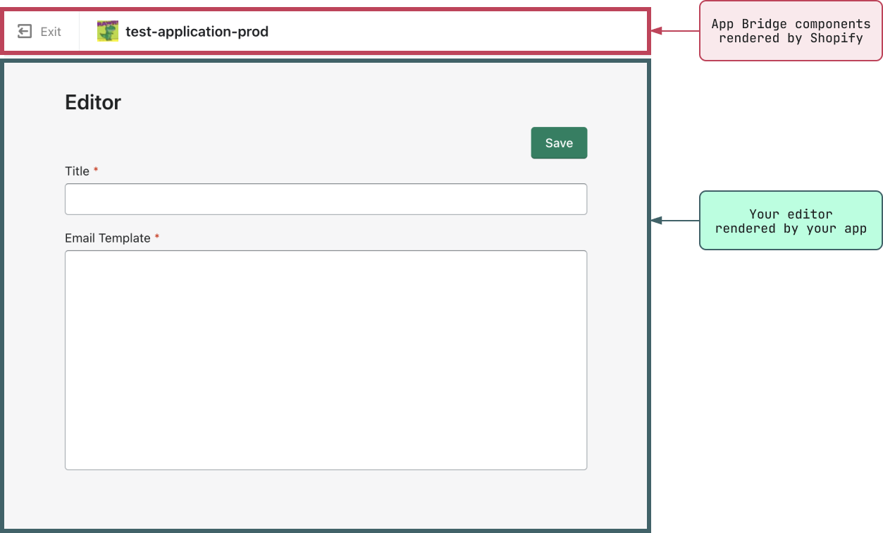
In this tutorial, you'll learn how to render a custom configuration page in Shopify Flow, customize the page frame, and access data relevant to your action in the custom configuration page context.
Anchor to RequirementsRequirements
- You're a user with app development permissions.
- You've created an app.
Anchor to ResourcesResources
To implement this feature, you'll use the following:
- Shopify App Bridge
- App Bridge components
- App Bridge actions specific to the custom configuration page
Anchor to Implementing a custom configuration pageImplementing a custom configuration page
To build a custom configuration page, you'll use Shopify App Bridge to render a page from your app page in Shopify Flow.
From the context of the custom configuration page, you can then access step and property information that you can use to display the appropriate information.
You can also add buttons to the App Bridge title bar or trigger a redirect to the previous page.
Anchor to Use Shopify App Bridge to render your app pageUse Shopify App Bridge to render your app page
The specifics of the Custom Configuration Page integration varies between Shopify App Bridge versions. Make sure you implement the integration specific to your Shopify App Bridge version.
The specifics of the Custom Configuration Page integration varies between Shopify App Bridge versions. Make sure you implement the integration specific to your Shopify App Bridge version.
To render your custom configuration page, you need to integrate Shopify App Bridge on the route that you want to render. To learn about setting up Shopify App Bridge, refer to one of the following pages:
Anchor to Access action informationAccess action information
In the context of the custom configuration page, Shopify Flow makes the following action information available:
- A
step_referencesearch parameter:step_referenceis a unique ID for the step within a workflow, and can be used to identify the resource that the merchant is requesting. - Property data: Properties contains the extension fields data that make up your action payload schema. The properties are passed as an object containing the properties as key-value pairs:
Anchor to Shopify App Bridge integration for versions 4.X.X and upShopify App Bridge integration for versions 4.
Anchor to Register to the Custom Configuration Page's intentRegister to the Custom Configuration Page's intent
To access the step configuration data with Shopify App Bridge version 4.X.X and up, use the shopify.intents API. Registering to the intent gives you the step's action, its step_reference (encoded in intent.type as gid://flow/stepReference/<step-reference>), and the configured step properties under intent.data.properties.
The following example registers to the intent and renders the step's data in a configuration UI built with Polaris web components. It also adds a Done button to the App Bridge title bar that calls intent.finish() to return the merchant to the action configuration pane:
Example
The register callback receives an intent object with the following fields:
| Field | Type | Description |
|---|---|---|
action | string | The operation the merchant is performing. Always configure for the Custom Configuration Page. |
type | string | A GID of the form gid://flow/stepReference/<step-reference>. |
data | object | Contains the configured properties as key-value pairs. |
finish | method | Returns the merchant to the previous page (the action configuration pane). |
The register method returns a cleanup function. Call it when your component unmounts to unregister from the intent.
You can add more actions to the title bar by passing <button> elements to the TitleBar component. Only primary and secondary actions are supported.
Example
Anchor to Shopify App Bridge integration for versions 3.X.X and downShopify App Bridge integration for versions 3.
Anchor to Request property dataRequest property data
To access property data, you need to subscribe to APP::APP_FRAME::PROPERTIES_EVENT, and then request the properties by triggering the APP::APP_FRAME::REQUEST_PROPERTIES event. The following example code subscribes to the properties event and requests the action properties in React:
Example
Anchor to Return to the previous pageReturn to the previous page
By default, the title bar of the custom configuration page includes an Exit button that the user can use to return to the previous page. This might be the Shopify Flow editor. However, you can choose to trigger a redirect to the previous page using APP::APP_FRAME::NAVIGATE_BACK:
Example
You can add more actions to the App Bridge title bar in one of two ways:
-
Using
@shopify/app-bridge: Use theButton.createinitializer to create the buttons, then pass them to theTitlebar.createinitializer to set the buttons. You need to keep a reference to the Titlebar instance if you wish to do additional updates after the initialization. -
Using
@shopify/app-bridge-react: Pass the primary and secondary actions to theTitleBarReact component.Only primary and secondary actions on the TitleBar are supported. Other App Bridge actions are ignored.
Example
JavaScript
import { TitleBar, Button } from '@shopify/app-bridge/actions'

// create the buttons
const primaryBtn = Button.create(app, {
  label: 'Button 1',
})
const secondaryBtn = Button.create(app, {
  label: 'Button 2',
})

// add click handlers
primaryBtn.subscribe(Button.Action.CLICK, () => {
  console.log('button 1 clicked')
})
secondaryBtn.subscribe(Button.Action.CLICK, () => {
  console.log('button 2 clicked')
})

const titleBar = TitleBar.create(app, {
  title: '',
  buttons: {
    primary: primaryBtn,
    secondary: [secondaryBtn],
  },
})

// update buttons after initialization
const newPrimary = Button.create(app, {
  label: 'New button',
})
newPrimary.subscribe(Button.Action.CLICK, () => {
  console.log('new primary button clicked')
})

titleBar.set({
  buttons: {
    primary: newPrimary,
    secondary: [secondaryBtn],
  },
})
React
import { TitleBar } from '@shopify/app-bridge-react'

function Page() {
  const buttons = {
    primaryAction: {
      content: 'Button 1',
      onAction: () => {
        console.log('button 1 clicked')
      },
    },
    secondaryActions: [
      {
        content: 'Button 2',
        onAction: () => {
          console.log('button 2 clicked')
        },
      },
    ],
  }

  return <TitleBar title="" {...buttons} />
}
Anchor to Next stepsNext steps
- Add custom configuration page preview URL and custom validation endpoints to your app.
- Add your custom configuration page preview URL, custom configuration page URL, and custom validation URL to your Shopify Flow action configuration.
To add a custom configuration page to your action, you also need to add a custom validation endpoint.
To add a custom configuration page to your action, you also need to add a custom validation endpoint.