Product thumbnail
The product thumbnail component displays small preview images representing products. Use product thumbnail to provide visual identification in lists, order summaries, or cards where space is constrained and quick recognition is important.
Product thumbnails provide a visual preview of items so customers can quickly identify products. For full-size images, use image. For user profile images, use avatar. To display multiple product images in a compact layout, use image group.
Product thumbnails render at a fixed aspect ratio and use center cropping for non-square images, which might cut off important details near the edges. Cross-origin images require proper CORS headers from the host. Custom placeholder graphics aren't available.
Supported targets
- customer-account.
footer. render-after - customer-account.
order-index. announcement. render - customer-account.
order-index. block. render - customer-account.
order-status. announcement. render - customer-account.
order-status. block. render - customer-account.
order-status. cart-line-item. render-after - customer-account.
order-status. cart-line-list. render-after - customer-account.
order-status. customer-information. render-after - customer-account.
order-status. fulfillment-details. render-after - customer-account.
order-status. payment-details. render-after - customer-account.
order-status. return-details. render-after - customer-account.
order-status. unfulfilled-items. render-after - customer-account.
order. action. menu-item. render - customer-account.
order. action. render - customer-account.
order. page. render - customer-account.
page. render - customer-account.
profile. addresses. render-after - customer-account.
profile. announcement. render - customer-account.
profile. block. render - customer-account.
profile. company-details. render-after - customer-account.
profile. company-location-addresses. render-after - customer-account.
profile. company-location-payment. render-after - customer-account.
profile. company-location-staff. render-after - customer-account.
profile. payment. render-after
Supported targets
- customer-account.
footer. render-after - customer-account.
order-index. announcement. render - customer-account.
order-index. block. render - customer-account.
order-status. announcement. render - customer-account.
order-status. block. render - customer-account.
order-status. cart-line-item. render-after - customer-account.
order-status. cart-line-list. render-after - customer-account.
order-status. customer-information. render-after - customer-account.
order-status. fulfillment-details. render-after - customer-account.
order-status. payment-details. render-after - customer-account.
order-status. return-details. render-after - customer-account.
order-status. unfulfilled-items. render-after - customer-account.
order. action. menu-item. render - customer-account.
order. action. render - customer-account.
order. page. render - customer-account.
page. render - customer-account.
profile. addresses. render-after - customer-account.
profile. announcement. render - customer-account.
profile. block. render - customer-account.
profile. company-details. render-after - customer-account.
profile. company-location-addresses. render-after - customer-account.
profile. company-location-payment. render-after - customer-account.
profile. company-location-staff. render-after - customer-account.
profile. payment. render-after
Anchor to Use casesUse cases
- Order details: Display product images alongside order line items for quick identification.
- Wishlists and saved items: Show product previews in saved product lists.
- Subscription products: Present the products included in a recurring subscription.
- Recommendations: Display suggested product thumbnails in upsell or cross-sell sections.
Anchor to PropertiesProperties
Configure the following properties on the product thumbnail component.
- Anchor to altaltaltstringstringDefault: ''Default: ''
Alternative text that describes the image for accessibility.
Provides a text description of the image for users with assistive technology and serves as a fallback when the image fails to load. A well-written description enables people with visual impairments to understand non-text content.
When a screen reader encounters an image, it reads this description aloud. When an image fails to load, this text displays on screen, helping all users understand what content was intended.
Learn more about writing effective alt text and the alt attribute.
- Anchor to sizesizesize'base' | 'small' | 'small-100''base' | 'small' | 'small-100'Default: 'base'Default: 'base'
The size of the product thumbnail image.
'base': Default size that works well in most contexts.'small': Small thumbnail, good for secondary contexts or tight layouts.'small-100': Extra small thumbnail for compact displays or dense lists.
- Anchor to sizessizessizesstringstring
A set of media conditions and their corresponding sizes. Learn more about the sizes attribute.
- Anchor to srcsrcsrcstringstring
The image source (either a remote URL or a local file resource).
When the image is loading or no
srcis provided, a placeholder is rendered. Learn more about the src attribute.- Anchor to srcSetsrc
Setsrc Set stringstring A set of image sources and their width or pixel density descriptors. Learn more about the srcset attribute. This overrides the
srcproperty.- Anchor to totalItemstotal
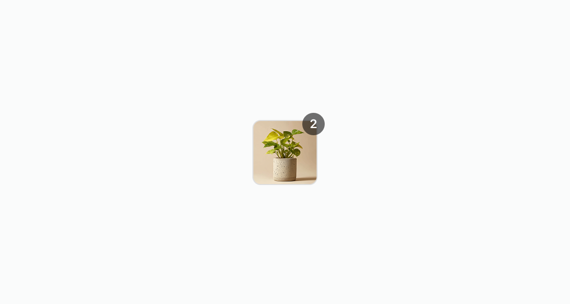
Itemstotal Items numbernumber The total number of items that the product thumbnail represents. When this value exceeds 1, the component displays a badge showing the count, useful for representing bundled products or quantities.
Anchor to ExamplesExamples
Anchor to Display a product thumbnailDisplay a product thumbnail
Display a small preview image for a product. This example presents a basic product thumbnail with a source URL and alt text for accessibility.
Display a product thumbnail
html
Anchor to Show an empty stateShow an empty state
Handle products without images gracefully. This example shows an empty thumbnail placeholder alongside product details when no image is available.
html
Anchor to Adjust the sizeAdjust the size
Compare available thumbnail sizes side by side. This example displays the same product at small-100, small, and base sizes aligned along the bottom edge.
html
Anchor to Display in an order summaryDisplay in an order summary
Build an order summary with product thumbnails, names, quantities, and prices. This example shows two line items inside a section with each product displayed alongside its details.
html
Anchor to Best practicesBest practices
- Use high-quality product images: Use optimized product images that ensure visual clarity and fast loading. Maintain a consistent aspect ratio for product thumbnails to avoid distortion or stretching.
- Maintain visual consistency: Keep a consistent visual style for product thumbnails throughout your extension. This consistency helps customers recognize and associate thumbnails with product offerings.
- Always provide descriptive alt text: Write alt text that describes the product, such as "Blue cotton t-shirt with crew neck." Avoid generic labels like "product image" or "thumbnail."
- Choose appropriate sizes for your context: Smaller thumbnails work better in dense layouts like lists, while larger sizes suit product-focused interfaces. Consider the customer's task and the information density when choosing a size.