Payment icon
The payment icon component displays icons representing payment methods. Use payment icon to visually communicate available or saved payment options so customers can quickly identify their payment instruments.
Payment icons render branded logos for common payment methods like Visa, Mastercard, and PayPal, maintaining consistent sizing and styling across different payment providers.
Supported targets
- customer-account.
footer. render-after - customer-account.
order-index. announcement. render - customer-account.
order-index. block. render - customer-account.
order-status. announcement. render - customer-account.
order-status. block. render - customer-account.
order-status. cart-line-item. render-after - customer-account.
order-status. cart-line-list. render-after - customer-account.
order-status. customer-information. render-after - customer-account.
order-status. fulfillment-details. render-after - customer-account.
order-status. payment-details. render-after - customer-account.
order-status. return-details. render-after - customer-account.
order-status. unfulfilled-items. render-after - customer-account.
order. action. menu-item. render - customer-account.
order. action. render - customer-account.
order. page. render - customer-account.
page. render - customer-account.
profile. addresses. render-after - customer-account.
profile. announcement. render - customer-account.
profile. block. render - customer-account.
profile. company-details. render-after - customer-account.
profile. company-location-addresses. render-after - customer-account.
profile. company-location-payment. render-after - customer-account.
profile. company-location-staff. render-after - customer-account.
profile. payment. render-after
Supported targets
- customer-account.
footer. render-after - customer-account.
order-index. announcement. render - customer-account.
order-index. block. render - customer-account.
order-status. announcement. render - customer-account.
order-status. block. render - customer-account.
order-status. cart-line-item. render-after - customer-account.
order-status. cart-line-list. render-after - customer-account.
order-status. customer-information. render-after - customer-account.
order-status. fulfillment-details. render-after - customer-account.
order-status. payment-details. render-after - customer-account.
order-status. return-details. render-after - customer-account.
order-status. unfulfilled-items. render-after - customer-account.
order. action. menu-item. render - customer-account.
order. action. render - customer-account.
order. page. render - customer-account.
page. render - customer-account.
profile. addresses. render-after - customer-account.
profile. announcement. render - customer-account.
profile. block. render - customer-account.
profile. company-details. render-after - customer-account.
profile. company-location-addresses. render-after - customer-account.
profile. company-location-payment. render-after - customer-account.
profile. company-location-staff. render-after - customer-account.
profile. payment. render-after
Anchor to Use casesUse cases
- Saved payment methods: Display icons next to saved cards or wallets in account settings.
- Payment confirmation: Show the payment method used for a completed order in order details.
- Payment selection: Help customers visually identify payment options during a transaction.
- Subscription billing: Display the payment method associated with a recurring subscription.
Anchor to PropertiesProperties
Configure the following properties on the payment icon component.
- Anchor to accessibilityLabelaccessibility
Labelaccessibility Label stringstring A label that describes the payment icon for accessibility. When set, it will be announced to users using assistive technologies such as screen readers, providing context about which payment method the icon represents.
- Anchor to idididstringstring
A unique identifier for the element. Use this to reference the element in JavaScript, link labels to form controls, or target specific elements for styling or scripting.
- Anchor to typetypetypePaymentIconName | AnyStringPaymentIconName | AnyStringDefault: ''Default: ''
The payment method to display. Specify a payment method name from the available set (for example,
'visa','mastercard', or'paypal'), or use an empty string to show no icon.
PaymentIconName
"abn" | "acima-leasing" | "acuotaz" | "ada" | "addi" | "adyen" | "aeropay" | "affin-bank" | "affirm" | "aftee" | "afterpay-paynl-version" | "afterpay" | "airtel-money" | "airteltigo-mobile-money" | "aktia" | "akulaku-paylater" | "akulaku" | "alandsbanken" | "alfamart" | "alfamidi" | "alipay-hk" | "alipay-paynl-version" | "alipay" | "alliance-bank" | "alma" | "aman" | "amazon" | "ambank" | "american-express" | "amex" | "ansa-stored-value" | "ansa" | "anyday" | "apecoin" | "aplazo" | "apple-pay" | "aqsat" | "arbitrum" | "arhaus" | "arvato" | "ashley-plcc" | "ask" | "astrapay" | "atm-bersama" | "atobaraidotcom" | "atome" | "atone" | "atrato" | "au-kantan-kessai" | "au-pay" | "authorize-net" | "avalanche" | "axs" | "bancnet" | "banco-azteca" | "bancomat" | "bancontact" | "bangkok-bank" | "bank-islam" | "bank-muamalat" | "bank-rakyat" | "barclays" | "base" | "bbva-cie" | "bc-card" | "bca-klikpay" | "bca" | "bdo" | "belfius" | "benefit" | "best-buy-card" | "biercheque-paynl-version" | "bigc" | "billease" | "biller-paynl-version" | "billie" | "billink-method" | "billink" | "bitcoin-cash" | "bitcoin" | "bizum" | "blik" | "bnbchain" | "bni" | "bnp" | "bogus-app-coin" | "bogus" | "boleto" | "boodil" | "boost" | "bpi" | "braintree" | "bread-pay" | "bread" | "bri-direct-debit" | "bri" | "brimo" | "bsi" | "bsn" | "bss" | "busd" | "careem-pay" | "cartes-bancaires" | "cash-app-pay" | "cash" | "cashew" | "cashinvoice-latin-america" | "catch-payments" | "cebuana" | "cembrapay" | "centi" | "cetelem" | "checkout-finance" | "chinabank" | "cimb-clicks" | "cimb" | "circle-k" | "citadele" | "citi-pay" | "clave-telered" | "clearpay" | "clerq" | "cleverpay" | "clip" | "cliq" | "codensa" | "coinsph" | "collector-bank" | "coop" | "coppel-pay" | "credit-agricole" | "credit-key" | "creditclick-paynl-version" | "credix" | "cuotas" | "d-barai" | "dai" | "daily-yamazaki" | "dan-dan" | "dana" | "danamon-online" | "dankort" | "danske-bank" | "dappmx" | "dash" | "daviplata" | "de-cadeaukaart" | "depay" | "deutsche-bank" | "dinacard" | "diners-club" | "direct-bank-transfer-latin-america" | "directa24" | "directpay" | "discover" | "divido" | "dnb" | "docomo-barai" | "dogecoin" | "dropp" | "duitnow" | "duologi" | "dwolla" | "easywallet" | "ebucks" | "echelon-financing" | "ecpay" | "edenred" | "efecty" | "eft-secure" | "eftpos-au" | "eghl" | "elo" | "elv" | "empty" | "enets" | "eos" | "epayments" | "epospay" | "eps" | "erste" | "escrowcom" | "esr-paymentslip-switzerland" | "ethereum" | "etihad-guest-pay" | "etika" | "ewallet-indonesia" | "ewallet-philippines" | "ewallet-southkorea" | "facebook-pay" | "fairstone-payments" | "fam" | "familymart" | "fantom" | "farmlands" | "fashion-giftcard-paynlversion" | "fashioncheque" | "favepay" | "fawry" | "finloup" | "fintecture" | "fintoc" | "flexiti" | "float-payments" | "flying-blue-plus" | "forbrugsforeningen" | "forsa" | "fortiva" | "fps" | "fpx" | "freecharge" | "freedompay" | "futurepay-mytab" | "gcash" | "generalfinancing" | "generic" | "genoapay" | "gezondheidsbon-paynl-version" | "giftcard" | "giropay" | "givacard" | "glbe-paypal" | "glbe-plus" | "gmo-atokara" | "gmo-bank-transfer" | "gmo-postpay" | "gmo-virtualaccount" | "gnosis" | "google-pay" | "google-wallet" | "gopay" | "grabpay" | "grailpay" | "gusd" | "hana-card" | "handelsbanken" | "happy-pay" | "hello-clever" | "heylight" | "hitrustpay-transfer" | "home-credit" | "hong-leong-bank" | "hong-leong-connect" | "hsbc" | "huis-tuin-cadeau" | "humm" | "hyper" | "hypercard" | "hypercash" | "hyundai-card" | "ibexpay" | "ideal" | "in3-via-ideal" | "in3" | "inbank" | "indomaret" | "ing-homepay" | "interac" | "ivy" | "iwocapay-pay-later" | "jcb" | "jenius" | "jko" | "jousto" | "kakao-pay" | "kakebaraidotcom" | "kasikornbank" | "kasssh" | "katapult" | "kb-card" | "kbc-cbc" | "kcp-credit-card" | "kfast" | "khqr" | "klarna-pay-later" | "klarna-pay-now" | "klarna-slice-it" | "klarna" | "knaken-settle" | "knet" | "koalafi" | "koin" | "krediidipank" | "kredivo" | "krungsri" | "krungthai-bank" | "kueski-pay" | "kunst-en-cultuur-cadeaukaart" | "kuwait-finance-house" | "land-bank" | "laser" | "latitude-creditline-au" | "latitude-gem-au" | "latitude-gem-nz" | "latitude-go-au" | "latitudepay" | "lawson" | "laybuy-heart" | "laybuy" | "lbc" | "lhv" | "line-pay" | "linkaja" | "linkpay" | "litecoin" | "lku" | "lloyds" | "lotte-card" | "lpb" | "luminor" | "lunch-check" | "lydia" | "mach" | "mada" | "maestro" | "mandiri" | "mash" | "master" | "mastercard" | "masterpass" | "maxima" | "maya-bank" | "maya" | "maybank-qrpay" | "maybank" | "maybankm2u" | "mb-way" | "mb" | "mcash" | "medicinos-bankas" | "meeza" | "mercado-credito" | "mercado-pago" | "merpay" | "meta-pay" | "metro-bank" | "military-starcard" | "minicuotas" | "ministop" | "mobicred" | "mobikwik" | "mobilepay" | "mode" | "mokka" | "momopay" | "mondido" | "monero" | "monzo" | "mpesa" | "mtn-mobile-money" | "multisafepay" | "mybank" | "myfatoorah" | "n26" | "naps" | "nationale-bioscoopbon" | "nationale-entertainmentcard" | "natwest" | "naver-pay" | "nelo" | "nequi" | "netbanking" | "neteller" | "nh-card" | "nordea" | "notyd" | "novuna" | "npatobarai" | "npkakebarai" | "oca" | "ocbc-bank" | "octo-clicks" | "octopus" | "offline-bank-transfer-latin-america" | "ola-money" | "omannet" | "omasp" | "oney" | "online-banking" | "online-banktransfer" | "op" | "opay" | "openpay" | "optimism" | "orange-mobile-money" | "overstock-citicobrand" | "overstock-citiplcc" | "ovo" | "oxxo" | "ozow" | "pagoefectivo" | "paid" | "paidy" | "palawa" | "palawan" | "pastpay" | "pay-after-delivery-instalments" | "pay-by-bank-us" | "pay-by-bank" | "pay-easy" | "pay-pay" | "paybylink" | "paycash" | "payco" | "payconiq" | "payd" | "payfast-instant-eft" | "payflex" | "payid" | "payitmonthly" | "payjustnow" | "paymark-online-eftpos" | "paymaya" | "payme" | "paynow-mbank" | "paynow" | "payoo-qr" | "payoo" | "paypal" | "payplan" | "paypo" | "payrexx-bank-transfer" | "payright" | "paysafecard-paynl-version" | "paysafecard" | "paysafecash" | "paysera" | "paysquad" | "paytm" | "payto" | "paytomorrow" | "payu" | "payzapp" | "pei" | "perlasfinance" | "permata" | "pf-pay" | "pivo" | "pix" | "podium-cadeaukaart" | "pointspay" | "poli" | "polygon" | "poppankki" | "postfinance-card" | "postfinance-efinance" | "postpay" | "powered-by-ansa-stored-value" | "powered-by-ansa" | "powerpay" | "pps" | "prepaysolutions" | "progressive-leasing" | "przelew24" | "przelewy24-paynl-version" | "przelewy24" | "pse" | "public-bank" | "publicbank-pbe" | "qasitli" | "qliro" | "qr-promptpay" | "qris" | "qrph" | "rabbit-line-pay" | "rabobank" | "rakuten-pay" | "rapid-transfer" | "ratepay" | "raty-pekao" | "rcbc" | "rcs" | "reka" | "resolve-pay" | "revolut" | "rhb-bank" | "rhb-now" | "rietumu" | "riverty-paynl-version" | "riverty" | "rupay" | "saastopankki" | "sadad" | "sam" | "samsung-card" | "samsung-pay" | "santander" | "satisfi" | "satispay" | "sbpl" | "scalapay" | "scream-truck-wallet" | "scream-truck" | "seb" | "seicomart" | "sepa-bank-transfer" | "sepa-direct-debit" | "sequra" | "seven-eleven" | "sezzle" | "shib" | "shinhan-card" | "shop-pay" | "shopeepay" | "shopify-pay" | "siam-commercial" | "siauliu-bankas" | "siirto" | "sika-fsa" | "sika-hsa" | "sika" | "simpl" | "simple-pay" | "sinpe-movil" | "sistecredito" | "skeps" | "skrill-digital-wallet" | "slice-fnbo" | "smartpay" | "snap-checkout" | "snapmint" | "societe-generale" | "sofort" | "softbank" | "solana-pay-helio" | "solana-pay" | "solana" | "souhoola" | "spankki" | "sparkasse" | "spei" | "splitit" | "spotii" | "spraypay" | "standard-chartered" | "stc-pay" | "stoov" | "store-credit" | "stripe" | "sunkus" | "super-payments" | "svea-b2b-faktura" | "svea-b2b-invoice" | "svea-checkout" | "svea-credit-account" | "svea-delbetalning" | "svea-faktura" | "svea-invoice" | "svea-lasku" | "svea-ostukonto" | "svea-part-payment" | "svea-yrityslasku" | "sveaeramaksu" | "swedbank" | "swiftpay" | "swish" | "swissbilling" | "sympl" | "synchrony-pay" | "synchrony" | "tabby" | "tabit" | "taly" | "tamara" | "tandympayment" | "tasa-cero" | "tbi-bank" | "tcf" | "tendopay" | "tensile" | "tesco-lotus" | "thanachart-bank" | "timepayment" | "tiptop" | "todopay" | "toss" | "touch-n-go" | "tpay" | "trevipay" | "truelayer" | "truemoney-pay" | "trustly" | "twig-pay" | "twint" | "twoinvoice" | "uae-visa" | "uangme" | "ubp" | "underpay" | "unionpay" | "unipay" | "uob-ez-pay" | "uob-thai" | "uob" | "upi" | "urbo" | "urpay" | "usdc" | "usdp" | "v-pay" | "valu" | "venmo" | "ventipay" | "venus-plcc" | "viabill" | "vipps" | "visa-electron" | "visa" | "volksbank" | "volt" | "vvv-cadeaukaart-paynl-version" | "vvv-giftcard" | "waave-pay-by-bank" | "wallet" | "walley" | "wbtc" | "webshop-giftcard" | "wechat-pay" | "wechat-paynl-version" | "wegetfinancing" | "whish-checkout" | "whish-pay" | "wise" | "wissel" | "world-chain" | "xrp" | "yape" | "yappy" | "ymobile" | "younited-pay" | "zalopay" | "zapper" | "zingala" | "zinia" | "zip" | "zoodpay" | "zulily-credit-card" | "zustaina"AnyString
Prevents widening string literal types in a union to `string`.
string & {}Anchor to ExamplesExamples
Anchor to Display payment iconsDisplay payment icons
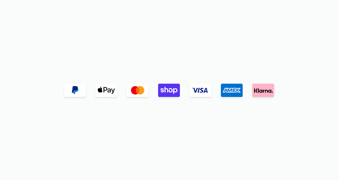
Show available payment method icons in a row. This example displays icons for common payment providers using an inline stack layout.
Display payment icons
html
Anchor to Show a saved cardShow a saved card
Pair a payment icon with card details for quick identification. This example displays a Visa icon next to the last four digits of a saved card.
html
Anchor to Display order payment methodDisplay order payment method
Show the payment method used for an order within a section. This example combines a payment icon with card number and expiry details.
html
Anchor to List saved payment methodsList saved payment methods
Display multiple saved payment methods in a vertical list. This example shows cards and wallets with their identifying details alongside the payment icon.
html
Anchor to Best practicesBest practices
- Maintain the interior appearance of the icon: The branded portion of the payment icon meets the brand guidelines of the payment provider. Don't alter or overlay the icon content.
- Maintain the border property of the icon: The border is designed to adapt to merchant branding and ensures a consistent appearance across the customer experience.
- Use consistent sizing: The icon size is designed to display consistently across customer account pages. Avoid overriding the default dimensions.
- Pair with identifying text: Display the payment method name or last four digits alongside the icon so customers can distinguish between multiple saved payment methods.