Stepper
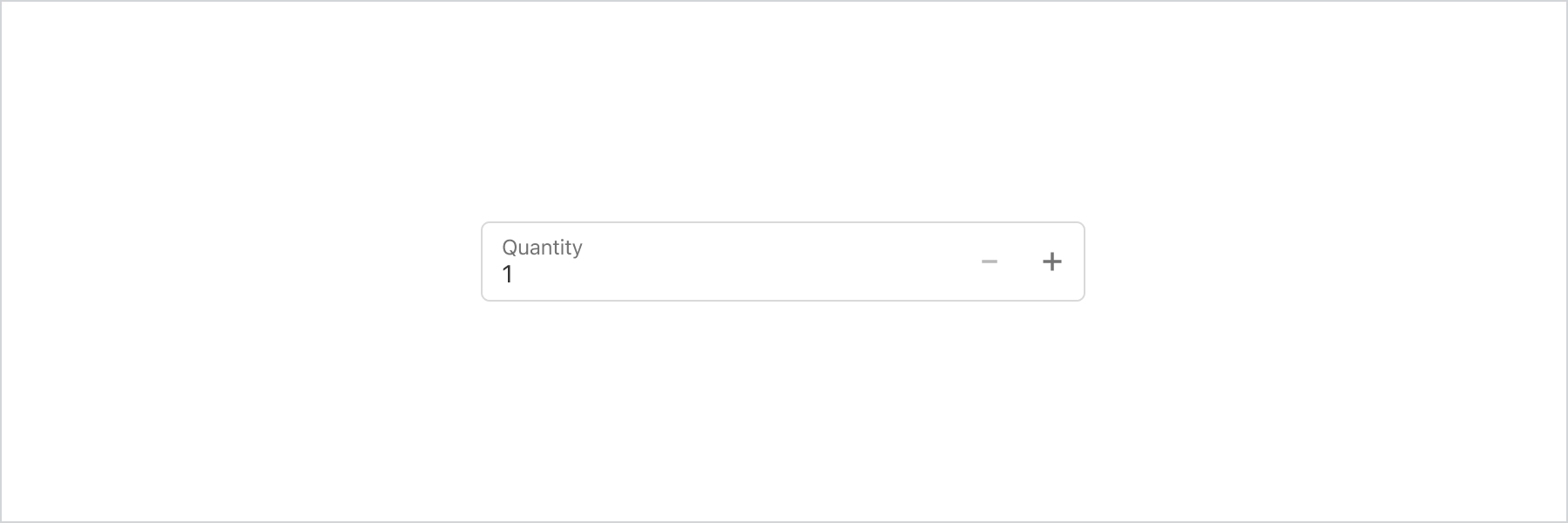
Use a stepper to increase or decrease a value, like changing the quantity from 1 to 2.
Anchor to stepperpropsStepperProps
- Anchor to labellabelstringrequired
Content to use as the field label. This value is also used as the placeholder when the field is empty.
- Anchor to accessibilityDescriptionaccessibilityDescriptionstring
A detailed description for screen readers.
- Anchor to disableddisabledboolean
Whether the field can be modified.
- Anchor to errorerrorstring
Indicate an error to the user. The field will be given a specific stylistic treatment to communicate problems that have to be resolved immediately.
- Anchor to iconiconIconSource
An icon to render at the start of the field.
- string
A unique identifier for the field. When no
idis set, a globally unique value will be used instead.- number
The highest decimal or integer to be accepted for the stepper field. When used with
stepthe value will round down to the max number. Note: a buyer will still be able to use the keyboard to input a number higher than the max. It is up to the developer to add appropriate validation.- numberDefault: 0
The lowest decimal or integer to be accepted for the stepper field. When used with
stepthe value will round up to the min number. Note: a buyer will still be able to use the keyboard to input a number lower than the min. It is up to the developer to add appropriate validation.- Anchor to namenamestring
An identifier for the field that is unique within the nearest containing
Formcomponent.- Anchor to onBluronBlur() => void
Callback when focus is removed.
- Anchor to onChangeonChange(value: number) => void
Callback when the buyer has finished editing a field. Unlike
callbacks you may be familiar with from Polaris or other React component libraries, this callback is not run on every change to the input. Text fields are “partially controlled” components, which means that while the buyer edits the field, its state is controlled by the component. Once the buyer has signalled that they have finished editing the field (typically, by blurring the field),is called if the input actually changed from the most recentvalueproperty. At that point, you are expected to store this “committed value” in state, and reflect it in the text field’svalueproperty.This state management model is important given how UI Extensions are rendered. UI Extension components run on a separate thread from the UI, so they can’t respond to input synchronously. A pattern popularized by controlled React components is to have the component be the source of truth for the input
value, and update thevalueon every user input. The delay in responding to events from a UI extension is only a few milliseconds, but attempting to strictly store state with this delay can cause issues if a user types quickly, or if the buyer is using a lower-powered device. Having the UI thread take ownership for “in progress” input, and only synchronizing when the user is finished with a field, avoids this risk.It can still sometimes be useful to be notified when the user makes any input in the field. If you need this capability, you can use the
prop. However, never use that property to create tightly controlled state for thevalue.This callback is called with the current value of the field. If the value of a field is the same as the current
valueprop provided to the field, thecallback will not be run.- Anchor to onFocusonFocus() => void
Callback when input is focused.
- Anchor to onInputonInput(value: number) => void
Callback when the user makes any changes in the field. As noted in the documentation for
, you must not use this to updatestate— use thecallback for that purpose. Use theprop when you need to do something as soon as the buyer makes a change, like clearing validation errors that apply to the field as soon as the user begins making the necessary adjustments.This callback is called with the current value of the field.
- Anchor to prefixprefixstring
Text content to render before the value.
- Anchor to readonlyreadonlyboolean
Whether the field is read-only.
- Anchor to requiredrequiredboolean
Whether the field needs a value. This requirement adds semantic value to the field, but it will not cause an error to appear automatically. If you want to present an error when this field is empty, you can do so with the
errorprop.- Anchor to stepstepnumberDefault: 1
The amount the value can increase or decrease by. This can be an integer or decimal. If a
maxorminis specified withstepwhen increasing/decreasing the value via the stepper buttons the final value will always round to themaxorminrather than the closest valid amount.- Anchor to valuevaluenumber | undefined
The current value for the field. If omitted, the field will be empty. You should update this value in response to the
callback.
IconSource
'arrowLeft' | 'arrowRight' | 'arrowUp' | 'arrowUpRight' | 'arrowDown' | 'bag' | 'bullet' | 'calendar' | 'camera' | 'caretDown' | 'cart' | 'cashDollar' | 'categories' | 'checkmark' | 'chevronLeft' | 'chevronRight' | 'chevronUp' | 'chevronDown' | 'clipboard' | 'clock' | 'close' | 'creditCard' | 'critical' | 'delete' | 'delivered' | 'delivery' | 'disabled' | 'discount' | 'email' | 'error' | 'errorFill' | 'external' | 'filter' | 'geolocation' | 'gift' | 'giftFill' | 'grid' | 'hamburger' | 'hollowCircle' | 'horizontalDots' | 'image' | 'info' | 'infoFill' | 'list' | 'lock' | 'magnify' | 'map' | 'marker' | 'minus' | 'mobile' | 'note' | 'orderBox' | 'pen' | 'plus' | 'profile' | 'question' | 'questionFill' | 'reorder' | 'reset' | 'return' | 'savings' | 'settings' | 'star' | 'starFill' | 'starHalf' | 'store' | 'success' | 'truck' | 'upload' | 'verticalDots' | 'warning' | 'warningFill'Basic Stepper
Examples
Basic Stepper
React
import {
  reactExtension,
  Stepper,
} from '@shopify/ui-extensions-react/checkout';

export default reactExtension(
  'purchase.checkout.block.render',
  () => <Extension />,
);

function Extension() {
  return <Stepper label="Quantity" value={1} />;
}
JS
import {extension, Stepper} from '@shopify/ui-extensions/checkout';

export default extension('purchase.checkout.block.render', (root) => {
  const stepper = root.createComponent(Stepper, {
    label: 'Quantity',
    value: 1,
  });

  root.appendChild(stepper);
});
Preview
Anchor to best-practicesBest Practices
Use this component when customers are likely to choose a number within a small range, such as when changing a quantity from one to three.
If there’s no default number, then consider choosing another component such as a TextField or Select.