Drop
DropZone allows file uploads through drag-and-drop functionality into a designated area on a page, or by activating a button. At present, DropZone does not offer image upload preview capabilities. The use of object URLs directly in an image component is not possible due to the extension and host operating on separate domains.
Any element focused within the Dropzone component, including child elements such as the 'Add file' button, will initiate the file selector when the Enter or Spacebar key is pressed.
Anchor to dropzonepropsDropZoneProps
- Anchor to acceptacceptstring
A string representing the types of files that are accepted by the dropzone. This string is a comma-separated list of unique file type specifiers which can be one of the following:
- A file extension starting with a period (".") character (e.g. .jpg, .pdf, .doc)
- A valid MIME type string with no extensions
If left empty, the dropzone will accept all files.
- Anchor to accessibilityLabelaccessibilityLabelstring
A label that describes the purpose or contents of the item. When set, it will be announced to buyers using assistive technologies and will provide them with more context.
- Anchor to disableddisabledboolean
Whether the field can be modified.
- Anchor to errorerrorstring
Indicate an error to the user. The field will be given a specific stylistic treatment to communicate problems that have to be resolved immediately.
- string
A unique identifier for the component.
- Anchor to labellabelstring
Content to use as the field label.
- Anchor to multiplemultiplebooleanDefault: false
Defines if the user can select or drop multiple files at once.
- Anchor to namenamestring
An identifier for the field that is unique within the nearest containing
Formcomponent.- Anchor to onDropRejectedonDropRejected(files: File[]) => void
Callback when rejected files are dropped. Files are rejected based on the
acceptprop.- Anchor to onInputonInput(files: File[]) => void
Callback when files are dropped or selected.
- Anchor to requiredrequiredboolean
Whether the field needs a value. This requirement adds semantic value to the field, but it will not cause an error to appear automatically. If you want to present an error when this field is empty, you can do so with the
errorprop.
DropZone
Examples
DropZone
React
import {
  reactExtension,
  DropZone,
} from '@shopify/ui-extensions-react/checkout';

export default reactExtension(
  'purchase.checkout.block.render',
  () => <Extension />,
);

function Extension() {
  return <DropZone accept="image/*" />;
}
JS
import {DropZone, extension} from '@shopify/ui-extensions/checkout';

export default extension('purchase.checkout.block.render', (root) => {
  const dropZone = root.createComponent(DropZone, {
    accept: 'image/*',
  });

  root.appendChild(dropZone);
});
Preview
Anchor to best-practicesBest Practices
File storage
File storage for uploads must be implemented separately. Metafields and the corresponding Checkout API or Customer Accounts API can be utilized to store references to files alongside the relevant objects.
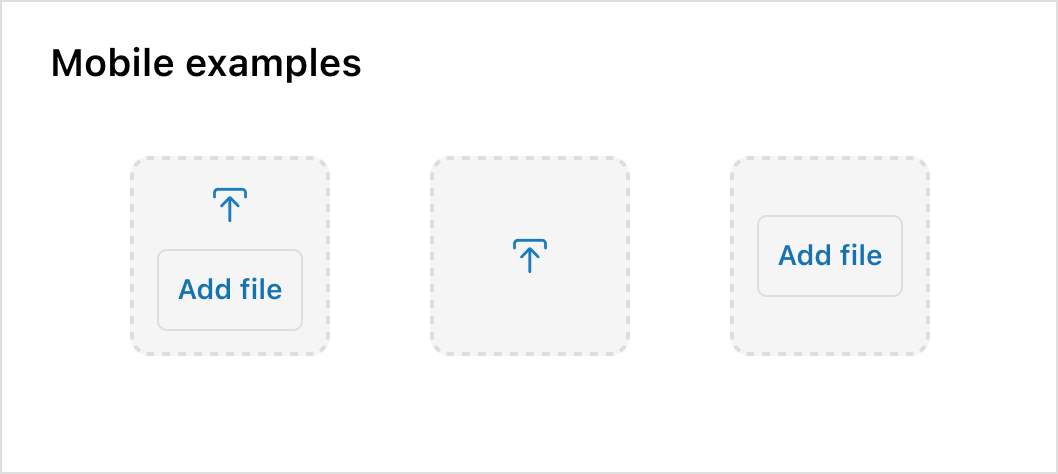
Mobile
Remember that the drag and drop feature won’t be effective on mobile devices. Adding a button can offer additional context and guide users through the next steps.
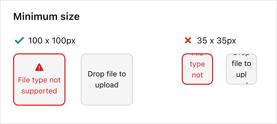
Minimum size
To prevent cut-off text and spacing issues, the minimum size of a Dropzone should be 100px by 100px.