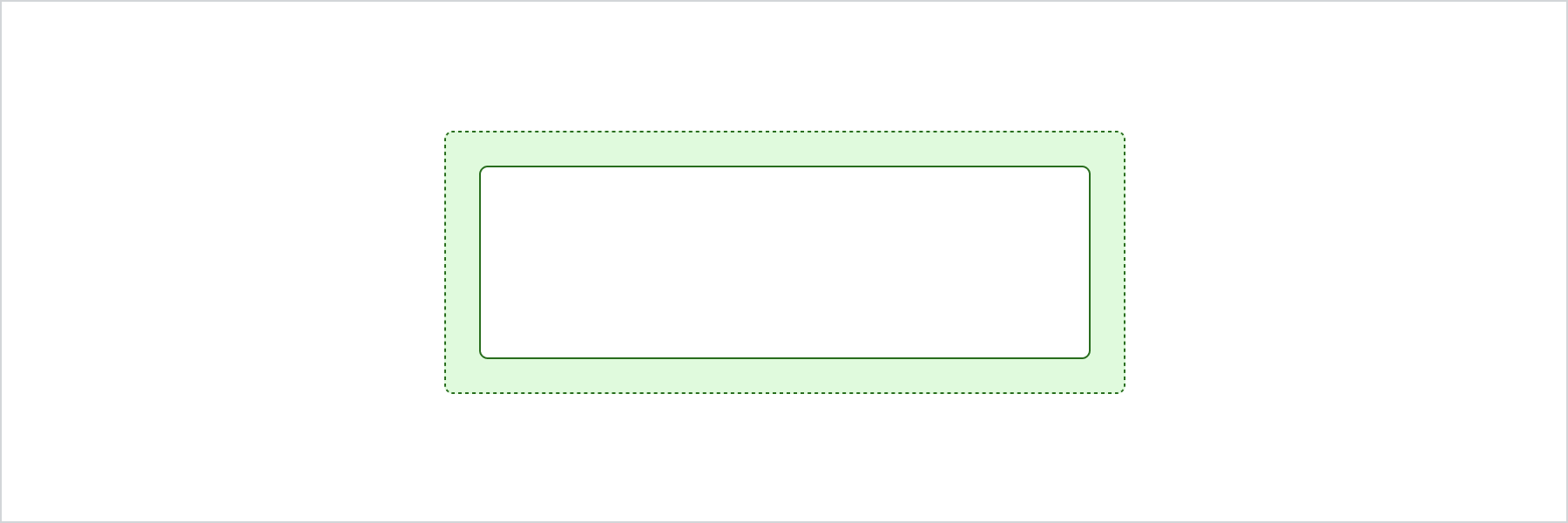
Section
Section is a structural component that allows thematic grouping of content. Its visual style is contextual and controlled by Shopify, so a Section may look different depending on the component it is nested inside.
Section also automatically increases the heading level for its content to ensure a semantically correct heading structure in the document. To further increase the heading level inside the Section, consider nesting new Sections.
Anchor to sectionpropsSectionProps
- Anchor to accessibilityLabelaccessibilityLabelstring
A label used to describe the section that will be announced by assistive technologies.
When no
headingproperty is provided or included as a children of the Section, you must provide anto describe the Section. This is important as it allows assistive technologies to provide the right context to users.- Anchor to headingheadingstring
A title that describes the content of the section.
- Anchor to paddingpadding'base' | 'none'Default: "base"
Adjust the padding of all edges.
base: applies padding that is appropriate for the element. Note that it may result in no padding if Shopify believes this is the right design decision in a particular context.none: removes all padding from the element. This can be useful when elements inside the Section need to span to the edge of the Section. For example, a full-width image. In this case, rely onBoxor any other layout element to bring back the desired padding for the rest of the content.
Section to an app page
Examples
Section to an app page
React
import React from 'react';
import {
  render,
  Section,
} from '@shopify/ui-extensions-react/admin';


render('Playground', () => <App />);

function App() {
  return (
    <Section heading="Section heading">
      Section content
    </Section>
  );
}
JS
import {
  extend,
  Section,
} from '@shopify/ui-extensions/admin';

export default extend(
  'Playground',
  (root) => {
    const section = root.createComponent(
      Section,
      {
        heading: 'Section heading',
      },
      'Section content'
    );

    root.appendChild(section);
  },
);
Preview
