Popover
The popover component displays contextual content in an overlay triggered by a button. Use for secondary actions, settings, or information that doesn't require a full modal.
For interactions that need more space or user focus, such as confirmations or complex forms, use modal instead.
Popovers open in response to user interaction only, not programmatically on page load.
Supported targets
- customer-account.
footer. render-after - customer-account.
order-index. announcement. render - customer-account.
order-index. block. render - customer-account.
order-status. announcement. render - customer-account.
order-status. block. render - customer-account.
order-status. cart-line-item. render-after - customer-account.
order-status. cart-line-list. render-after - customer-account.
order-status. customer-information. render-after - customer-account.
order-status. fulfillment-details. render-after - customer-account.
order-status. payment-details. render-after - customer-account.
order-status. return-details. render-after - customer-account.
order-status. unfulfilled-items. render-after - customer-account.
order. action. menu-item. render - customer-account.
order. action. render - customer-account.
order. page. render - customer-account.
page. render - customer-account.
profile. addresses. render-after - customer-account.
profile. announcement. render - customer-account.
profile. block. render - customer-account.
profile. company-details. render-after - customer-account.
profile. company-location-addresses. render-after - customer-account.
profile. company-location-payment. render-after - customer-account.
profile. company-location-staff. render-after - customer-account.
profile. payment. render-after
Supported targets
- customer-account.
footer. render-after - customer-account.
order-index. announcement. render - customer-account.
order-index. block. render - customer-account.
order-status. announcement. render - customer-account.
order-status. block. render - customer-account.
order-status. cart-line-item. render-after - customer-account.
order-status. cart-line-list. render-after - customer-account.
order-status. customer-information. render-after - customer-account.
order-status. fulfillment-details. render-after - customer-account.
order-status. payment-details. render-after - customer-account.
order-status. return-details. render-after - customer-account.
order-status. unfulfilled-items. render-after - customer-account.
order. action. menu-item. render - customer-account.
order. action. render - customer-account.
order. page. render - customer-account.
page. render - customer-account.
profile. addresses. render-after - customer-account.
profile. announcement. render - customer-account.
profile. block. render - customer-account.
profile. company-details. render-after - customer-account.
profile. company-location-addresses. render-after - customer-account.
profile. company-location-payment. render-after - customer-account.
profile. company-location-staff. render-after - customer-account.
profile. payment. render-after
Anchor to Use casesUse cases
- Contextual menus: Display additional options or actions in an overlay triggered by a button.
- Filter controls: Present filter options in a popover to save screen space while keeping controls accessible.
- Extended help: Show detailed help content or explanations in a popover triggered by an info button.
- Quick actions: Provide quick action panels that appear on demand without navigating away from the current view.
Anchor to PropertiesProperties
Configure the following properties on the popover component.
- Anchor to blockSizeblock
Sizeblock Size SizeUnitsOrAutoSizeUnitsOrAutoDefault: 'auto'Default: 'auto' The block size of the popover (height in horizontal writing modes). Learn more about the block-size property.
- Anchor to idididstringstring
A unique identifier for the element. Use this to reference the element in JavaScript, link labels to form controls, or target specific elements for styling or scripting.
- Anchor to inlineSizeinline
Sizeinline Size SizeUnitsOrAutoSizeUnitsOrAutoDefault: 'auto'Default: 'auto' The inline size of the popover (width in horizontal writing modes). Learn more about the inline-size property.
- Anchor to maxBlockSizemax
Block Sizemax Block Size SizeUnitsOrNoneSizeUnitsOrNoneDefault: 'none'Default: 'none' The maximum block size of the popover. Constrains the popover's height to prevent it from exceeding this value. Learn more about the max-block-size property.
- Anchor to maxInlineSizemax
Inline Sizemax Inline Size SizeUnitsOrNoneSizeUnitsOrNoneDefault: 'none'Default: 'none' The maximum inline size of the popover. Constrains the popover's width to prevent it from exceeding this value. Learn more about the max-inline-size property.
- Anchor to minBlockSizemin
Block Sizemin Block Size SizeUnitsSizeUnitsDefault: '0'Default: '0' The minimum block size of the popover. Ensures the popover maintains at least this height. Learn more about the min-block-size property.
- Anchor to minInlineSizemin
Inline Sizemin Inline Size SizeUnitsSizeUnitsDefault: '0'Default: '0' The minimum inline size of the popover. Ensures the popover maintains at least this width. Learn more about the min-inline-size property.
SizeUnitsOrAuto
Represents size values that can also be set to `auto` for automatic sizing. - `SizeUnits`: Specific size values in pixels, percentages, or zero for precise control. - `auto`: Automatically sizes based on content and layout constraints. Learn more about the [auto value](https://developer.mozilla.org/en-US/docs/Web/CSS/width#auto).
SizeUnits | "auto"SizeUnits
Represents size values in pixels, percentages, or zero. - `` `${number}px` ``: Absolute size in pixels for fixed dimensions (such as `100px`, `24px`). - `` `${number}%` ``: Relative size as a percentage of the parent container (such as `50%`, `100%`). - `0`: Zero size, equivalent to no dimension.
`${number}px` | `${number}%` | `0`SizeUnitsOrNone
Represents size values that can also be set to `none` to remove the size constraint. - `SizeUnits`: Specific size values in pixels, percentages, or zero for precise control. - `none`: No size constraint, allowing unlimited growth. Learn more about the [none value](https://developer.mozilla.org/en-US/docs/Web/CSS/max-width#none).
SizeUnits | "none"Anchor to EventsEvents
The popover component provides event callbacks for handling user interactions. Learn more about handling events.
- Anchor to hidehidehideCallbackEventListener<typeof tagName>CallbackEventListener<typeof tagName>
A callback fired immediately after the popover is hidden.
- Anchor to showshowshowCallbackEventListener<typeof tagName>CallbackEventListener<typeof tagName>
A callback fired immediately after the popover is shown.
CallbackEventListener
A typed event listener for custom element events. The listener receives a `CallbackEvent` with the correct `currentTarget` type for the associated custom element tag.
(EventListener & {
      (event: CallbackEvent<TTagName, TEvent>): void;
    }) | null
CallbackEvent
An event type that narrows the `currentTarget` to the specific HTML element associated with the custom element tag. This provides type-safe event handling in callback listeners.
TEvent & {
  currentTarget: HTMLElementTagNameMap[TTagName];
}
Anchor to ExamplesExamples
Anchor to Show a form in a popoverShow a form in a popover
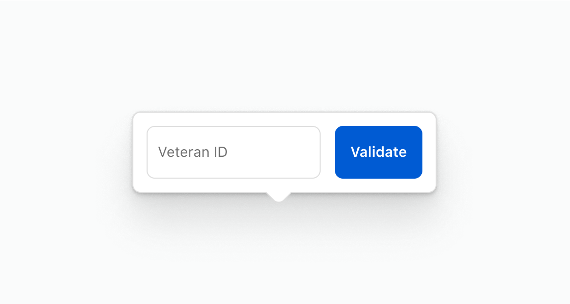
Collect input inline without navigating away from the page. This example presents a text field and submit button inside a popover for verifying a veteran ID.
Show a form in a popover
html
Anchor to Display contextual informationDisplay contextual information
Surface supplementary information on demand without cluttering the main view. This example shows shipping details in a popover triggered by a button.
html
Anchor to Show a list of actionsShow a list of actions
Present a set of related actions in a compact overlay. This example shows an action list with options for returns, issue reporting, and support.
html
Anchor to Best practicesBest practices
- Avoid placing critical information in a popover: Popovers are hidden until triggered, making them unsuitable for essential content that customers need to see immediately.
- Group related actions: Contain actions that share a relationship to each other so the popover feels cohesive.
- Trigger with a clearly labeled button: The button that opens the popover should clearly indicate what'll appear when activated.