Modal
The modal component displays content in an overlay. Use to create a distraction-free experience such as a confirmation dialog or a settings panel.
Modals support a heading, scrollable body content, and action slots for primary and secondary buttons. For contextual content that doesn't require full focus, use popover instead.
Modals open in response to user interaction only, not programmatically on page load.
Supported targets
- customer-account.
footer. render-after - customer-account.
order-index. announcement. render - customer-account.
order-index. block. render - customer-account.
order-status. announcement. render - customer-account.
order-status. block. render - customer-account.
order-status. cart-line-item. render-after - customer-account.
order-status. cart-line-list. render-after - customer-account.
order-status. customer-information. render-after - customer-account.
order-status. fulfillment-details. render-after - customer-account.
order-status. payment-details. render-after - customer-account.
order-status. return-details. render-after - customer-account.
order-status. unfulfilled-items. render-after - customer-account.
order. action. menu-item. render - customer-account.
order. action. render - customer-account.
order. page. render - customer-account.
page. render - customer-account.
profile. addresses. render-after - customer-account.
profile. announcement. render - customer-account.
profile. block. render - customer-account.
profile. company-details. render-after - customer-account.
profile. company-location-addresses. render-after - customer-account.
profile. company-location-payment. render-after - customer-account.
profile. company-location-staff. render-after - customer-account.
profile. payment. render-after
Supported targets
- customer-account.
footer. render-after - customer-account.
order-index. announcement. render - customer-account.
order-index. block. render - customer-account.
order-status. announcement. render - customer-account.
order-status. block. render - customer-account.
order-status. cart-line-item. render-after - customer-account.
order-status. cart-line-list. render-after - customer-account.
order-status. customer-information. render-after - customer-account.
order-status. fulfillment-details. render-after - customer-account.
order-status. payment-details. render-after - customer-account.
order-status. return-details. render-after - customer-account.
order-status. unfulfilled-items. render-after - customer-account.
order. action. menu-item. render - customer-account.
order. action. render - customer-account.
order. page. render - customer-account.
page. render - customer-account.
profile. addresses. render-after - customer-account.
profile. announcement. render - customer-account.
profile. block. render - customer-account.
profile. company-details. render-after - customer-account.
profile. company-location-addresses. render-after - customer-account.
profile. company-location-payment. render-after - customer-account.
profile. company-location-staff. render-after - customer-account.
profile. payment. render-after
Anchor to Use casesUse cases
- Confirmation dialogs: Display confirmation prompts for destructive or irreversible actions like canceling a subscription.
- Policy display: Present terms, return policies, or other important information that requires customer acknowledgment.
- Data entry: Collect structured input through forms displayed in a modal with save and cancel actions.
- Detail previews: Show detailed information or previews without navigating away from the current page.
Anchor to PropertiesProperties
Configure the following properties on the modal component.
- Anchor to accessibilityLabelaccessibility
Labelaccessibility Label stringstring A label that describes the purpose of the modal, announced by assistive technologies. When set, screen readers will use this label instead of the
headingto describe the modal.- Anchor to headingheadingheadingstringstring
A title that describes the content of the modal.
- Anchor to idididstringstring
A unique identifier for the element. Use this to reference the element in JavaScript, link labels to form controls, or target specific elements for styling or scripting.
- Anchor to paddingpaddingpadding'base' | 'none''base' | 'none'Default: 'base'Default: 'base'
Adjust the padding around the modal content.
base: Applies padding that is appropriate for the element.none: Removes all padding from the element. This can be useful when elements inside the modal need to span to the edge of the modal. For example, a full-width image. In this case, rely on box with a padding ofbaseto bring back the desired padding for the rest of the content.
- Anchor to sizesizesize'base' | 'small' | 'small-100' | 'large' | 'large-100' | 'max''base' | 'small' | 'small-100' | 'large' | 'large-100' | 'max'Default: 'base'Default: 'base'
The size of the modal.
'base': The default size, suitable for most use cases.'small': A compact modal for simple confirmations or short messages.'small-100': The smallest modal size.'large': A large modal for complex content or forms.'large-100': The largest fixed-size modal, providing maximum room for content.'max': Expands the modal to its maximum size as defined by the host application, on both the horizontal and vertical axes.
Anchor to EventsEvents
The modal component provides event callbacks for handling user interactions. Learn more about handling events.
- Anchor to afterhideafterhideafterhideCallbackEventListener<typeof tagName>CallbackEventListener<typeof tagName>
A callback fired when the modal is hidden, after any hide animations have completed.
- Anchor to aftershowaftershowaftershowCallbackEventListener<typeof tagName>CallbackEventListener<typeof tagName>
A callback fired when the modal is shown, after any show animations have completed.
- Anchor to hidehidehideCallbackEventListener<typeof tagName>CallbackEventListener<typeof tagName>
A callback fired immediately after the modal is hidden.
- Anchor to showshowshowCallbackEventListener<typeof tagName>CallbackEventListener<typeof tagName>
A callback fired immediately after the modal is shown.
CallbackEventListener
A typed event listener for custom element events. The listener receives a `CallbackEvent` with the correct `currentTarget` type for the associated custom element tag.
(EventListener & {
      (event: CallbackEvent<TTagName, TEvent>): void;
    }) | null
CallbackEvent
An event type that narrows the `currentTarget` to the specific HTML element associated with the custom element tag. This provides type-safe event handling in callback listeners.
TEvent & {
  currentTarget: HTMLElementTagNameMap[TTagName];
}
Anchor to SlotsSlots
The modal component supports slots for additional content placement within the component. Learn more about using slots.
- Anchor to primary-actionprimary-actionprimary-actionHTMLElementHTMLElement
The main action button displayed in the modal footer, representing the primary action users should take. Only accepts a single button component.
- Anchor to secondary-actionssecondary-actionssecondary-actionsHTMLElementHTMLElement
Additional action buttons displayed in the modal footer, providing alternative or supporting actions.
Anchor to MethodsMethods
The modal component exposes methods for programmatic control.
- Anchor to hideOverlayhide
Overlayhide Overlay () => void() => voidrequiredrequired A method to programmatically hide the overlay and run any associated hide animations.
Anchor to ExamplesExamples
Anchor to Display a return policyDisplay a return policy
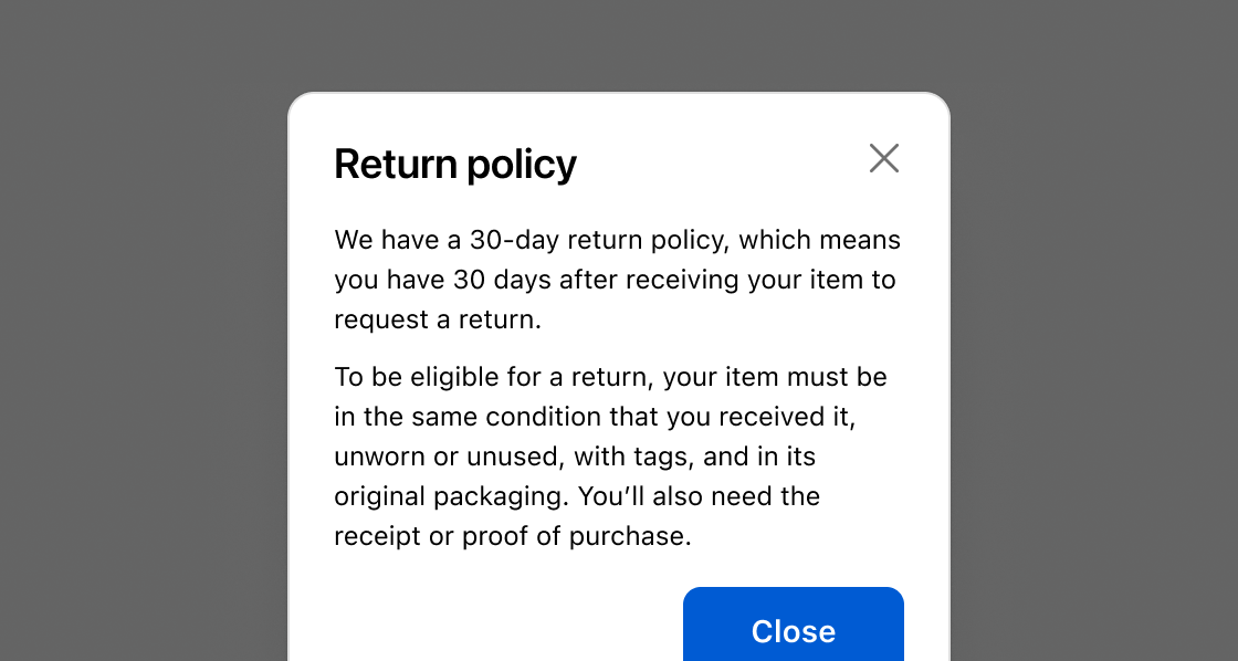
Present information that requires customer acknowledgment. This example shows a modal with a heading, body text, and a close button using command="--hide" in the primary-action slot.
Display a return policy
html
Anchor to Confirm a destructive actionConfirm a destructive action
Pair a cancel button with a critical-toned action button to prevent accidental destructive operations. This example presents a subscription cancellation confirmation with cancel and confirm buttons in the secondary-actions and primary-action slots.
html
Anchor to Collect input with a formCollect input with a form
Gather information without leaving the current context. This example embeds a feedback form with a select field and text area inside the modal.
html
Anchor to Best practicesBest practices
- Use for focused, specific tasks: Modals work best when customers need to make a decision or acknowledge critical information. Don't use them for contextual tools or actions that could happen on the page directly.
- Include a prominent call to action: Every modal should have a clear primary action so customers know what to do next.
- Don't nest modals: Avoid launching one modal from another. If the workflow requires multiple steps, reconsider the design.
- Use specific action verbs: Label buttons with clear verbs like "Cancel subscription", "Save", or "Continue" rather than vague terms like "Yes", "OK", or "Submit".
- Explain destructive consequences: For destructive actions, describe what'll happen in the modal body before the customer confirms.
- Use sparingly: Don't create unnecessary interruptions. Modals should be a last resort for important decisions.