Map
The map component displays an interactive map on a page. Use map to show geographic locations such as store addresses, pickup points, or customer delivery destinations.
Maps render using Google Maps and require an API key along with a set of allowed domains. You can add markers to highlight specific locations and attach popovers to provide additional details about each point.
Map requires a Google Maps API key with the following allowed domains: https://*.[MERCHANT-DOMAIN].com, https://shop.app, and https://shopify.com. Refer to the Google Maps Platform documentation for details on obtaining an API key, and to match patterns for the domain syntax. Rendering depends on the customer's network connection and Google Maps availability — there's no built-in offline fallback.
Supported targets
- customer-account.
footer. render-after - customer-account.
order-index. announcement. render - customer-account.
order-index. block. render - customer-account.
order-status. announcement. render - customer-account.
order-status. block. render - customer-account.
order-status. cart-line-item. render-after - customer-account.
order-status. cart-line-list. render-after - customer-account.
order-status. customer-information. render-after - customer-account.
order-status. fulfillment-details. render-after - customer-account.
order-status. payment-details. render-after - customer-account.
order-status. return-details. render-after - customer-account.
order-status. unfulfilled-items. render-after - customer-account.
order. action. menu-item. render - customer-account.
order. action. render - customer-account.
order. page. render - customer-account.
page. render - customer-account.
profile. addresses. render-after - customer-account.
profile. announcement. render - customer-account.
profile. block. render - customer-account.
profile. company-details. render-after - customer-account.
profile. company-location-addresses. render-after - customer-account.
profile. company-location-payment. render-after - customer-account.
profile. company-location-staff. render-after - customer-account.
profile. payment. render-after
Supported targets
- customer-account.
footer. render-after - customer-account.
order-index. announcement. render - customer-account.
order-index. block. render - customer-account.
order-status. announcement. render - customer-account.
order-status. block. render - customer-account.
order-status. cart-line-item. render-after - customer-account.
order-status. cart-line-list. render-after - customer-account.
order-status. customer-information. render-after - customer-account.
order-status. fulfillment-details. render-after - customer-account.
order-status. payment-details. render-after - customer-account.
order-status. return-details. render-after - customer-account.
order-status. unfulfilled-items. render-after - customer-account.
order. action. menu-item. render - customer-account.
order. action. render - customer-account.
order. page. render - customer-account.
page. render - customer-account.
profile. addresses. render-after - customer-account.
profile. announcement. render - customer-account.
profile. block. render - customer-account.
profile. company-details. render-after - customer-account.
profile. company-location-addresses. render-after - customer-account.
profile. company-location-payment. render-after - customer-account.
profile. company-location-staff. render-after - customer-account.
profile. payment. render-after
Anchor to Use casesUse cases
- Store locator: Display nearby store locations so customers can find the closest pickup point.
- Order tracking: Show the delivery destination or current package location on a map.
- Address verification: Let customers visually confirm their shipping or billing address.
- Pickup locations: Present available pickup points for click-and-collect orders.
Anchor to PropertiesProperties
Configure the following properties on the map component.
- Anchor to accessibilityLabelaccessibility
Labelaccessibility Label stringstring A label that describes the purpose or contents of the map for accessibility. When set, it will be announced to users using assistive technologies such as screen readers, providing context about what the map displays.
- Anchor to apiKeyapi
Keyapi Key stringstring A valid API key for the map service provider. This key is required to load and render the map tiles. Obtain a key from a supported provider such as Google Maps Platform.
- Anchor to blockSizeblock
Sizeblock Size MaybeResponsive<SizeUnitsOrAuto>MaybeResponsive<SizeUnitsOrAuto>Default: 'auto'Default: 'auto' The block size of the element (height in horizontal writing modes). Learn more about the block-size property.
: Specific size values in pixels, percentages, or zero for precise control.auto: Automatically sizes based on content and layout constraints.
- Anchor to idididstringstring
A unique identifier for the element. Use this to reference the element in JavaScript, link labels to form controls, or target specific elements for styling or scripting.
- Anchor to inlineSizeinline
Sizeinline Size MaybeResponsive<SizeUnitsOrAuto>MaybeResponsive<SizeUnitsOrAuto>Default: 'auto'Default: 'auto' The inline size of the element (width in horizontal writing modes). Learn more about the inline-size property.
: Specific size values in pixels, percentages, or zero for precise control.auto: Automatically sizes based on content and layout constraints.
- Anchor to latitudelatitudelatitudenumbernumberDefault: 0Default: 0
The latitude of the map's center point, in degrees. Valid values range from -90 (South Pole) to 90 (North Pole).
- Anchor to longitudelongitudelongitudenumbernumberDefault: 0Default: 0
The longitude of the map's center point, in degrees. Valid values range from -180 (west) to 180 (east).
- Anchor to maxBlockSizemax
Block Sizemax Block Size MaybeResponsive<SizeUnitsOrNone>MaybeResponsive<SizeUnitsOrNone>Default: 'none'Default: 'none' The maximum block size of the element (maximum height in horizontal writing modes). Learn more about the max-block-size property.
- Anchor to maxInlineSizemax
Inline Sizemax Inline Size MaybeResponsive<SizeUnitsOrNone>MaybeResponsive<SizeUnitsOrNone>Default: 'none'Default: 'none' The maximum inline size of the element (maximum width in horizontal writing modes). Learn more about the max-inline-size property.
- Anchor to maxZoommax
Zoommax Zoom numbernumberDefault: 18Default: 18 The maximum zoom level the user can reach on the map. Valid values are numbers from 0 (world view) to 18 (street level). Use this to prevent users from zooming in beyond a useful level of detail.
- Anchor to minBlockSizemin
Block Sizemin Block Size MaybeResponsive<SizeUnits>MaybeResponsive<SizeUnits>Default: '0'Default: '0' The minimum block size of the element (minimum height in horizontal writing modes). Learn more about the min-block-size property.
- Anchor to minInlineSizemin
Inline Sizemin Inline Size MaybeResponsive<SizeUnits>MaybeResponsive<SizeUnits>Default: '0'Default: '0' The minimum inline size of the element (minimum width in horizontal writing modes). Learn more about the min-inline-size property.
- Anchor to minZoommin
Zoommin Zoom numbernumberDefault: 0Default: 0 The minimum zoom level the user can reach on the map. Valid values are numbers from 0 (world view) to 18 (street level). Use this to prevent users from zooming out beyond a useful level of context.
- Anchor to zoomzoomzoomnumbernumberDefault: 4Default: 4
The initial zoom level of the map. Valid values are numbers from 0 (fully zoomed out, world view) to 18 (fully zoomed in, street level).
MaybeResponsive
Makes a property responsive by allowing it to be set conditionally based on container query conditions. The value can be either a base value or a container query string. - `T`: Base value that applies in all conditions. - `@container${string}`: Container query string for conditional responsive styling based on container size.
T | `@container${string}`SizeUnitsOrAuto
Represents size values that can also be set to `auto` for automatic sizing. - `SizeUnits`: Specific size values in pixels, percentages, or zero for precise control. - `auto`: Automatically sizes based on content and layout constraints. Learn more about the [auto value](https://developer.mozilla.org/en-US/docs/Web/CSS/width#auto).
SizeUnits | "auto"SizeUnits
Represents size values in pixels, percentages, or zero. - `` `${number}px` ``: Absolute size in pixels for fixed dimensions (such as `100px`, `24px`). - `` `${number}%` ``: Relative size as a percentage of the parent container (such as `50%`, `100%`). - `0`: Zero size, equivalent to no dimension.
`${number}px` | `${number}%` | `0`SizeUnitsOrNone
Represents size values that can also be set to `none` to remove the size constraint. - `SizeUnits`: Specific size values in pixels, percentages, or zero for precise control. - `none`: No size constraint, allowing unlimited growth. Learn more about the [none value](https://developer.mozilla.org/en-US/docs/Web/CSS/max-width#none).
SizeUnits | "none"Anchor to EventsEvents
The map component provides event callbacks for handling user interactions. Learn more about handling events.
- Anchor to boundschangeboundschangeboundschangeCallbackEventListener<typeof tagName, MapBoundsEvent>CallbackEventListener<typeof tagName, MapBoundsEvent>
A callback fired when the visible map boundaries change, such as after a pan or zoom completes.
- Anchor to clickclickclickCallbackEventListener<typeof tagName, MapLocationEvent>CallbackEventListener<typeof tagName, MapLocationEvent>
A callback fired when the user clicks on the map. Provides the geographic location of the click.
- Anchor to dblclickdblclickdblclickCallbackEventListener<typeof tagName, MapLocationEvent>CallbackEventListener<typeof tagName, MapLocationEvent>
A callback fired when the user double-clicks on the map. Provides the geographic location of the double-click.
- Anchor to viewchangeviewchangeviewchangeCallbackEventListener<typeof tagName, MapViewChangeEvent>CallbackEventListener<typeof tagName, MapViewChangeEvent>
A callback fired when the map view changes, such as when the user pans or zooms. Provides the new center location and zoom level.
CallbackEventListener
A typed event listener for custom element events. The listener receives a `CallbackEvent` with the correct `currentTarget` type for the associated custom element tag.
(EventListener & {
      (event: CallbackEvent<TTagName, TEvent>): void;
    }) | null
CallbackEvent
An event type that narrows the `currentTarget` to the specific HTML element associated with the custom element tag. This provides type-safe event handling in callback listeners.
TEvent & {
  currentTarget: HTMLElementTagNameMap[TTagName];
}
MapBoundsEvent
The event data provided when the visible map boundaries change, such as after a pan or zoom completes. Contains the new geographic bounds of the visible area.
- bounds
The geographic boundaries of the currently visible map area, defined by its north-east and south-west corners.
{ northEast?: MapLocation; southWest?: MapLocation; }
MapLocation
A geographic coordinate pair representing a location on the map, defined by latitude and longitude values.
- latitude
The latitude of the location in degrees. Valid values range from -90 (South Pole) to 90 (North Pole).
number - longitude
The longitude of the location in degrees. Valid values range from -180 (west) to 180 (east).
number
MapLocationEvent
The event data provided when a map interaction occurs at a specific geographic location, such as a click or double-click.
- location
The geographic location on the map where the interaction occurred, as a latitude/longitude coordinate pair.
MapLocation
MapViewChangeEvent
The event data provided when the map view changes, such as after the user pans or zooms. Contains the new center location and zoom level.
- location
The geographic location on the map where the interaction occurred, as a latitude/longitude coordinate pair.
MapLocation - zoom
The current zoom level of the map after the view change, as a number from 0 (world view) to 18 (street level).
number
Anchor to Map markerMap marker
Represents a pin or point of interest on a map. Use only as a child of s-map components.
- Anchor to accessibilityLabelaccessibility
Labelaccessibility Label stringstring A label that describes the purpose or location of the marker for accessibility. When set, it will be announced to users using assistive technologies such as screen readers, providing context about what the marker represents.
- Anchor to blockSizeblock
Sizeblock Size MaybeResponsive<SizeUnitsOrAuto>MaybeResponsive<SizeUnitsOrAuto>Default: 'auto'Default: 'auto' The block size of the element (height in horizontal writing modes). Learn more about the block-size property.
: Specific size values in pixels, percentages, or zero for precise control.auto: Automatically sizes based on content and layout constraints.
- Anchor to clusterableclusterableclusterablebooleanbooleanDefault: falseDefault: false
Whether the marker can be grouped into clusters when the map is zoomed out. Clustering helps reduce visual clutter when many markers are close together at low zoom levels.
- Anchor to commandcommandcommand'--auto' | '--show' | '--hide' | '--toggle''--auto' | '--show' | '--hide' | '--toggle'Default: '--auto'Default: '--auto'
Sets the action the
target should take when this component is activated. Learn more about thecommandattribute.--auto: a default action for the target component.--show: shows the target component.--hide: hides the target component.--toggle: toggles the target component.
- Anchor to commandForcommand
Forcommand For stringstring The ID of the component to control when this component is activated. Pair with the
commandproperty to specify what action to perform on the target component. Learn more about theattribute.- Anchor to inlineSizeinline
Sizeinline Size MaybeResponsive<SizeUnitsOrAuto>MaybeResponsive<SizeUnitsOrAuto>Default: 'auto'Default: 'auto' The inline size of the element (width in horizontal writing modes). Learn more about the inline-size property.
: Specific size values in pixels, percentages, or zero for precise control.auto: Automatically sizes based on content and layout constraints.
- Anchor to latitudelatitudelatitudenumbernumberDefault: 0Default: 0
The latitude of the marker’s position in degrees. Valid values range from -90 (South Pole) to 90 (North Pole).
- Anchor to longitudelongitudelongitudenumbernumberDefault: 0Default: 0
The longitude of the marker’s position in degrees. Valid values range from -180 (west) to 180 (east).
Anchor to EventsEvents
The map marker component provides event callbacks for handling user interactions. Learn more about handling events.
- Anchor to clickclickclickCallbackEventListener<typeof tagName>CallbackEventListener<typeof tagName>
A callback fired when the user clicks on the marker. This event does not propagate to the parent map — only the marker receives the click.
Anchor to SlotsSlots
The map marker component supports slots for additional content placement within the component. Learn more about using slots.
- Anchor to graphicgraphicgraphicHTMLElementHTMLElement
A custom graphic element to use as the marker. If not provided, the map provider’s default marker pin is displayed.
Anchor to ExamplesExamples
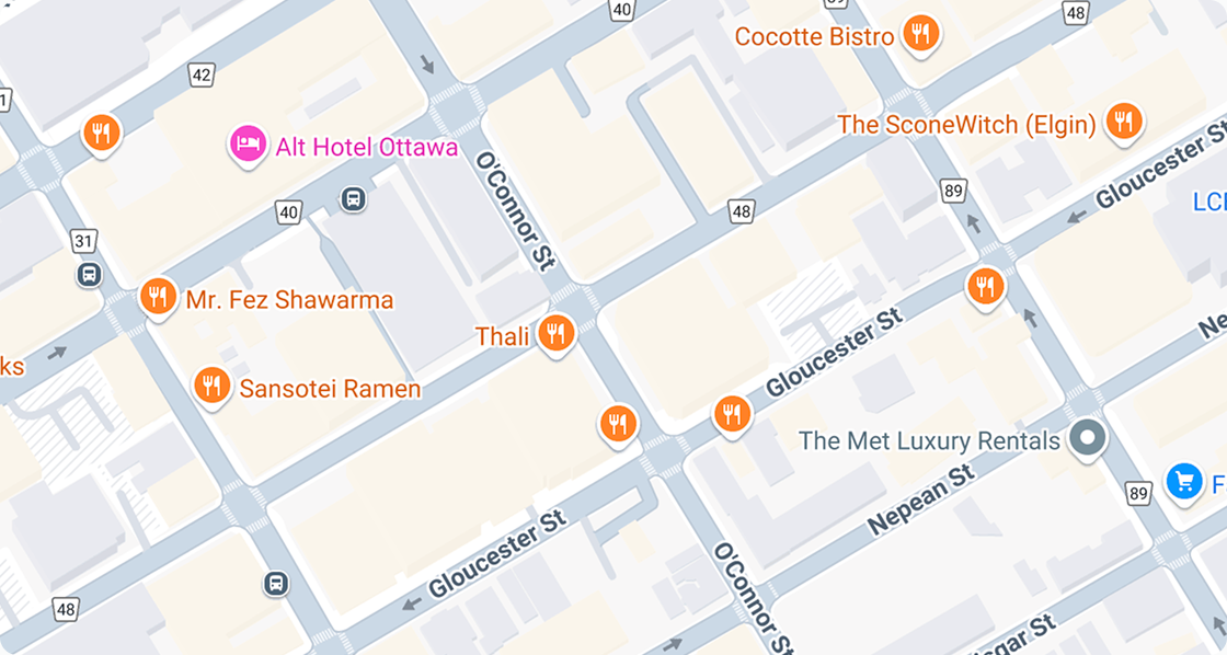
Anchor to Display a locationDisplay a location
Show a single location on a map with a marker. This example centers the map on a specific latitude and longitude with a zoom level that provides street-level context.
Display a location
html
Anchor to Add multiple markersAdd multiple markers
Display several locations on a single map. This example places three markers at different coordinates with a zoom level that fits all locations in view.
html
Anchor to Handle map eventsHandle map events
Respond to customer interactions with the map. This example listens for click events and displays the selected coordinates in a text element below the map.
html
Anchor to Show a pickup locationShow a pickup location
Present a pickup point within a section with a text address. This example combines a map with supporting text so customers can identify the location visually and by address.
html
Anchor to Best practicesBest practices
- Provide a sensible default view: Set the initial map center and zoom level so that all relevant markers are visible without requiring the customer to pan or zoom.
- Use distinct marker icons for different states: If your markers are interactive, make sure the selected marker's icon is visually different from non-selected markers so customers can identify their selection.
- Cluster markers when displaying many locations: If there are a large number of markers obscuring important features of the map, set the markers to clusterable to help increase readability.
- Include supporting context: Pair the map with text-based address information so customers who can't interact with the map still have access to the location details.