Section
The section component groups related content into clearly-defined thematic areas with consistent styling and structure. Use section to organize page content into logical blocks, each with its own heading and visual container.
Sections automatically adapt their styling based on nesting depth and adjust heading levels to maintain meaningful, accessible page hierarchies. For simple visual separation without headings, use divider.
Section heading levels and visual styling (borders, backgrounds) are determined automatically by nesting depth and can't be overridden. Only buttons are supported in the primary-action and secondary-actions slots.
Supported targets
- customer-account.
footer. render-after - customer-account.
order-index. announcement. render - customer-account.
order-index. block. render - customer-account.
order-status. announcement. render - customer-account.
order-status. block. render - customer-account.
order-status. cart-line-item. render-after - customer-account.
order-status. cart-line-list. render-after - customer-account.
order-status. customer-information. render-after - customer-account.
order-status. fulfillment-details. render-after - customer-account.
order-status. payment-details. render-after - customer-account.
order-status. return-details. render-after - customer-account.
order-status. unfulfilled-items. render-after - customer-account.
order. action. menu-item. render - customer-account.
order. action. render - customer-account.
order. page. render - customer-account.
page. render - customer-account.
profile. addresses. render-after - customer-account.
profile. announcement. render - customer-account.
profile. block. render - customer-account.
profile. company-details. render-after - customer-account.
profile. company-location-addresses. render-after - customer-account.
profile. company-location-payment. render-after - customer-account.
profile. company-location-staff. render-after - customer-account.
profile. payment. render-after
Supported targets
- customer-account.
footer. render-after - customer-account.
order-index. announcement. render - customer-account.
order-index. block. render - customer-account.
order-status. announcement. render - customer-account.
order-status. block. render - customer-account.
order-status. cart-line-item. render-after - customer-account.
order-status. cart-line-list. render-after - customer-account.
order-status. customer-information. render-after - customer-account.
order-status. fulfillment-details. render-after - customer-account.
order-status. payment-details. render-after - customer-account.
order-status. return-details. render-after - customer-account.
order-status. unfulfilled-items. render-after - customer-account.
order. action. menu-item. render - customer-account.
order. action. render - customer-account.
order. page. render - customer-account.
page. render - customer-account.
profile. addresses. render-after - customer-account.
profile. announcement. render - customer-account.
profile. block. render - customer-account.
profile. company-details. render-after - customer-account.
profile. company-location-addresses. render-after - customer-account.
profile. company-location-payment. render-after - customer-account.
profile. company-location-staff. render-after - customer-account.
profile. payment. render-after
Anchor to Use casesUse cases
- Order details: Group shipping information, payment details, and line items into clearly labeled sections within an order page.
- Account settings: Organize profile fields, notification preferences, and security settings into separate sections with headings.
- Loyalty programs: Create a section for rewards information with a heading, point balance, and a "Redeem" action button.
- Subscription management: Display subscription details, billing history, and delivery schedule in distinct sections with relevant actions.
Anchor to PropertiesProperties
Configure the following properties on the section component.
- Anchor to accessibilityLabelaccessibility
Labelaccessibility Label stringstring A label announced by assistive technologies that describes the purpose or contents of the element. Only set this when the element's visible content doesn't provide enough context on its own.
- Anchor to headingheadingheadingstringstring
A title that describes the content of the section.
- Anchor to idididstringstring
A unique identifier for the element. Use this to target the element with CSS, JavaScript, or accessibility attributes. The
idmust be unique within the document.- Anchor to paddingpaddingpadding'base' | 'none''base' | 'none'Default: 'base'Default: 'base'
Adjust the padding of all edges.
base: Applies padding that is appropriate for the element. Note that it may result in no padding if this is the right design decision in a particular context.none: Removes all padding from the element. This can be useful when elements inside the Section need to span to the edge of the Section. For example, a full-width image. In this case, rely ons-boxwith a padding of 'base' to bring back the desired padding for the rest of the content.
Anchor to SlotsSlots
The section component supports slots for additional content placement within the component. Learn more about using slots.
- Anchor to primary-actionprimary-actionprimary-actionHTMLElementHTMLElement
The main call-to-action for the section. Accepts a single button component.
- Anchor to secondary-actionssecondary-actionssecondary-actionsHTMLElementHTMLElement
Additional actions for the section. Accepts one or more button components.
Anchor to ExamplesExamples
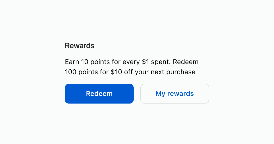
Use a section to wrap related content under a descriptive heading. This example shows a rewards section with descriptive text and action buttons.
Group related content with a heading
html
Anchor to Add section-level actionsAdd section-level actions
Place buttons in the primary-action and secondary-actions slots to add contextual actions to a section. This example shows a rewards section with "Redeem" and "View history" buttons.
html
Anchor to Nest sections for content hierarchyNest sections for content hierarchy
Nest sections to create visual and semantic hierarchy. Heading levels adjust automatically based on nesting depth. This example groups shipping and payment details inside an outer order details section.
html
Anchor to Best practicesBest practices
- Describe each section with a clear heading: Use concise, sentence-case headings that reflect the section's purpose so customers can scan the page quickly.
- Provide an accessible name when no heading exists: If a visual heading isn't appropriate, set
accessibilityLabelso assistive technologies can identify the section. - Align actions to the section's content: Only include primary and secondary actions that relate directly to the content in that section.
- Limit and prioritize actions: Keep the number of actions small to reduce noise and emphasize what matters most.
- Keep layout consistent: Maintain consistent spacing and structure between sections across the page for a coherent experience.