Page
The page component is the outer wrapper of a full page, including the page heading, subheading, and page-level actions. It provides a familiar and consistent style that sets expectations about the purpose of the page.
Page supports primary actions, secondary actions, and breadcrumb navigation to help customers orient themselves and take action. For grouping content within a page, use section.
Page is a full-page wrapper for the top level of a customer-account.page.render extension target. Only buttons are supported in the action slots, with one primary action — additional actions go in secondary-actions.
Support
Targets (24)
Supported targets
- customer-account.
footer. render-after - customer-account.
order-index. announcement. render - customer-account.
order-index. block. render - customer-account.
order-status. announcement. render - customer-account.
order-status. block. render - customer-account.
order-status. cart-line-item. render-after - customer-account.
order-status. cart-line-list. render-after - customer-account.
order-status. customer-information. render-after - customer-account.
order-status. fulfillment-details. render-after - customer-account.
order-status. payment-details. render-after - customer-account.
order-status. return-details. render-after - customer-account.
order-status. unfulfilled-items. render-after - customer-account.
order. action. menu-item. render - customer-account.
order. action. render - customer-account.
order. page. render - customer-account.
page. render - customer-account.
profile. addresses. render-after - customer-account.
profile. announcement. render - customer-account.
profile. block. render - customer-account.
profile. company-details. render-after - customer-account.
profile. company-location-addresses. render-after - customer-account.
profile. company-location-payment. render-after - customer-account.
profile. company-location-staff. render-after - customer-account.
profile. payment. render-after
Supported targets
- customer-account.
footer. render-after - customer-account.
order-index. announcement. render - customer-account.
order-index. block. render - customer-account.
order-status. announcement. render - customer-account.
order-status. block. render - customer-account.
order-status. cart-line-item. render-after - customer-account.
order-status. cart-line-list. render-after - customer-account.
order-status. customer-information. render-after - customer-account.
order-status. fulfillment-details. render-after - customer-account.
order-status. payment-details. render-after - customer-account.
order-status. return-details. render-after - customer-account.
order-status. unfulfilled-items. render-after - customer-account.
order. action. menu-item. render - customer-account.
order. action. render - customer-account.
order. page. render - customer-account.
page. render - customer-account.
profile. addresses. render-after - customer-account.
profile. announcement. render - customer-account.
profile. block. render - customer-account.
profile. company-details. render-after - customer-account.
profile. company-location-addresses. render-after - customer-account.
profile. company-location-payment. render-after - customer-account.
profile. company-location-staff. render-after - customer-account.
profile. payment. render-after
Anchor to Use casesUse cases
- Order status pages: Display an order heading with confirmation details and actions like "Buy again" or "Cancel order".
- Subscription management: Show subscription details with a breadcrumb back to the subscriptions list and a primary "Manage" action.
- Custom account pages: Build branded full-page experiences with clear headings and contextual actions.
- Return and exchange flows: Structure multi-step processes with a descriptive heading and navigation back to the originating page.
Anchor to PropertiesProperties
Configure the following properties on the page component.
- Anchor to headingheadingheadingstringstring
The main heading displayed at the top of the page.
- Anchor to idididstringstring
A unique identifier for the element. Use this to target the element with CSS, JavaScript, or accessibility attributes. The
idmust be unique within the document.- Anchor to inlineSizeinline
Sizeinline Size 'large' | 'base''large' | 'base'Default: 'base'Default: 'base' The inline size of the page.
base: Matches the narrow width used by native pages for simple workflows.large: Uses the full width available to the main content area in customer accounts. Recommended for content-heavy pages or desktop-first experiences.
- Anchor to subheadingsubheadingsubheadingstringstring
A secondary heading displayed below the main heading for additional context.
Anchor to SlotsSlots
The page component supports slots for additional content placement within the component. Learn more about using slots.
- HTMLElementHTMLElement
A navigation link that lets the customer return to the previous page. Accepts a single button component. Learn more about breadcrumb actions.
- Anchor to primary-actionprimary-actionprimary-actionHTMLElementHTMLElement
The main call-to-action for the page. Accepts a single button component. Learn more about primary actions.
- Anchor to secondary-actionssecondary-actionssecondary-actionsHTMLElementHTMLElement
Additional actions for the page. Accepts one or more button components. Learn more about secondary actions.
Place a button in the breadcrumb-actions slot to provide backward navigation. The breadcrumb button appears above the page heading and lets customers return to a parent page, such as navigating from a subscription detail page back to the subscriptions list.
- stringstringrequiredrequired
A label that describes the breadcrumb's destination to assistive technologies. Required because
childrenpassed to this button are discarded.- (event: EventListener & ((event: CallbackEvent<"s-button", Event>) => void)) => void(event: EventListener & ((event: CallbackEvent<"s-button", Event>) => void)) => void
A callback that fires when the breadcrumb is activated.
- stringstring
The URL to navigate to when the breadcrumb is activated.
CallbackEvent
An event type that narrows the `currentTarget` to the specific HTML element associated with the custom element tag. This provides type-safe event handling in callback listeners.
TEvent & {
  currentTarget: HTMLElementTagNameMap[TTagName];
}
Anchor to Primary actionsPrimary actions
Place a button in the primary-action slot to surface the most important action for the page. The primary action button appears prominently in the page header. Each page supports only one primary action, so choose the single most relevant action for the current context.
- stringstring
A label that describes the button's purpose to assistive technologies. Use this when the button text alone doesn't provide enough context.
- (event: EventListener & ((event: CallbackEvent<"s-button", Event>) => void)) => void(event: EventListener & ((event: CallbackEvent<"s-button", Event>) => void)) => void
A callback that fires when the button is activated, before the action indicated by
type.- '--auto' | '--show' | '--hide' | '--toggle' | '--copy''--auto' | '--show' | '--hide' | '--toggle' | '--copy'Default: '--auto'Default: '--auto'
The action the
target should take when this button is activated.--auto: A default action for the target component.--show: Shows the target component.--hide: Hides the target component.--toggle: Toggles the target component.--copy: Copies the target ClipboardItem.
- stringstring
The ID of the component to control when this component is activated. Pair with the
commandproperty to specify what action to perform on the target component. Learn more about theattribute.- booleanbooleanDefault: falseDefault: false
Whether the button is disabled and non-interactive.
- stringstring
The URL to navigate to when the button is activated. If a
is set, thecommandis executed instead of the navigation.- booleanbooleanDefault: falseDefault: false
Whether to replace the button content with a loading indicator.
Anchor to Secondary actionsSecondary actions
Place one or more buttons in the secondary-actions slot to provide additional actions that support the page's purpose without competing with the primary action. Secondary actions appear alongside the primary action in the page header and are styled with less visual emphasis.
- stringstring
A label that describes the button's purpose to assistive technologies. Use this when the button text alone doesn't provide enough context.
- (event: EventListener & ((event: CallbackEvent<"s-button", Event>) => void)) => void(event: EventListener & ((event: CallbackEvent<"s-button", Event>) => void)) => void
A callback that fires when the button is activated, before the action indicated by
type.- '--auto' | '--show' | '--hide' | '--toggle' | '--copy''--auto' | '--show' | '--hide' | '--toggle' | '--copy'Default: '--auto'Default: '--auto'
The action the
target should take when this button is activated.--auto: A default action for the target component.--show: Shows the target component.--hide: Hides the target component.--toggle: Toggles the target component.--copy: Copies the target ClipboardItem.
- stringstring
The ID of the component to control when this component is activated. Pair with the
commandproperty to specify what action to perform on the target component. Learn more about theattribute.- booleanbooleanDefault: falseDefault: false
Whether the button is disabled and non-interactive.
- stringstring
The URL to navigate to when the button is activated. If a
is set, thecommandis executed instead of the navigation.- booleanbooleanDefault: falseDefault: false
Whether to replace the button content with a loading indicator.
Anchor to ExamplesExamples
Anchor to Display an Order status pageDisplay an Order status page
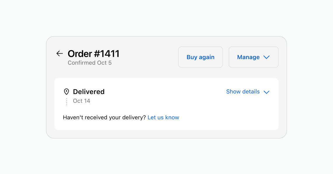
Use page to structure an order detail view with a heading, subheading, and action buttons. This example shows an Order status page with "Buy again" and "Manage" secondary actions in the page header.
Display an Order status page
html
<s-page heading="Order #1411" subheading="Confirmed Oct 5">
<s-button slot="secondary-actions">Buy again</s-button>
<s-button slot="secondary-actions" commandFor="manage-menu" command="--show">Manage</s-button>
<s-text>Delivered Oct 14</s-text>
<s-text>Haven't received your delivery? <s-link href="/contact">Let us know</s-link></s-text>
</s-page>
Anchor to Add a page-level actionAdd a page-level action
Place a button in the secondary-actions slot to add a contextual action to the page header. This example shows a subscription detail page with a "Manage" action.
html
<s-page heading="Subscription details" subheading="Mini garden seeds — Monthly">
<s-button slot="secondary-actions">Manage</s-button>
<s-text>Next delivery: January 15, 2026</s-text>
</s-page>
Anchor to Add multiple actionsAdd multiple actions
Place multiple buttons in the secondary-actions slot to provide additional actions for the page. This example shows a return request page with "Submit return" and "Contact support" actions.
html
<s-page heading="Return request" subheading="Order #1042 — Mini garden seeds">
<s-button slot="secondary-actions">Submit return</s-button>
<s-button slot="secondary-actions">Contact support</s-button>
<s-text>Select the items you'd like to return and choose a reason for each item.</s-text>
</s-page>
Anchor to Best practicesBest practices
- Write clear, focused headings: State the main purpose of the page in a few words and use sentence case for readability.
- Use subheadings only when they add value: Add a subheading when it provides helpful context that's different from the heading. Keep it brief to avoid clutter.
- Add page-level actions thoughtfully: Include buttons in the header only for actions that affect the entire page. Make the main action a primary button and keep lesser actions secondary.
- Limit the number of actions: Too many actions in the page header can overwhelm customers. Focus on the most important one or two actions.
Was this page helpful?