Button group
The button group component displays multiple button elements in a contextual layout based on screen width or parent component. When there is more than one secondary action, they get collapsed.
When used within a section component, the buttons fill the width of the section.
Button group accepts a single button in the primary-action slot — additional primary buttons are ignored. Secondary actions automatically collapse into an overflow menu when space is limited; the collapse threshold isn't configurable.
Supported targets
- customer-account.
footer. render-after - customer-account.
order-index. announcement. render - customer-account.
order-index. block. render - customer-account.
order-status. announcement. render - customer-account.
order-status. block. render - customer-account.
order-status. cart-line-item. render-after - customer-account.
order-status. cart-line-list. render-after - customer-account.
order-status. customer-information. render-after - customer-account.
order-status. fulfillment-details. render-after - customer-account.
order-status. payment-details. render-after - customer-account.
order-status. return-details. render-after - customer-account.
order-status. unfulfilled-items. render-after - customer-account.
order. action. menu-item. render - customer-account.
order. action. render - customer-account.
order. page. render - customer-account.
page. render - customer-account.
profile. addresses. render-after - customer-account.
profile. announcement. render - customer-account.
profile. block. render - customer-account.
profile. company-details. render-after - customer-account.
profile. company-location-addresses. render-after - customer-account.
profile. company-location-payment. render-after - customer-account.
profile. company-location-staff. render-after - customer-account.
profile. payment. render-after
Supported targets
- customer-account.
footer. render-after - customer-account.
order-index. announcement. render - customer-account.
order-index. block. render - customer-account.
order-status. announcement. render - customer-account.
order-status. block. render - customer-account.
order-status. cart-line-item. render-after - customer-account.
order-status. cart-line-list. render-after - customer-account.
order-status. customer-information. render-after - customer-account.
order-status. fulfillment-details. render-after - customer-account.
order-status. payment-details. render-after - customer-account.
order-status. return-details. render-after - customer-account.
order-status. unfulfilled-items. render-after - customer-account.
order. action. menu-item. render - customer-account.
order. action. render - customer-account.
order. page. render - customer-account.
page. render - customer-account.
profile. addresses. render-after - customer-account.
profile. announcement. render - customer-account.
profile. block. render - customer-account.
profile. company-details. render-after - customer-account.
profile. company-location-addresses. render-after - customer-account.
profile. company-location-payment. render-after - customer-account.
profile. company-location-staff. render-after - customer-account.
profile. payment. render-after
Anchor to Use casesUse cases
- Order management: Group related order actions like "Reorder," "Edit order," and "Cancel order" in a structured layout.
- Primary and secondary actions: Combine a primary action with supporting secondary actions that collapse on smaller screens.
- Account settings: Group account-related actions like "Save changes" and "Reset" with clear visual hierarchy.
Anchor to PropertiesProperties
Configure the following properties on the button group component.
- stringstring
A label that describes the purpose of the button group for users of assistive technologies such as screen readers. Use this to provide context about the grouped actions, such as "Order actions" or "Profile settings."
- stringstring
A unique identifier for the element. Use this to target the element with CSS, JavaScript, or accessibility attributes. The
idmust be unique within the document.
Anchor to SlotsSlots
The button group component supports slots for additional content placement within the component. Learn more about using slots.
- HTMLElementHTMLElement
The primary action for the group. Accepts a single button element. Use this for the most important action in the group, such as "Save" or "Submit."
- HTMLElementHTMLElement
The secondary actions for the group. Accepts multiple button elements. Use this for supplementary actions like "Cancel", "Delete", or other alternatives.
Anchor to ExamplesExamples
Anchor to Add primary and secondary actionsAdd primary and secondary actions
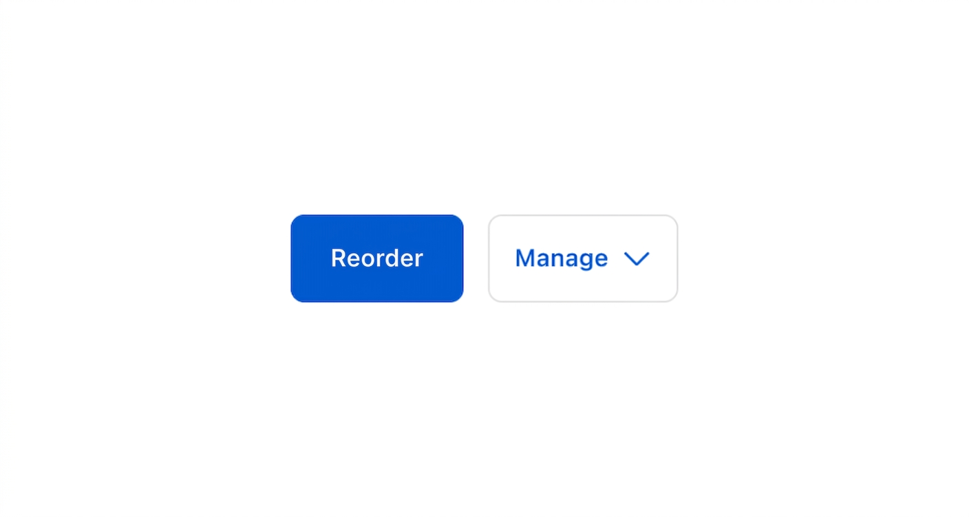
Display a primary action alongside secondary options. This example shows an s-button-group with a primary button and a secondary dropdown menu for order management.Add primary and secondary actions
html
Anchor to Use a single primary actionUse a single primary action
Display a standalone primary action within a button group layout. This example shows an s-button-group with a single primary button for updating account preferences.html
Anchor to Collapse multiple secondary actionsCollapse multiple secondary actions
Automatically collapse extra secondary actions into an overflow menu on smaller screens. This example shows an s-button-group with one primary and three secondary buttons.html
Anchor to Best practicesBest practices
- Use a single primary action: Reserve the
primary-actionslot for one button only. Keep all other actions insecondary-actionsto reinforce hierarchy. - Write short, scannable labels: Use verbs and nouns in sentence case, such as "Edit address." Keep styling consistent across actions.
- Limit secondary actions: Reduce clutter by keeping the number of secondary actions small. Extra actions collapse automatically on smaller screens.
- Group related actions: Cluster actions by purpose and place the most important or common action first to set a clear default.