Switch
Use a switch to represent an on or off state that takes effect immediately when tapped.
Anchor to switchpropsSwitchProps
- Anchor to accessibilityLabelaccessibilityLabelstring
A label used for buyers using assistive technologies.
- Anchor to checkedcheckedboolean
Whether the switch is active.
- Anchor to disableddisabledboolean
Whether the switch can be changed.
- string
A unique identifier for the component.
- Anchor to labellabelstring
Visual content to use as the switch label.
- Anchor to namenamestring
An identifier for the field that is unique within the nearest containing
Formcomponent.- Anchor to onChangeonChange(value: boolean) => void
A callback that is run whenever the switch is changed. This callback is called with a boolean indicating whether the switch should now be active or inactive. This component is controlled, so you must store this value in state and reflect it back in the
checkedorvalueprops.- Anchor to togglestogglesstring
The component's identifier whose visibility will be toggled when this component is actioned.
- Anchor to valuevalueboolean
Whether the switch is selected. This prop is an alias for
checked, and can be useful in form libraries that provide a normalized API for dealing with bothbooleanandstringvalues. If bothvalueandcheckedare set,checkedtakes precedence.
Basic Switch
Examples
Basic Switch
React
import {
  reactExtension,
  Switch,
} from '@shopify/ui-extensions-react/checkout';

export default reactExtension(
  'purchase.checkout.block.render',
  () => <Extension />,
);

function Extension() {
  return (
    <Switch accessibilityLabel="my-switch" />
  );
}
JS
import {extension, Switch} from '@shopify/ui-extensions/checkout';

export default extension('purchase.checkout.block.render', (root) => {
  const baseSwitch = root.createComponent(Switch, {
    accessibilityLabel: 'my-switch',
  });

  root.appendChild(baseSwitch);
});
Preview

Anchor to best-practicesBest Practices
- The outcome of a switch should take effect immediately when tapped.
- Use for independent settings, like turning on a stand-alone feature.
- Most of the time no call-to-action should be needed as the switch should take effect immediately, but if the experience needs one, use “done” instead of “submit” or “apply”.
Content
The label should be a noun. Try explaining the setting out loud to test the name. The name should make sense when you insert it into these statements:
- You can turn [setting_label] on or off in settings.
- [setting_label] is on.
- [setting_label] is off.
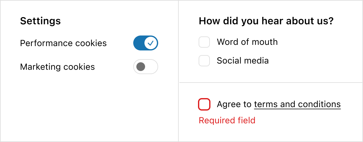
Switch vs checkbox
- If the experience requires multiple connected inputs, like a survey, use a checkbox instead of a switch.
- If the experience requires an error state, like agreeing to terms and conditions, use a checkbox instead of a switch. Both on and off options for a switch should always be valid.
- If you’re unsure, default to a checkbox as it’s the more familiar web pattern.
Anchor to examplesExamples
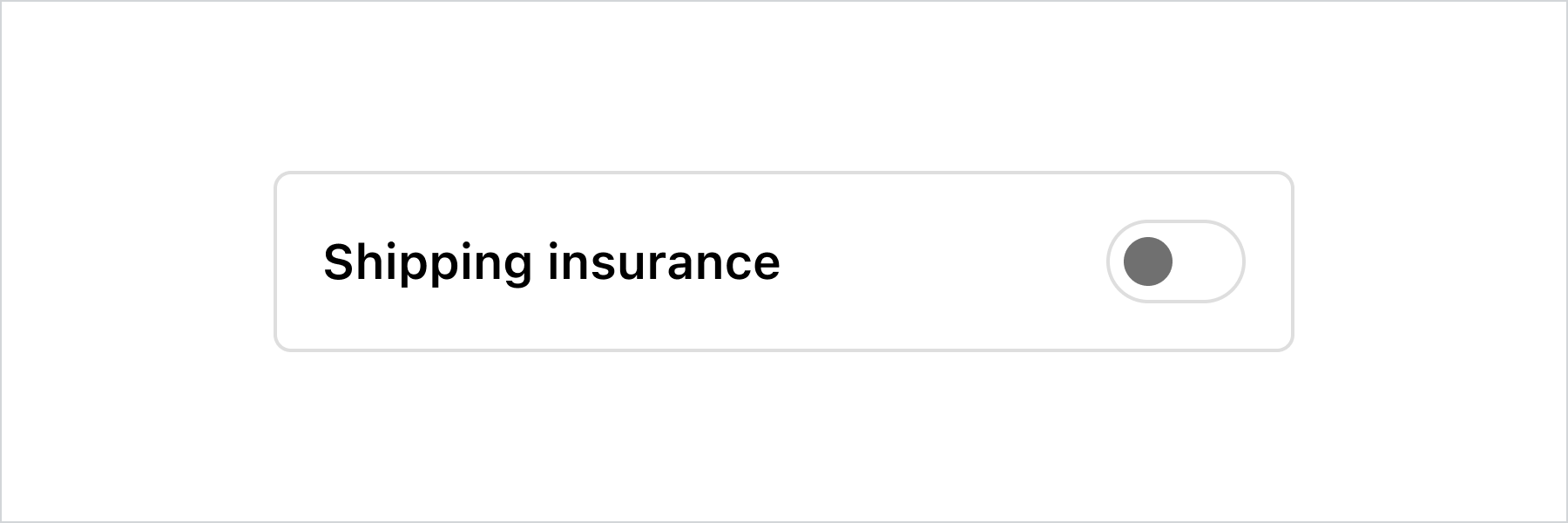
Anchor to example-custom-labelCustom label
This example demonstrates pairing the switch with a custom label and layout while keeping it accessible to screen readers.
Custom label
Examples
Custom label
Description
This example demonstrates pairing the switch with a custom label and layout while keeping it accessible to screen readers.
React
import {
  reactExtension,
  InlineLayout,
  Switch,
  Text,
} from '@shopify/ui-extensions-react/checkout';

export default reactExtension(
  'purchase.checkout.footer.render-after',
  () => <Extension />,
);

function Extension() {
  const switchLabel = 'Shipping insurance';
  return (
    <InlineLayout
      padding="base"
      borderRadius="base"
      border="base"
      columns={['fill', 'auto']}
    >
      <Text>{switchLabel}</Text>
      <Switch accessibilityLabel={switchLabel} />
    </InlineLayout>
  );
}
JavaScript
import {
  extension,
  InlineLayout,
  Switch,
  Text,
} from '@shopify/ui-extensions/checkout';

export default extension(
  'purchase.checkout.block.render',
  (root) => {
    const switchLabel = 'Shipping insurance';

    const inlineLayout = root.createComponent(
      InlineLayout,
      {
        padding: 'base',
        borderRadius: 'base',
        border: 'base',
        columns: ['fill', 'auto'],
      },
      [
        root.createComponent(
          Text,
          null,
          switchLabel,
        ),
        root.createComponent(Switch, {
          accessibilityLabel: switchLabel,
        }),
      ],
    );

    root.appendChild(inlineLayout);
  },
);
Preview