Checkbox
Use checkboxes to give customers a single binary option, such as signing up for marketing, or agreeing to terms and conditions.
Anchor to checkboxpropsCheckboxProps
- Anchor to accessibilityLabelaccessibilityLabelstring
A label used for buyers using assistive technologies. When set, any
childrensupplied to this component will not be announced to screen reader users.- Anchor to checkedcheckedboolean
Whether the checkbox is active.
- Anchor to disableddisabledboolean
Whether the checkbox can be changed.
- Anchor to errorerrorstring
Indicate an error to the user. The field will be given a specific stylistic treatment to communicate problems that have to be resolved immediately.
- string
A unique identifier for the field. When no
idis set, a globally unique value will be used instead.- Anchor to namenamestring
An identifier for the field that is unique within the nearest containing
Formcomponent.- Anchor to onChangeonChange(value: boolean) => void
A callback that is run whenever the checkbox is changed. This callback is called with a boolean indicating whether the checkbox should now be active or inactive. This component is controlled, so you must store this value in state and reflect it back in the
checkedorvalueprops.- Anchor to togglestogglesstring
The component's identifier whose visibility will be toggled when this component is actioned.
- Anchor to valuevalueboolean
Whether the checkbox is active. This prop is an alias for
checked, and can be useful in form libraries that provide a normalized API for dealing with bothbooleanandstringvalues. If bothvalueandcheckedare set,checkedtakes precedence.
Basic Checkbox
Examples
Basic Checkbox
React
import {
  reactExtension,
  Checkbox,
} from '@shopify/ui-extensions-react/checkout';

export default reactExtension(
  'purchase.checkout.block.render',
  () => <Extension />,
);

function Extension() {
  return (
    <Checkbox id="checkbox" name="checkbox">
      Save this information for next time
    </Checkbox>
  );
}
JS
import {extension, Checkbox} from '@shopify/ui-extensions/checkout';

export default extension('purchase.checkout.block.render', (root) => {
  const checkbox = root.createComponent(
    Checkbox,
    {id: 'checkbox', name: 'checkbox'},
    'Save this information for next time',
  );

  root.appendChild(checkbox);
});
Preview

Anchor to examplesExamples
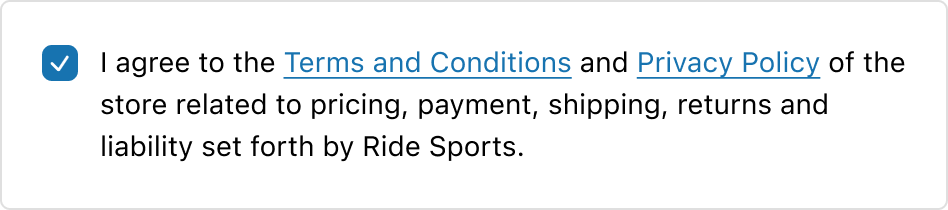
Anchor to example-embedding-links-in-checkbox-componentsEmbedding links in checkbox components
To provide buyers with additional information or references, couple it with link components seamlessly within checkbox components. This can be done by including links as part of the checkbox label in the checkbox. This will provide an easy way to access relevant content that buyers may need.
Embedding links in checkbox components
Examples
Embedding links in checkbox components
Description
To provide buyers with additional information or references, couple it with link components seamlessly within checkbox components. This can be done by including links as part of the checkbox label in the checkbox. This will provide an easy way to access relevant content that buyers may need.
React
import {
  reactExtension,
  Checkbox,
  Link,
} from '@shopify/ui-extensions-react/checkout';

export default reactExtension(
  'purchase.checkout.block.render',
  () => <CheckBoxLinks />,
);

export const CheckBoxLinks = () => {
  return (
    <Checkbox
      id="checkbox1"
      name="checkboxchoices"
    >
      I agree to the{' '}
      <Link to="https://www.shopify.com">
        terms and conditions
      </Link>{' '}
      and{' '}
      <Link to="https://www.shopify.com">
        privacy policy
      </Link>{' '}
      of the store related to pricing, payment,
      shipping, returns, and liability set forth
      by Ride Sports
    </Checkbox>
  );
};
JavaScript
import {
  extension,
  Checkbox,
  Link,
} from '@shopify/ui-extensions/checkout';

export default extension(
  'purchase.checkout.block.render',
  (root) => {
    const checkbox = root.createComponent(
      Checkbox,
      {
        id: 'checkbox1',
        name: 'checkboxchoices',
      },
      [
        ' I agree to the ',
        root.createComponent(
          Link,
          {to: 'https://www.shopify.com'},
          'terms and conditions',
        ),
        ' and ',
        root.createComponent(
          Link,
          {to: 'https://www.shopify.com'},
          'privacy policy',
        ),
        ' of the store related to pricing, payment, shipping, returns, and liability set forth by Ride Sports.',
      ],
    );

    root.appendChild(checkbox);
  },
);
Preview