ui-modal
The Modal API allows you to display an overlay that prevents interaction with the rest of the app until dismissed.
It is used by customizing your Modal content with the ui-modal element and then opening it with the show() instance method or the shopify.modal.show('modal-id') API.
Anchor to ui-modal elementui-modal element
The ui-modal element is available for use in your app. It configures a Modal to display in the Shopify Admin.
The content you provide can be simple HTML elements or a src URL that will be loaded. When adding custom content, you can only provide a single parent element (commonly a div or form).
- Anchor to childrenchildrenHTMLCollection & UITitleBarAttributes
The content to display within a Modal. You can provide a single HTML element with children and the ui-title-bar element to configure the Modal title bar.
- string
A unique identifier for the Modal
- string
The URL of the content to display within a Modal. If provided, the Modal will display the content from the provided URL and any children other than the ui-title-bar and ui-save-bar elements will be ignored.
- Anchor to variantvariant'small' | 'base' | 'large' | 'max'Default: "base"
The size of the modal.
Before the Modal is shown, this can be changed to any of the provided values. After the Modal is shown, this can can only be changed between
small,base, andlarge.
UITitleBarAttributes
- children
The children of the title bar.
any - title
The title of the title bar. Can also be set via <code>document.title</code>.
string
export interface UITitleBarAttributes extends _UITitleBarAttributes {
  children?: any;
}Anchor to ui-modal instanceui-modal instance
The ui-modal element provides instance properties and methods to control the Modal.
- Anchor to addEventListeneraddEventListener(type: "show" | "hide", listener: EventListenerOrEventListenerObject) => void
Add 'show' | 'hide' event listeners.
- Anchor to contentcontentHTMLElement
A getter/setter that is used to get the DOM content of the modal element and update the content after the modal has been opened.
- Anchor to contentWindowcontentWindowWindow | null
A getter that is used to get the Window object of the modal iframe when the modal is used with a
srcattribute. This can only be accessed when the modal is open, so it is recommended to useawait modal.show()before accessing this property.- Anchor to hidehide() => Promise<void>
Hides the save bar element
- Anchor to removeEventListenerremoveEventListener(type: "show" | "hide", listener: EventListenerOrEventListenerObject) => void
Remove 'show' | 'hide' event listeners.
- Anchor to showshow() => Promise<void>
Shows the save bar element
- string
A getter/setter that is used to set modal src.
- Anchor to toggletoggle() => Promise<void>
Toggles the save bar element between the showing and hidden states
- Anchor to variantvariantVariant
A getter/setter that is used to set modal variant.
Variant
'small' | 'base' | 'large' | 'max'Modal
Examples
Modal
Modal
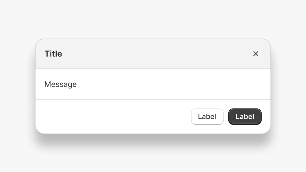
<ui-modal id="my-modal">
  <p>Message</p>
  <ui-title-bar title="Title">
    <button variant="primary">Label</button>
    <button onclick="document.getElementById('my-modal').hide()">Label</button>
  </ui-title-bar>
</ui-modal>

<button onclick="document.getElementById('my-modal').show()">Open Modal</button>
Preview
Anchor to examplesExamples
Modal options, variations, and events
Anchor to example-modals-with-different-optionsModals with different options
Anchor to example-opening-a-max-size-modalOpening a max size Modal
Modal with max size
Anchor to example-specifying-a-modal-sizeSpecifying a Modal size
Modal with variant
Anchor to example-using-a-form-in-a-modalUsing a form in a Modal
Modal with form
Anchor to example-specifying-a-title-for-the-modalSpecifying a title for the Modal
Modal with title
Anchor to example-adding-primary-and-secondary-actions-to-a-modalAdding primary and secondary actions to a Modal
Modal with primary and secondary actions
Anchor to example-using-a-modal-for-a-destructive-actionUsing a modal for a destructive action
Adding a critical button to a Modal
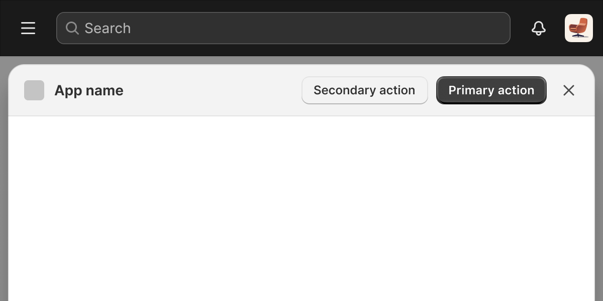
Opening a max size Modal
Examples
Opening a max size Modal
Description
Modal with max size
Default
<ui-modal id="my-modal" variant="max">
  <div></div>
  <ui-title-bar>
    <button variant="primary">Primary action</button>
    <button>Secondary action</button>
  </ui-title-bar>
</ui-modal>

<button onclick="document.getElementById('my-modal').show()">Open Modal</button>
Specifying a Modal size
Description
Modal with variant
Default
<ui-modal id="my-modal" variant="large">
  <p>Hello, World!</p>
</ui-modal>

<button onclick="document.getElementById('my-modal').show()">Open Modal</button>
Using a form in a Modal
Description
Modal with form
Default
<ui-modal id="my-modal" variant="max">
  <form data-save-bar>
    <label>
      Name:
      <input name="submitted-name" autocomplete="name" />
    </label>
    <button>Save</button>
  </form>
  <ui-title-bar>
    <button variant="primary">Save</button>
    <button>Cancel</button>
  </ui-title-bar>
</ui-modal>

<button onclick="document.getElementById('my-modal').show()">Open Modal</button>
Specifying a title for the Modal
Description
Modal with title
Default
<ui-modal id="my-modal">
  <p>Hello, World!</p>
  <ui-title-bar title="My Modal"></ui-title-bar>
</ui-modal>

<button onclick="document.getElementById('my-modal').show()">Open Modal</button>
Adding primary and secondary actions to a Modal
Description
Modal with primary and secondary actions
Default
<ui-modal id="my-modal">
  <p>Hello, World!</p>
  <ui-title-bar>
    <button variant="primary" onclick="console.log('Saving')">Save</button>
    <button onclick="console.log('Cancelling')">Cancel</button>
  </ui-title-bar>
</ui-modal>

<button onclick="document.getElementById('my-modal').show()">Open Modal</button>
Using a modal for a destructive action
Description
Adding a critical button to a Modal
Default
<ui-modal id="my-modal">
  <p>If you delete this resource, it can't be undone.</p>
  <ui-title-bar title="Delete this resource">
    <button variant="primary" tone="critical" onclick="console.log('Deleting')">
      Delete
    </button>
    <button onclick="console.log('Cancelling')">Cancel</button>
  </ui-title-bar>
</ui-modal>

<button onclick="document.getElementById('my-modal').show()">Open Modal</button>
Preview
Anchor to example-modal-eventsModal events
Anchor to example-subscribing-to-showSubscribing to Show
Subscribing to the show event which is emitted when the Modal is shown
Anchor to example-subscribing-to-hideSubscribing to Hide
Subscribing to the hide event which is emitted when the Modal is closed
Subscribing to Show
Event listener
Examples
Subscribing to Show
Description
Subscribing to the `show` event which is emitted when the Modal is shown
Event listener
<ui-modal id="my-modal">
  <p>Message</p>
</ui-modal>

<button onclick="document.getElementById('my-modal').show()">Open Modal</button>

<script>
  document.getElementById('my-modal').addEventListener('show', () => {
    console.log('Modal is showing');
  });
</script>
Subscribing to Hide
Description
Subscribing to the `hide` event which is emitted when the Modal is closed
Event listener
<ui-modal id="my-modal">
  <div>
    <button onclick="document.getElementById('my-modal').hide()">
      Hide Modal
    </button>
  </div>
</ui-modal>

<button onclick="document.getElementById('my-modal').show()">Show Modal</button>

<script>
  document.getElementById('my-modal').addEventListener('hide', () => {
    console.log('Modal is hiding');
  });
</script>
Anchor to example-updating-the-modal-once-it-is-openUpdating the Modal once it is open
Anchor to example-adding-an-elementAdding an element
Adding an element to the Modal after it is opened
Anchor to example-updating-the-modal-variantUpdating the Modal variant
Updating the Modal variant after it is opened.
When the Modal is open, it can only be changed between the small, base, and large variants.
Adding an element
Examples
Adding an element
Description
Adding an element to the Modal after it is opened
Default
<ui-modal id="my-modal">
  <div>
    <p>Message</p>
    <button id="add-content">Add element</button>
  </div>
</ui-modal>

<button onclick="document.getElementById('my-modal').show()">Open Modal</button>

<script>
  const button = document.getElementById('add-content');
  button.addEventListener('click', () => {
    const p = document.createElement('p');
    p.textContent = 'Lorem ipsum';

    const modal = document.getElementById('my-modal');
    modal.content.appendChild(p);
  });
</script>
Updating the Modal variant
Description
Updating the Modal variant after it is opened. When the Modal is open, it can only be changed between the `small`, `base`, and `large` variants.
Default
<ui-modal id="my-modal">
  <div>
    <p>Message</p>
    <button id="add-content">Add element</button>
  </div>
</ui-modal>

<button onclick="document.getElementById('my-modal').show()">Open Modal</button>

<script>
  const button = document.getElementById('add-content');
  button.addEventListener('click', () => {
    const p = document.createElement('p');
    p.textContent = 'Lorem ipsum';

    const modal = document.getElementById('my-modal');
    modal.content.appendChild(p);
  });
</script>
Anchor to example-using-a-src-url-to-load-contentUsing a src URL to load content
Anchor to example-loading-content-from-a-urlLoading content from a URL
Loading content from a URL
Anchor to example-communicating-between-the-modal-and-the-parent-windowCommunicating between the Modal and the parent window
Communicating between the Modal and the parent window
Anchor to example-opening-a-base-modal-within-a-max-src-modalOpening a base modal within a max src modal
This pattern is useful for displaying a dialog or prompt from within a max variant modal.
Loading content from a URL
Examples
Loading content from a URL
Description
Loading content from a URL
Default
// main app
<ui-modal id="my-modal" src="/my-route">
  <ui-title-bar title="Title">
    <button variant="primary">Label</button>
    <button onclick="document.getElementById('my-modal').hide()">Label</button>
  </ui-title-bar>
</ui-modal>

<button onclick="document.getElementById('my-modal').show()">Open Modal</button>

// my-route.html
<!DOCTYPE html>
<html>
  <head>
    <meta charset="utf-8" />
    <meta name="viewport" content="width=device-width, initial-scale=1" />
    <meta name="shopify-api-key" content="%SHOPIFY_API_KEY%" />
    <script src="https://cdn.shopify.com/shopifycloud/app-bridge.js"></script>
  </head>

  <body>
    <h1>My separate route</h1>
  </body>
</html>
Communicating between the Modal and the parent window
Description
Communicating between the Modal and the parent window
Default
// main app
<script>
  window.addEventListener('message', (ev) => {
    console.log('Message received in main app:', ev.data);
  });

  window.addEventListener('load', async () => {
    const modal = document.getElementById('src-modal');
    await modal.show();
    modal.contentWindow.postMessage('Hello from the main app', location.origin);
  });
</script>

<ui-modal id="my-modal" src="/my-route">
  <ui-title-bar title="Title">
    <button variant="primary">Label</button>
    <button onclick="document.getElementById('my-modal').hide()">Label</button>
  </ui-title-bar>
</ui-modal>

<button onclick="document.getElementById('my-modal').show()">Open Modal</button>

// my-route.html
<!DOCTYPE html>
<html>
  <head>
    <meta charset="utf-8" />
    <meta name="viewport" content="width=device-width, initial-scale=1" />
    <meta name="shopify-api-key" content="%SHOPIFY_API_KEY%" />
    <script src="https://cdn.shopify.com/shopifycloud/app-bridge.js"></script>
  </head>

  <body>
    <button
      onclick="window.opener.postMessage('Hello from the modal', location.origin)"
    >
      Send message
    </button>
    <script>
      window.addEventListener('message', (ev) => {
        console.log('Message received in modal:', ev.data);
      });
    </script>
  </body>
</html>
Opening a base modal within a max src modal
Description
This pattern is useful for displaying a dialog or prompt from within a max variant modal.
Default
// main app
<ui-modal src="/my-route" variant="max" id="my-modal"></ui-modal>
<button onclick="shopify.modal.show('my-modal')">Open</button>
<ui-modal id="my-nested-modal">
  <p>Message</p>
</ui-modal>

// my-route.html
<!DOCTYPE html>
<html>
  <head>
    <meta charset="utf-8" />
    <meta name="viewport" content="width=device-width, initial-scale=1" />
    <meta name="shopify-api-key" content="%SHOPIFY_API_KEY%" />
    <script src="https://cdn.shopify.com/shopifycloud/app-bridge.js"></script>
  </head>
  <body>
    <button onclick="window.opener.shopify.modal.show('my-nested-modal')">Open</button>
  </body>
</html>