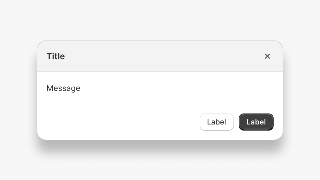
Modal
The Modal API allows you to display an overlay that prevents interaction with the rest of the app until dismissed.
Anchor to modalModal
The modal API provides a show method to display a Modal, a hide method to hide a Modal, and a toggle method to toggle the visibility of a Modal. These are used in conjunction with the ui-modal element. They are alternatives to the show, hide, and toggle instance methods.
- Anchor to hidehide(id: string) => Promise<void>
Hides the modal element. An alternative to the
hideinstance method on theui-modalelement.- Anchor to showshow(id: string) => Promise<void>
Shows the modal element. An alternative to the
showinstance method on theui-modalelement.- Anchor to toggletoggle(id: string) => Promise<void>
Toggles the modal element visibility. An alternative to the
toggleinstance method on theui-modalelement.
Was this section helpful?
Modal
<ui-modal id="my-modal">
  <p>Hello, World!</p>
</ui-modal>

<button onclick="shopify.modal.show('my-modal')">Open Modal</button>
Examples
Modal
Modal
<ui-modal id="my-modal"> <p>Hello, World!</p> </ui-modal> <button onclick="shopify.modal.show('my-modal')">Open Modal</button>
Preview