Title
Requires
@shopify/app-bridge-react@v4 and the app-bridge.js script tagThe Title Bar API allows you to populate a standardized title bar with button actions and navigation breadcrumbs.
Anchor to titlebar componentTitleBar component
The component is available for use in your app. It configures the Title Bar in the Shopify admin.
- Anchor to childrenchildrenUITitleBarChildren
The children of the title bar.
- Anchor to titletitlestring
The title of the title bar. Can also be set via
document.title.
UITitleBarChildren
- a
BaseElementAttributes & { variant?: "breadcrumb" | "primary"; } - button
BaseElementAttributes & { variant?: "breadcrumb" | "primary"; tone?: "critical" | "default"; } - section
{ label?: string; children?: { a?: BaseElementAttributes; button?: BaseElementAttributes; }; }
interface UITitleBarChildren {
  a?: BaseElementAttributes & {variant?: 'breadcrumb' | 'primary'};
  button?: BaseElementAttributes & {
    variant?: 'breadcrumb' | 'primary';
    tone?: 'critical' | 'default';
  };
  section?: {
    label?: string;
    children?: {
      a?: BaseElementAttributes;
      button?: BaseElementAttributes;
    };
  };
}
BaseElementAttributes
- children
string - class
string - href
string - id
string - name
string - onclick
string - rel
string - target
string
interface BaseElementAttributes {
  id?: string;
  name?: string;
  class?: string;
  href?: string;
  rel?: string;
  target?: string;
  onclick?: string;
  children?: string;
}
Was this section helpful?
TitleBar
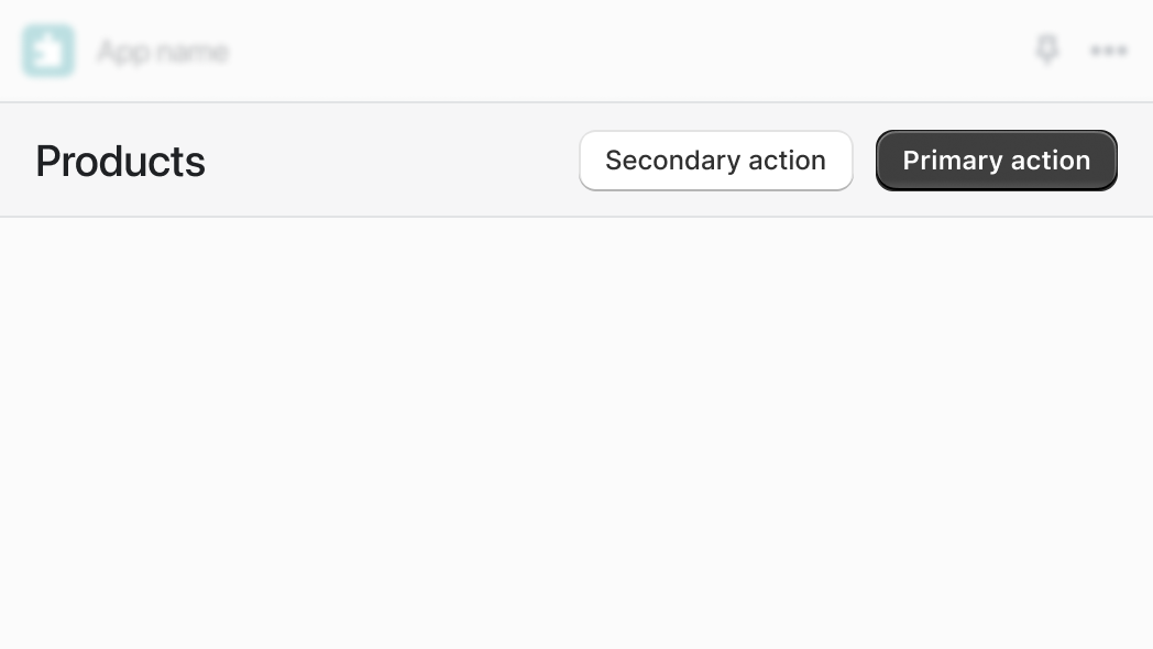
import {TitleBar} from '@shopify/app-bridge-react';

export function MyApp() {
  return (
    <TitleBar title="Products">
      <button variant="primary">Primary action</button>
      <button>Secondary action</button>
    </TitleBar>
  );
}
Examples
TitleBar
Default
import {TitleBar} from '@shopify/app-bridge-react'; export function MyApp() { return ( <TitleBar title="Products"> <button variant="primary">Primary action</button> <button>Secondary action</button> </TitleBar> ); }
Preview
Anchor to examplesExamples
Title Bar with different options
Was this section helpful?
Title Bar with breadcrumb
import {TitleBar} from '@shopify/app-bridge-react';

export function MyApp() {
  return (
    <TitleBar title="Products">
      <button variant="breadcrumb">Home</button>
    </TitleBar>
  );
}
Examples
Title Bar with breadcrumb
Description
Title Bar with breadcrumb
Default
import {TitleBar} from '@shopify/app-bridge-react'; export function MyApp() { return ( <TitleBar title="Products"> <button variant="breadcrumb">Home</button> </TitleBar> ); }Title Bar with buttons
Description
Title Bar with buttons
Default
import {TitleBar} from '@shopify/app-bridge-react';

export function MyApp() {
  return (
    <TitleBar title="Products">
      <button onClick={() => console.log('Secondary Action')}>
        Secondary Action
      </button>
      <button variant="primary" onClick={() => console.log('Primary Action')}>
        Primary Action
      </button>
    </TitleBar>
  );
}
Title Bar with grouped secondary buttons
Description
Title Bar with grouped secondary buttons
Default
import {TitleBar} from '@shopify/app-bridge-react';

export function MyApp() {
  return (
    <TitleBar title="Products">
      <section label="More actions">
        <button onClick={() => console.log('Secondary Action 1')}>
          Secondary Action 1
        </button>
        <button onClick={() => console.log('Secondary Action 2')}>
          Secondary Action 2
        </button>
      </section>
    </TitleBar>
  );
}