Save
@shopify/app-bridge-react@v4 and the app-bridge.js script tagThe Save Bar API is used to indicate that a form on the current page has unsaved information. It can be used in 2 ways:
- It is automatically configured when you provide the
data-save-barattribute to aformelement and will display the save bar when there are unsaved changes. For more information, refer to the save bar API. - It can be controlled declaratively through the
component.
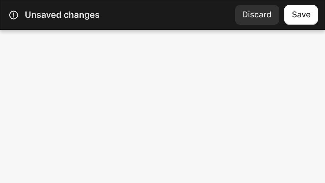
Anchor to savebar componentSaveBar component
The component is available for use in your app. It configures a save bar to display in the Shopify Admin.
You can provide HTML <button> elements as children to hook into the Save and Discard buttons. The button with variant primary is the Save button and the button without a variant is the Discard button.
- Anchor to childrenchildrenUISaveBarChildren
HTML
<button>elements to hook into the Save and Discard buttons of the contextual save bar.The button with variant
primaryis the Save button and the button without a variant is the Discard button.- Anchor to discardConfirmationdiscardConfirmationboolean
Whether to show a confirmation dialog when the discard button is clicked
- string
A unique identifier for the save bar
UISaveBarChildren
- button
{ id?: string; class?: string; children?: string; disabled?: boolean; loading?: boolean; name?: string; onclick?: string; variant?: "primary"; }
interface UISaveBarChildren {
  button?: {
    id?: string;
    class?: string;
    children?: string;
    disabled?: boolean;
    loading?: boolean;
    name?: string;
    onclick?: string;
    variant?: 'primary';
  };
}SaveBar
Examples
SaveBar
Default
import {SaveBar} from '@shopify/app-bridge-react';

export function MyApp() {
  const shopify = useAppBridge();

  const handleSave = () => {
    console.log('Saving');
    shopify.saveBar.hide('my-save-bar');
  };

  const handleDiscard = () => {
    console.log('Discarding');
    shopify.saveBar.hide('my-save-bar');
  };

  return (
    <>
      <button onClick={() => shopify.saveBar.show('my-save-bar')}>
        Show Save Bar
      </button>
      <SaveBar id="my-save-bar">
        <button variant="primary" onClick={handleSave}></button>
        <button onClick={handleDiscard}></button>
      </SaveBar>
    </>
  );
}
Preview
Anchor to examplesExamples
Save bar options, variations, and events
Anchor to example-savebar-with-different-optionsSaveBar with different options
Anchor to example-showing-a-discard-confirmation-modalShowing a discard confirmation modal
Set the prop on the component to show a confirmation modal after the user clicks the Discard button of the save bar
Setting the loading state of the Save and Discard buttons
Examples
Setting the loading state of the Save and Discard buttons
Description
Setting the loading state of the Save and Discard buttons
Default
import {SaveBar} from '@shopify/app-bridge-react';

export function MyApp() {
  const shopify = useAppBridge();

  return (
    <>
      <button onClick={() => shopify.saveBar.show('my-save-bar')}>
        Show Save Bar
      </button>
      <SaveBar id="my-save-bar">
        <button variant="primary" loading=""></button>
        <button loading=""></button>
      </SaveBar>
    </>
  );
}
Setting the disabled state of the Save and Discard buttons
Description
Setting the disabled state of the Save and Discard buttons
Default
import {SaveBar} from '@shopify/app-bridge-react';

export function MyApp() {
  const shopify = useAppBridge();

  return (
    <>
      <button onClick={() => shopify.saveBar.show('my-save-bar')}>
        Show Save Bar
      </button>
      <SaveBar id="my-save-bar">
        <button variant="primary" disabled></button>
        <button disabled></button>
      </SaveBar>
    </>
  );
}
Showing a discard confirmation modal
Description
Set the `discardConfirmation` prop on the `SaveBar` component to show a confirmation modal after the user clicks the Discard button of the save bar
Default
import {SaveBar} from '@shopify/app-bridge-react';

export function MyApp() {
  const shopify = useAppBridge();

  const handleDiscard = () => {
    shopify.saveBar.hide('my-save-bar');
  };

  return (
    <>
      <button onClick={() => shopify.saveBar.show('my-save-bar')}>
        Show Save Bar
      </button>
      <SaveBar id="my-save-bar" discardConfirmation>
        <button onClick={handleDiscard}></button>
      </SaveBar>
    </>
  );
}
Anchor to example-savebar-controlsSaveBar controls
Anchor to example-showing-the-save-bar-with-the-savebar-apiShowing the save bar with the saveBar API
Showing the save bar with the saveBar API
Anchor to example-showing-the-save-bar-with-the-open-propShowing the save bar with the open prop
Showing the save bar with the open prop
Showing the save bar with the saveBar API
Examples
Showing the save bar with the saveBar API
Description
Showing the save bar with the saveBar API
Default
import {SaveBar} from '@shopify/app-bridge-react';

export function MyApp() {
  const shopify = useAppBridge();

  return (
    <>
      <button onClick={() => shopify.saveBar.show('my-save-bar')}>
        Show Save Bar
      </button>
      <button onClick={() => shopify.saveBar.hide('my-save-bar')}>
        Hide Save Bar
      </button>
      <SaveBar id="my-save-bar"></SaveBar>
    </>
  );
}
Showing the save bar with the open prop
Description
Showing the save bar with the open prop
Default
import {useState} from 'react';
import {SaveBar} from '@shopify/app-bridge-react';

export function MyModal() {
  const [saveBarOpen, setSaveBarOpen] = useState(false);

  return (
    <>
      <button onClick={() => setSaveBarOpen(true)}>Show Save Bar</button>
      <SaveBar id="my-save-bar" open={saveBarOpen}>
        <button onClick={() => setSaveBarOpen(false)}></button>
      </SaveBar>
    </>
  );
}