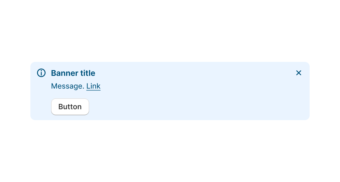
Banner
Use this component if you need to communicate to merchants in a prominent way.
- boolean
Whether or not the banner can be dismissed
- string
A unique identifier for the element.
- () => void
Function invoked when the banner is dismissed
- RemoteFragment
Sets the Primary action button of the container. This component must be a button component.
- RemoteFragment
Sets the Secondary action button of the container. This component must be a button component.
- string
Message to display inside the banner
- Tone
Adjusts the color and icon of the banner
Tone
'info' | 'success' | 'warning' | 'critical'Was this section helpful?
Simple Banner example
import React from 'react';
import {
  render,
  Banner,
  Paragraph,
} from '@shopify/ui-extensions-react/admin';

render('Playground', () => <App />);

function App() {
  return (
    <Banner title="Shipping rates changed" dismissible onDismiss={() => console.log('dismissed banner')}>
      <Paragraph>Your store may be affected</Paragraph>
    </Banner>
  );
}
Examples
Simple Banner example
React
import React from 'react'; import { render, Banner, Paragraph, } from '@shopify/ui-extensions-react/admin'; render('Playground', () => <App />); function App() { return ( <Banner title="Shipping rates changed" dismissible onDismiss={() => console.log('dismissed banner')}> <Paragraph>Your store may be affected</Paragraph> </Banner> ); }JS
import {extend, Banner} from '@shopify/ui-extensions/admin';

extend('Playground', (root) => {
  const banner = root.createComponent(Banner, {
    title: 'Shipping rates changed',
    dismissible: true,
    onDismiss: () => console.log('dismissed banner')
  }, 'Your store may be affected');

  root.appendChild(banner);
});
Preview