Button
Use this component when you want to provide users the ability to perform specific actions, like saving data.
- stringrequired
The URL to link to. If set, it will navigate to the location specified by
hrefafter executing thecallback.- string
A label that describes the purpose or contents of the Button. It will be read to users using assistive technologies such as screen readers.
Use this when using only an icon or the button text is not enough context for users using assistive technologies.
- boolean
Disables the button, disallowing any interaction.
- boolean | string
Tells browsers to download the linked resource instead of navigating to it. Optionally accepts filename value to rename file.
- string
A unique identifier for the button.
- string
Alias for
language- string
Indicate the text language. Useful when the text is in a different language than the rest of the page. It will allow assistive technologies such as screen readers to invoke the correct pronunciation. Reference of values ("subtag" label)
- () => void
Callback when focus is removed.
- () => void
Callback when a link is pressed. If
hrefis set, it will execute the callback and then navigate to the location specified byhref.- () => void
Callback when input is focused.
- () => void
Alias for
Callback when a link is pressed. Ifhrefis set, it will execute the callback and then navigate to the location specified byhref.- '_blank' | '_self'Default: '_self'
Specifies where to display the linked URL
- string
Alias for
hrefIf set, it will navigate to the location specified bytoafter executing thecallback.- 'default' | 'critical'
Sets the color treatment of the Button.
- 'primary' | 'secondary' | 'tertiary'
Changes the visual appearance of the Button.
- string
A label that describes the purpose or contents of the Button. It will be read to users using assistive technologies such as screen readers.
Use this when using only an icon or the button text is not enough context for users using assistive technologies.
- Extract<AccessibilityRole, 'submit' | 'button' | 'reset'>
Sets the semantic meaning of the component’s content. When set, the role will be used by assistive technologies to help users navigate the page.
- boolean
Disables the button, disallowing any interaction.
- string
A unique identifier for the button.
- string
Alias for
language- string
Indicate the text language. Useful when the text is in a different language than the rest of the page. It will allow assistive technologies such as screen readers to invoke the correct pronunciation. Reference of values ("subtag" label)
- () => void
Callback when focus is removed.
- () => void
Callback when a link is pressed. If
hrefis set, it will execute the callback and then navigate to the location specified byhref.- () => void
Callback when input is focused.
- () => void
Alias for
Callback when a button is pressed. Ifhrefis set, it will execute the callback and then navigate to the location specified byhref.- 'default' | 'critical'
Sets the color treatment of the Button.
- 'primary' | 'secondary' | 'tertiary'
Changes the visual appearance of the Button.
ButtonBaseProps
- accessibilityLabel
A label that describes the purpose or contents of the Button. It will be read to users using assistive technologies such as screen readers. Use this when using only an icon or the button text is not enough context for users using assistive technologies.
string - accessibilityRole
Sets the semantic meaning of the component’s content. When set, the role will be used by assistive technologies to help users navigate the page.
Extract<AccessibilityRole, 'submit' | 'button' | 'reset'> - disabled
Disables the button, disallowing any interaction.
boolean - id
A unique identifier for the button.
string - lang
Alias for `language`
string - language
Indicate the text language. Useful when the text is in a different language than the rest of the page. It will allow assistive technologies such as screen readers to invoke the correct pronunciation. [Reference of values](https://www.iana.org/assignments/language-subtag-registry/language-subtag-registry) ("subtag" label)
string - onBlur
Callback when focus is removed.
() => void - onClick
Callback when a link is pressed. If `href` is set, it will execute the callback and then navigate to the location specified by `href`.
() => void - onFocus
Callback when input is focused.
() => void - onPress
Alias for `onClick` Callback when a button is pressed. If `href` is set, it will execute the callback and then navigate to the location specified by `href`.
() => void - tone
Sets the color treatment of the Button.
'default' | 'critical' - variant
Changes the visual appearance of the Button.
'primary' | 'secondary' | 'tertiary'
interface ButtonBaseProps extends CommonProps {
  /**
   * Sets the semantic meaning of the component’s content. When set,
   * the role will be used by assistive technologies to help users
   * navigate the page.
   */
  accessibilityRole?: Extract<AccessibilityRole, 'submit' | 'button' | 'reset'>;
}
AccessibilityRole
'main' | 'header' | 'footer' | 'section' | 'aside' | 'navigation' | 'ordered-list' | 'list-item' | 'list-item-separator' | 'unordered-list' | 'separator' | 'status' | 'alert' | 'generic'ButtonAnchorProps
- accessibilityLabel
A label that describes the purpose or contents of the Button. It will be read to users using assistive technologies such as screen readers. Use this when using only an icon or the button text is not enough context for users using assistive technologies.
string - disabled
Disables the button, disallowing any interaction.
boolean - download
Tells browsers to download the linked resource instead of navigating to it. Optionally accepts filename value to rename file.
boolean | string - href
The URL to link to. If set, it will navigate to the location specified by `href` after executing the `onClick` callback.
string - id
A unique identifier for the button.
string - lang
Alias for `language`
string - language
Indicate the text language. Useful when the text is in a different language than the rest of the page. It will allow assistive technologies such as screen readers to invoke the correct pronunciation. [Reference of values](https://www.iana.org/assignments/language-subtag-registry/language-subtag-registry) ("subtag" label)
string - onBlur
Callback when focus is removed.
() => void - onClick
Callback when a link is pressed. If `href` is set, it will execute the callback and then navigate to the location specified by `href`.
() => void - onFocus
Callback when input is focused.
() => void - onPress
Alias for `onClick` Callback when a link is pressed. If `href` is set, it will execute the callback and then navigate to the location specified by `href`.
() => void - target
Specifies where to display the linked URL
'_blank' | '_self' - to
Alias for `href` If set, it will navigate to the location specified by `to` after executing the `onClick` callback.
string - tone
Sets the color treatment of the Button.
'default' | 'critical' - variant
Changes the visual appearance of the Button.
'primary' | 'secondary' | 'tertiary'
interface ButtonAnchorProps extends CommonProps {
  /**
   * The URL to link to.
   * If set, it will navigate to the location specified by `href` after executing the `onClick` callback.
   */
  href: AnchorProps['href'];

  /**
   * Alias for `href`
   * If set, it will navigate to the location specified by `to` after executing the `onClick` callback.
   */
  to?: AnchorProps['href'];

  /**
   * Tells browsers to download the linked resource instead of navigating to it.
   * Optionally accepts filename value to rename file.
   */
  download?: boolean | string;

  /**
   * Specifies where to display the linked URL
   * @default '_self'
   */
  target?: '_blank' | '_self';

  /**
   * Callback when a link is pressed. If `href` is set,
   * it will execute the callback and then navigate to the location specified by `href`.
   */
  onClick?: AnchorProps['onClick'];

  /**
   * Alias for `onClick`
   * Callback when a link is pressed. If `href` is set,
   * it will execute the callback and then navigate to the location specified by `href`.
   */
  onPress?: AnchorProps['onClick'];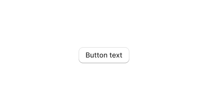
}Add a simple button to your app.
Examples
Add a simple button to your app.
React
import {render, Button} from '@shopify/ui-extensions-react/admin';

render('Playground', () => <App />);

function App() {
  return (
    <Button
      onPress={() => {
        console.log('onPress event');
      }}
    >
      Click here
    </Button>
  );
}
JS
import {extend, Button} from '@shopify/ui-extensions/admin';

extend('Playground', (root) => {
  const button = root.createComponent(
    Button,
    {onPress: () => console.log('onPress event')},
    'Click here',
  );

  root.appendChild(button);
});
Preview