Components
Anchor to additional-componentsAdditional components
In addition to the components below, you can also use checkout components to build customer account UI extensions.
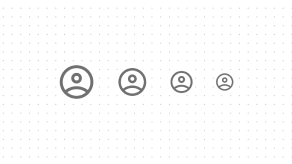
Avatar
Avatar component is used to show a thumbnail representation of an individual or business in the interface. It can be a graphical representation or visual depiction, such as an image, initials, or an icon.
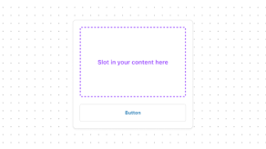
Card
Group related content and functionality together in a familiar and consistent style, for customers to scan, read, and get things done.
Customer
A modal to complete an order action flow. This component can only be used to populate the customer-account.order.action.render extension target, which renders as a result of the customer clicking the order action button rendered via the customer-account.order.action.menu-item.render extension target.
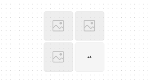
Image
Display up to 4 images in a grid or stacked layout. For example, images of products in a wishlist or subscription. When there are more than 4 images, the component indicates how many more images are not displayed.

Menu
Use a menu to display a list of actions in a popover. Actions can open a modal, trigger an event, or link to an external page.
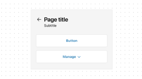
Page
The outer wrapper of the page—including the page title, subtitle, and page-level actions—displayed in a familiar and consistent style that sets expectations about the purpose of the page.
Resource
Use to represent a specific object within a collection, that a customer can take action on. For example, a list of active subscriptions or redeemable offers, in a style consistent with the order index page.