Menu
Use a menu to display a list of actions in a popover. Actions can open a modal, trigger an event, or link to an external page.
- string
A label to describe the purpose of the menu that is announced by screen readers.
- string
A unique identifier for the component.
- () => void
Callback to run when the Menu is closed
- () => void
Callback to run when the Menu is opened
The Menu component exclusively accepts Button elements with restricted props as its children. The appearance prop will always be set to monochrome by default.
- string
A label used for buyers using assistive technologies. When set, any
childrensupplied to this component will not be announced to screen reader users.- ButtonAccessibilityRoleDefault: 'button'
The role of the button that will be rendered.
button: renders a regular button.submit: renders a button that submits a form.- 'auto' | 'copy'Default: 'auto' - a default action for the target component.
- string
ID of a component that should respond to activations (e.g. clicks) on this pressable.
See
for how to control the behavior of the target.- Extract<Appearance, 'monochrome' | 'critical'>
Specify the color treatment of the Button.
- booleanDefault: false
Disables the button, disallowing any interaction.
- string
A unique identifier for the component.
- booleanDefault: false
Replaces content with a loading indicator.
- string
Accessible label for the loading indicator when user prefers reduced motion. This value is only used if
loadingis true.- () => void
Callback that is run when the button is pressed.
- RemoteFragment
An overlay component to render when the user interacts with the component.
- string
Destination URL to link to.
- string
The component's identifier whose visibility will be toggled when this component is actioned.
- booleandeprecated
Allows the button to submit a form.
Deprecateduse
instead
ButtonAccessibilityRole
'button' | 'submit'Appearance
'base' | 'accent' | 'decorative' | 'interactive' | 'subdued' | 'info' | 'success' | 'warning' | 'critical' | 'monochrome'Basic Menu
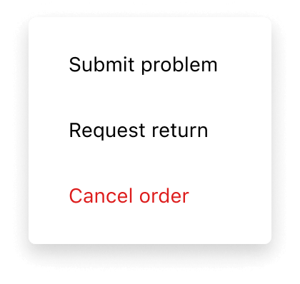
Examples
Basic Menu
React
import {
  reactExtension,
  Button,
  Menu,
} from '@shopify/ui-extensions-react/customer-account';
import React from 'react';

export default reactExtension(
  'customer-account.page.render',
  () => <App />,
);

function App() {
  return (
    <Button
      overlay={
        <Menu>
          <Button
            onPress={() =>
              console.log('Submit problem')
            }
          >
            Submit problem
          </Button>
          <Button to="https://shopify.com">
            Request return
          </Button>
          <Button appearance="critical">
            Cancel order
          </Button>
        </Menu>
      }
    >
      Manage
    </Button>
  );
}
JS
import {Menu, Button, extension} from '@shopify/ui-extensions/customer-account';

export default extension('customer-account.page.render', (root, api) => {
  renderApp(root, api);
});

async function renderApp(root, api) {
  const menuFragment = root.createFragment();
  const menu = root.createComponent(Menu, {}, [
    root.createComponent(
      Button,
      {onPress: () => console.log('Submit problem')},
      'Submit problem',
    ),
    root.createComponent(Button, {to: 'https://shopify.com'}, 'Request return'),
    root.createComponent(Button, {appearance: 'critical'}, 'Cancel order'),
  ]);
  menuFragment.appendChild(menu);
  const button = root.createComponent(
    Button,
    {overlay: menuFragment},
    'Manage',
  );

  root.appendChild(button);
}
Preview
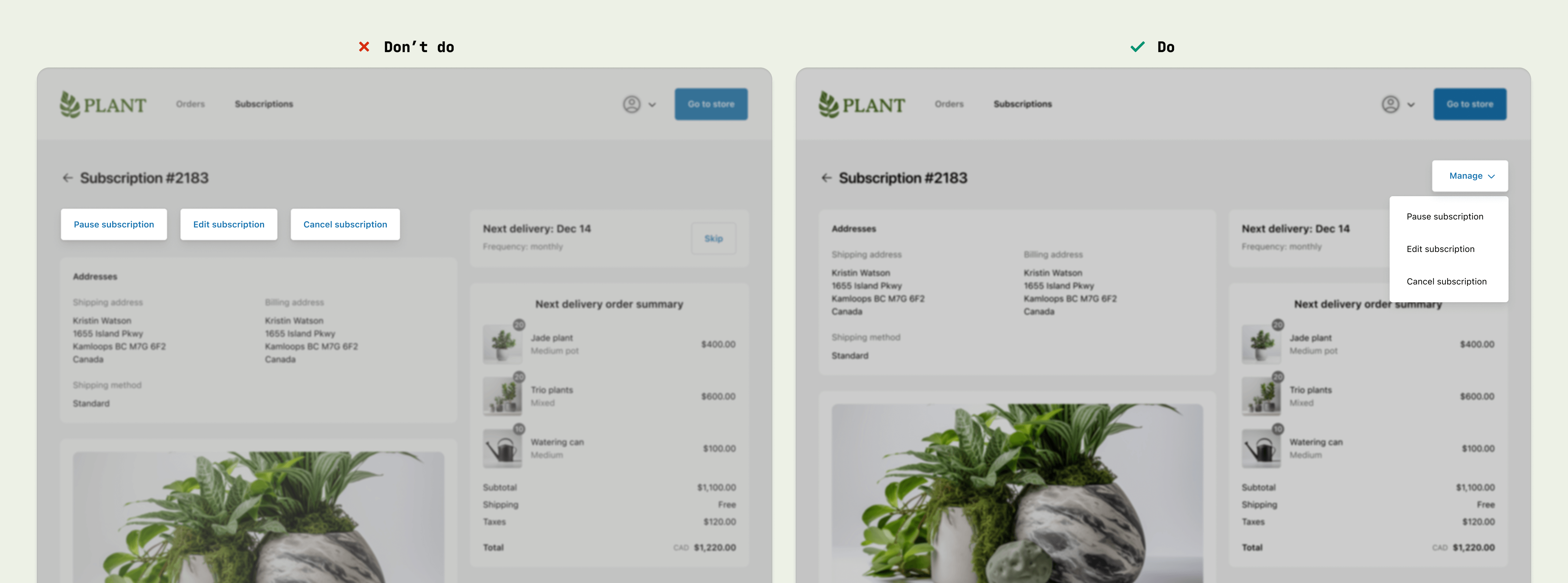
Anchor to best-practicesBest Practices
Consolidate actions into one menu
- Use the menu component in the upper-right corner of full-page extensions, to be consistent with the Order status page.
- Use menus to consolidate page-level actions, instead of adding multiple buttons around the page.
Content guidelines
When writing button labels:
- Aim for 2 words (verb and noun).
- Lead with a strong verb that encourages action.
- Avoid unnecessary words and articles such as “the,” “an,” or “a.”
- Use sentence case.
