Text
The text component displays text with specific visual styles or tones. Use it to present content with appropriate emphasis, hierarchy, or tone while maintaining semantic meaning.
Text on mobile surfaces is blockish, rather than inline.
Supported targets
- pos.
cart. line-item-details. action. render - pos.
customer-details. action. render - pos.
customer-details. block. render - pos.
draft-order-details. action. render - pos.
draft-order-details. block. render - pos.
home. modal. render - pos.
order-details. action. render - pos.
order-details. block. render - pos.
product-details. action. render - pos.
product-details. block. render - pos.
purchase. post. action. render - pos.
purchase. post. block. render
Supported targets
- pos.
cart. line-item-details. action. render - pos.
customer-details. action. render - pos.
customer-details. block. render - pos.
draft-order-details. action. render - pos.
draft-order-details. block. render - pos.
home. modal. render - pos.
order-details. action. render - pos.
order-details. block. render - pos.
product-details. action. render - pos.
product-details. block. render - pos.
purchase. post. action. render - pos.
purchase. post. block. render
Anchor to Use casesUse cases
- Body content: Display text, labels, and descriptions with appropriate visual hierarchy.
- Status information: Present alerts or notifications using tone to convey urgency or importance.
- Emphasis: Create emphasized text elements using type variations like strong or small.
- Nested content: Support nested text elements for complex formatting within a single block.
Anchor to PropertiesProperties
Configure the following properties on the Text component.
- Anchor to colorcolorcolorColorKeywordColorKeywordDefault: 'base'Default: 'base'
The color intensity of the text. Controls how prominent or subtle the text appears within the interface.
- Anchor to idididstringstring
A unique identifier for the element used for targeting with CSS, JavaScript, or accessibility features.
- Anchor to tonetonetone| 'auto' | 'neutral' | 'info' | 'success' | 'caution' | 'warning' | 'critical'| 'auto' | 'neutral' | 'info' | 'success' | 'caution' | 'warning' | 'critical'Default: 'auto'Default: 'auto'
Determines the visual appearance and semantic meaning of the text. Available options:
'auto'- Lets the system automatically choose the appropriate tone based on context. Use when you want the system to determine the most appropriate styling.'neutral'- Gray styling for general status information that doesn't require emphasis. Use for general status updates and standard information.'info'- Blue styling for informational content and neutral updates. Use for informational content that provides helpful context.'success'- Green styling for positive states, completed actions, and successful operations. Use for positive outcomes and successful processes.'caution'- Yellow styling for situations that need attention but aren't urgent. Use for potential issues that require awareness.'warning'- Orange styling for important notices that require merchant awareness. Use for situations that need attention but aren't critical.'critical'- Red styling for errors, failures, and urgent issues requiring immediate action. Use for urgent issues that need immediate merchant attention.
- Anchor to typetypetype'strong' | 'small' | 'generic''strong' | 'small' | 'generic'Default: 'generic'Default: 'generic'
The semantic meaning and default styling of the text. Other presentation properties override the default styling provided by the type. Available options:
'generic'- The default text type for general content without specific semantic meaning or emphasis.'strong'- A text type that provides emphasis and importance, typically rendered with increased font weight or visual prominence.'small'- A text type for secondary or supplementary content, typically rendered with reduced size for captions, fine print, or less important information.
ColorKeyword
Defines the available color intensity options for icons. Controls the visual prominence and contrast of icon elements within the interface.
'subdued' | 'base' | 'strong'Anchor to ExamplesExamples
Anchor to Display text with visual stylesDisplay text with visual styles
Display text content using a text component with customizable visual styles and tones. This example shows basic text with appropriate emphasis and hierarchy.Display text with visual styles
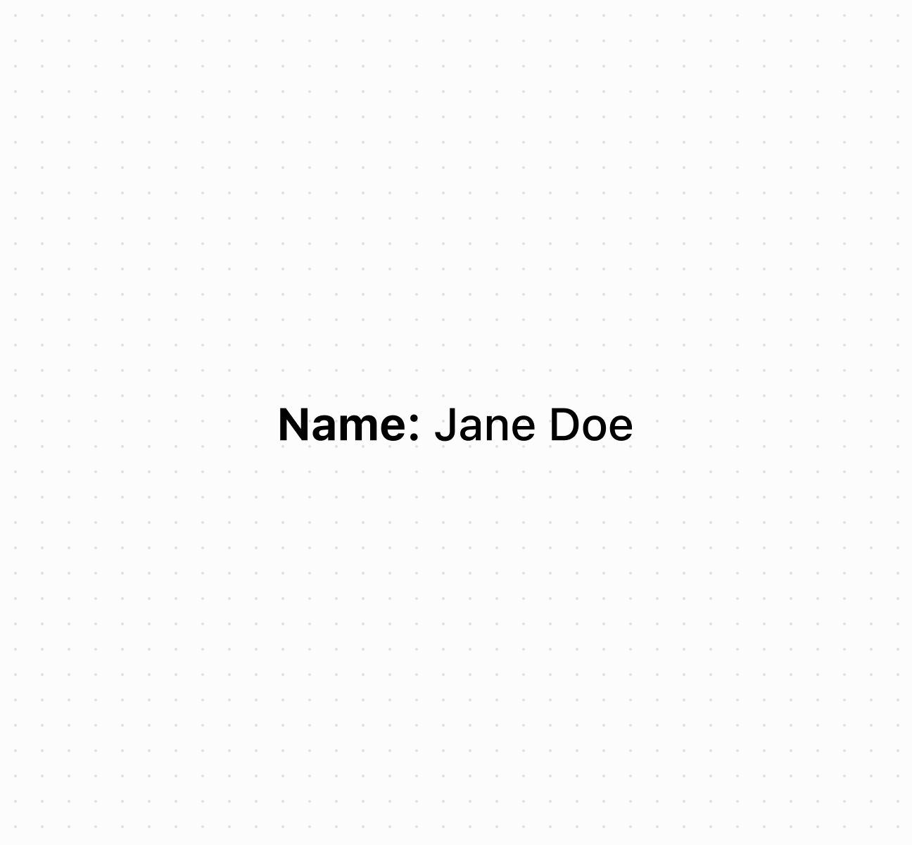
Display text with visual styles
Anchor to Best practicesBest practices
- Choose semantic types: Use
strongfor emphasis,smallfor secondary info,genericfor standard text. - Apply appropriate tones: Use
successfor positive outcomes,warningorcriticalfor alerts,infofor helpful context,autofor neutral content. - Balance color intensity: Use
strongfor emphasis,basefor readability,subduedfor secondary info. - Nest for mixed formatting: Nest text components when you need multiple styles within one text block.
Anchor to LimitationsLimitations
Complex rich text formatting isn't supported—use multiple text components or nested text elements for varied formatting needs.