Stack
The stack component organizes elements along the block (vertical) or inline (horizontal) axis. Use it to structure layouts and control spacing between elements.
The component automatically manages spacing through gap properties and supports flexible alignment and wrapping behavior. Complex grid-like layouts may require multiple nested stack components or alternative layout approaches.
Supported targets
- pos.
cart. line-item-details. action. render - pos.
customer-details. action. render - pos.
customer-details. block. render - pos.
draft-order-details. action. render - pos.
draft-order-details. block. render - pos.
home. modal. render - pos.
order-details. action. render - pos.
order-details. block. render - pos.
product-details. action. render - pos.
product-details. block. render - pos.
purchase. post. action. render - pos.
purchase. post. block. render
Supported targets
- pos.
cart. line-item-details. action. render - pos.
customer-details. action. render - pos.
customer-details. block. render - pos.
draft-order-details. action. render - pos.
draft-order-details. block. render - pos.
home. modal. render - pos.
order-details. action. render - pos.
order-details. block. render - pos.
product-details. action. render - pos.
product-details. block. render - pos.
purchase. post. action. render - pos.
purchase. post. block. render
Anchor to Use casesUse cases
- Layout arrangement: Arrange form elements, buttons, or content in vertical or horizontal layouts.
- Responsive design: Create layouts that adapt to different screen sizes and orientations.
- Spacing control: Control spacing between elements using gap properties for visual hierarchy.
- Content alignment: Align content precisely using
justifyandalignproperties.
Anchor to PropertiesProperties
Configure the following properties on the Stack component.
- Anchor to alignContentalign
Contentalign Content AlignContentKeywordAlignContentKeyword Controls the distribution of space between and around lines of wrapped content along the cross axis.
- Anchor to alignItemsalign
Itemsalign Items AlignItemsKeywordAlignItemsKeyword Controls the alignment of individual children along the cross axis (perpendicular to the main axis).
- Anchor to blockSizeblock
Sizeblock Size SizeUnitsOrAutoSizeUnitsOrAutoDefault: 'auto'Default: 'auto' The block size of the container. Auto automatically sizes based on the container's children.
- Anchor to columnGapcolumn
Gapcolumn Gap '' | SpacingKeyword'' | SpacingKeywordDefault: '' - meaning no overrideDefault: '' - meaning no override The spacing between elements in the inline axis. This overrides the column value of gap.
- Anchor to directiondirectiondirection'block' | 'inline''block' | 'inline'Default: 'block'Default: 'block'
The direction in which children are laid out using logical properties:
'block': Vertical arrangement along the block axis (typically top to bottom) without wrapping'inline': Horizontal arrangement along the inline axis (typically left to right) with automatic wrapping when space is insufficient
- Anchor to gapgapgapMaybeTwoValuesShorthandProperty<SpacingKeyword>MaybeTwoValuesShorthandProperty<SpacingKeyword>Default: 'none'Default: 'none'
The spacing between elements. A single value applies to both axes. A pair of values (eg large-100 large-500) can be used to set the inline and block axes respectively.
- Anchor to idididstringstring
A unique identifier for the element used for targeting with CSS, JavaScript, or accessibility features.
- Anchor to inlineSizeinline
Sizeinline Size SizeUnitsOrAutoSizeUnitsOrAutoDefault: 'auto'Default: 'auto' The inline size (width in horizontal writing modes) of the element.
Learn more about
inline-sizeon MDN.- Anchor to justifyContentjustify
Contentjustify Content JustifyContentKeywordJustifyContentKeywordDefault: 'normal'Default: 'normal' Controls the distribution and alignment of children along the main axis (the axis defined by the
directionproperty).Learn more about
justify-contenton MDN.- Anchor to maxBlockSizemax
Block Sizemax Block Size SizeUnitsOrNoneSizeUnitsOrNoneDefault: 'none'Default: 'none' The maximum block size constraint for the container.
- Anchor to maxInlineSizemax
Inline Sizemax Inline Size SizeUnitsOrNoneSizeUnitsOrNoneDefault: 'none'Default: 'none' The maximum inline size constraint for the container.
- Anchor to minBlockSizemin
Block Sizemin Block Size SizeUnitsSizeUnitsDefault: '0'Default: '0' The minimum block size constraint for the container.
- Anchor to minInlineSizemin
Inline Sizemin Inline Size SizeUnitsSizeUnitsDefault: '0'Default: '0' The minimum inline size constraint for the container.
- Anchor to paddingpaddingpaddingMaybeAllValuesShorthandProperty<PaddingKeyword>MaybeAllValuesShorthandProperty<PaddingKeyword>Default: 'none'Default: 'none'
The padding applied to all edges of the container. Supports 1-to-4-value syntax using flow-relative values in the order:
- 4 values:
block-start inline-end block-end inline-start - 3 values:
block-start inline block-end - 2 values:
block inline
For example:
largemeans block-start, inline-end, block-end and inline-start paddings arelarge.large nonemeans block-start and block-end paddings arelarge, inline-start and inline-end paddings arenone.large none largemeans block-start padding islarge, inline-end padding isnone, block-end padding islargeand inline-start padding isnone.large none large smallmeans block-start padding islarge, inline-end padding isnone, block-end padding islargeand inline-start padding issmall.
An
autovalue inherits the default padding from the closest container that has removed its usual padding.- 4 values:
- Anchor to paddingBlockpadding
Blockpadding Block MaybeTwoValuesShorthandProperty<'' | PaddingKeyword>MaybeTwoValuesShorthandProperty<'' | PaddingKeyword>Default: '' - meaning no overrideDefault: '' - meaning no override The block-axis padding for the container. Overrides the block value of the
paddingproperty.- Anchor to paddingBlockEndpadding
Block Endpadding Block End '' | PaddingKeyword'' | PaddingKeywordDefault: '' - meaning no overrideDefault: '' - meaning no override The block-end padding for the container. Overrides the block-end value of the
property.- Anchor to paddingBlockStartpadding
Block Startpadding Block Start '' | PaddingKeyword'' | PaddingKeywordDefault: '' - meaning no overrideDefault: '' - meaning no override The block-start padding for the container. Overrides the block-start value of the
property.- Anchor to paddingInlinepadding
Inlinepadding Inline MaybeTwoValuesShorthandProperty<'' | PaddingKeyword>MaybeTwoValuesShorthandProperty<'' | PaddingKeyword>Default: '' - meaning no overrideDefault: '' - meaning no override The inline-axis padding for the container. Supports two-value syntax where
large nonesets inline-start tolargeand inline-end tonone. Overrides the inline value of thepaddingproperty.- Anchor to paddingInlineEndpadding
Inline Endpadding Inline End '' | PaddingKeyword'' | PaddingKeywordDefault: '' - meaning no overrideDefault: '' - meaning no override The inline-end padding for the container. Overrides the inline-end value of the
property.- Anchor to paddingInlineStartpadding
Inline Startpadding Inline Start '' | PaddingKeyword'' | PaddingKeywordDefault: '' - meaning no overrideDefault: '' - meaning no override The inline-start padding for the container. Overrides the inline-start value of the
property.- Anchor to rowGaprow
Gaprow Gap '' | SpacingKeyword'' | SpacingKeywordDefault: '' - meaning no overrideDefault: '' - meaning no override The spacing between elements in the block axis. This overrides the row value of gap.
AlignContentKeyword
A type that defines the distribution of space between and around content items along a flexbox's cross axis, or a grid or block-level element's block axis. Learn more about [`align-content` on MDN](https://developer.mozilla.org/en-US/docs/Web/CSS/align-content).
'normal' | BaselinePosition | ContentDistribution | OverflowPosition | ContentPositionBaselinePosition
A baseline alignment position keyword.
'baseline' | 'first baseline' | 'last baseline'ContentDistribution
A content distribution strategy keyword for spacing.
'space-between' | 'space-around' | 'space-evenly' | 'stretch'OverflowPosition
A content position with optional overflow safety modifier.
`unsafe ${ContentPosition}` | `safe ${ContentPosition}`ContentPosition
A content position alignment keyword.
'center' | 'start' | 'end'AlignItemsKeyword
A type that defines how children are aligned along the cross axis. Sets the align-self value on all direct children as a group. Learn more about [`align-items` on MDN](https://developer.mozilla.org/en-US/docs/Web/CSS/align-items).
'normal' | 'stretch' | BaselinePosition | OverflowPosition | ContentPositionSizeUnitsOrAuto
Defines size values that can be specified as exact measurements or automatic sizing. Supports pixel values, percentages, zero, or automatic sizing based on content.
SizeUnits | 'auto'SizeUnits
Defines exact size measurements without automatic or unconstrained options. Limited to specific pixel values, percentages, or zero.
`${number}px` | `${number}%` | `0`SpacingKeyword
A spacing size keyword including the option for no spacing.
SizeKeyword | 'none'SizeKeyword
Defines the available size options for icons using a semantic scale. Provides granular control over icon dimensions from compact inline sizes to prominent display sizes.
'small-500' | 'small-400' | 'small-300' | 'small-200' | 'small-100' | 'small' | 'base' | 'large' | 'large-100' | 'large-200' | 'large-300' | 'large-400' | 'large-500'MaybeTwoValuesShorthandProperty
Defines a shorthand property that accepts either a single value or two space-separated values for directional properties like padding and spacing.
T | `${T} ${T}`JustifyContentKeyword
A type that defines how the browser distributes space between and around content items along the main-axis of a flex container, and the inline axis of a grid container. Learn more about [`justify-content` on MDN](https://developer.mozilla.org/en-US/docs/Web/CSS/justify-content).
'normal' | ContentDistribution | OverflowPosition | ContentPositionSizeUnitsOrNone
Defines size values that can be specified as exact measurements or no constraint. Supports pixel values, percentages, zero, or no maximum limit.
SizeUnits | 'none'MaybeAllValuesShorthandProperty
A utility type for properties that support [1-to-4-value shorthand syntax](https://developer.mozilla.org/en-US/docs/Web/CSS/Guides/Cascade/Shorthand_properties#edges_of_a_box).
T | `${T} ${T}` | `${T} ${T} ${T}` | `${T} ${T} ${T} ${T}`PaddingKeyword
Defines the available padding size options using a semantic scale. Provides consistent spacing values that align with the POS design system.
SizeKeyword | 'none'Anchor to ExamplesExamples
Anchor to Organize elements with a stackOrganize elements with a stack
Organize elements using a stack component. This example shows a basic stack with spacing between child elements.Organize elements with a stack
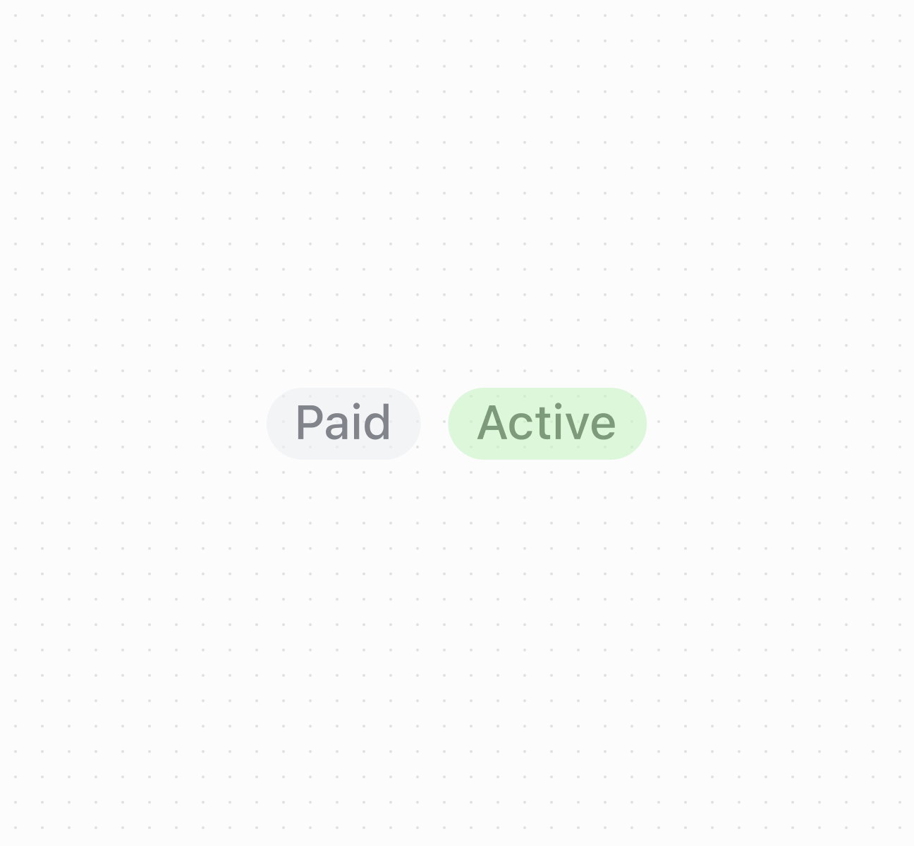
Organize elements with a stack
Anchor to Best practicesBest practices
- Choose appropriate direction: Use
blockfor vertical arrangements like forms. Useinlinefor horizontal arrangements like button groups. Note that inline wraps while block doesn't. - Use design system spacing: Use
SpacingKeywordvalues for consistency. Start withbaseand adjust as needed. - Apply alignment properties: Use
justifyContentfor main axis distribution,alignItemsfor cross axis positioning,alignContentfor extra space distribution. - Avoid percentages on mobile: Don't use percentage-based sizing within scrollable containers on mobile surfaces.
- Use gap for spacing control: Use
gapfor uniform spacing,rowGapfor block axis,columnGapfor inline axis.