Choice list
The choice list component presents multiple options for single or multiple selections. Use it when merchants need to choose from a defined set of options, such as filtering results or collecting preferences.
The component supports both single selection (radio button behavior) and multiple selection (checkbox behavior) modes. It offers multiple layout variants including list, inline, block, and grid formats to suit different space constraints and visual requirements.
Anchor to Use casesUse cases
- Option selection: Create fields where users select one or multiple options from a list.
- Filtering: Implement filtering where users select categories or attributes to refine content.
- Settings: Provide configuration options where users choose preferences.
- Multi-select: Enable scenarios like choosing multiple product variants or categories.
Anchor to PropertiesProperties
Configure the following properties on the ChoiceList component.
- Anchor to idididstringstring
A unique identifier for the element used for targeting with CSS, JavaScript, or accessibility features.
- Anchor to multiplemultiplemultiplebooleanbooleanDefault: falseDefault: false
Whether multiple choices can be selected simultaneously.
- Anchor to valuesvaluesvaluesstring[]string[]
An array of the values of the selected options. This is a convenience property for setting the selected state on child choice components.
Anchor to EventsEvents
The choice list component provides event callbacks for handling user interactions. Learn more about handling events.
- Anchor to changechangechange(event: CallbackEvent<"s-choice-list">) => void(event: CallbackEvent<"s-choice-list">) => void
Called after editing completes, typically on blur.
- Anchor to inputinputinput(event: CallbackEvent<"s-choice-list">) => void(event: CallbackEvent<"s-choice-list">) => void
Called when the user makes any changes in the field.
CallbackEvent
Represents the event object passed to callback functions when interactive events occur. Contains metadata about the event, including the target element, event phase, and propagation behavior.
- bubbles
Whether the event bubbles up through the DOM tree.
boolean - cancelable
Whether the event can be canceled.
boolean - composed
Whether the event will trigger listeners outside of a shadow root.
boolean - currentTarget
The element that the event listener is attached to.
HTMLElementTagNameMap[T] - detail
Additional data associated with the event.
any - eventPhase
The current phase of the event flow.
number - target
The element that triggered the event.
HTMLElementTagNameMap[T] | null
Anchor to ChoiceChoice
The choice component creates options that let merchants select one or multiple items from a list of choices.
- Anchor to disableddisableddisabledbooleanbooleanDefault: falseDefault: false
Whether the field is disabled, preventing user interaction. Use when the field is temporarily unavailable due to application state, permissions, or dependencies.
- Anchor to idididstringstring
A unique identifier for the element used for targeting with CSS, JavaScript, or accessibility features.
- Anchor to selectedselectedselectedbooleanbooleanDefault: falseDefault: false
Whether the choice control is currently active or selected.
- Anchor to valuevaluevaluestringstring
The unique value associated with this choice option. This value is used to identify the option and gets submitted with forms when selected. Use meaningful values like
"small","medium", or"large"rather than display text.
Anchor to ExamplesExamples
Anchor to Create a choice list for selectionsCreate a choice list for selections
Present options using a choice list component. This example shows a basic choice list for single selection.Create a choice list for selections
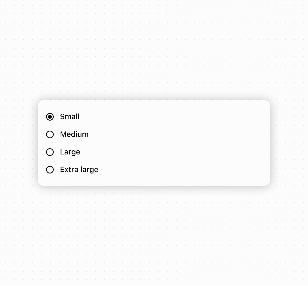
Create a choice list for selections
Anchor to Enable multiple selection modeEnable multiple selection mode
Enable multiple selection mode to allow merchants to select multiple options from the list. This example demonstrates using controlled values with the multiple property, perfect for filtering interfaces or collecting multiple preferences in forms.Enable multiple selection mode
Anchor to Handle selection eventsHandle selection events
Subscribe to onChange and onInput events to respond when merchants select options. This example shows how to handle selection changes and capture user input in real time, enabling dynamic behavior and form validation based on merchant choices.Handle selection events
Anchor to Compose rich choice contentCompose rich choice content
Compose rich choice content by nesting other components within choice elements. This example demonstrates combining images, text, and layout components to create visually enhanced choice options with descriptions and supporting images.Compose rich choice content
Anchor to Best practicesBest practices
- Choose appropriate selection modes: Use single selection for mutually exclusive options. Enable
multiplewhen merchants can select more than one. - Write clear, concise choice labels: Keep labels short but descriptive enough that merchants understand each option without additional explanation.
Anchor to LimitationsLimitations
Choice list component types other than choice can't be used as options within the choice list.