Modal
The modal component displays content in an overlay that requires merchant attention. Use modals to present critical information, confirmations, or focused tasks while maintaining page context.
Modals block interaction with the underlying interface until the merchant resolves the modal content.
Modals don't automatically handle state management or persistence, so manage visibility and lifecycle programmatically through events.
Supported targets
- pos.
cart. line-item-details. action. render - pos.
customer-details. action. render - pos.
customer-details. block. render - pos.
draft-order-details. action. render - pos.
draft-order-details. block. render - pos.
home. modal. render - pos.
order-details. action. render - pos.
order-details. block. render - pos.
product-details. action. render - pos.
product-details. block. render - pos.
purchase. post. action. render - pos.
purchase. post. block. render
Supported targets
- pos.
cart. line-item-details. action. render - pos.
customer-details. action. render - pos.
customer-details. block. render - pos.
draft-order-details. action. render - pos.
draft-order-details. block. render - pos.
home. modal. render - pos.
order-details. action. render - pos.
order-details. block. render - pos.
product-details. action. render - pos.
product-details. block. render - pos.
purchase. post. action. render - pos.
purchase. post. block. render
Anchor to Use casesUse cases
- Confirmations: Display confirmation dialogs for critical actions like refunds or data deletion.
- Detailed views: Present information requiring focused attention, like error details or status.
- Data collection: Collect input through forms or settings panels without navigating away.
- Progress indicators: Show progress for long-running operations like imports or sync.
Anchor to PropertiesProperties
Configure the following properties on the Modal component.
- Anchor to headingheadingheadingstringstring
A title that describes the content of the section. If omitted and no secondary actions are provided, the section will be rendered without a header.
- Anchor to idididstringstring
A unique identifier for the element used for targeting with CSS, JavaScript, or accessibility features.
Anchor to SlotsSlots
The modal component supports slots for additional content placement within the modal. Learn more about using slots.
- Anchor to primary-actionprimary-actionprimary-actionHTMLElementHTMLElement
The primary action button displayed in the modal. The tone of the button is used to define the tone of the modal. If omitted, the modal will default to an
'info'tone, and show an OK button, translated according to the user's locale.- Anchor to secondary-actionssecondary-actionssecondary-actionsHTMLElementHTMLElement
The secondary action buttons displayed in the modal. Use this slot to provide alternative actions or cancel options that give users flexibility in how they respond to the modal.
Anchor to EventsEvents
The modal component provides event callbacks for handling user interactions. Learn more about handling events.
- Anchor to hidehidehide(event: CallbackEvent<"s-modal">) => void(event: CallbackEvent<"s-modal">) => void
The callback when the modal is hidden. Use this event to perform cleanup tasks, update application state, or trigger other actions when the modal is dismissed or closed.
- Anchor to showshowshow(event: CallbackEvent<"s-modal">) => void(event: CallbackEvent<"s-modal">) => void
The callback when the modal is shown. Use this event to initialize modal content, focus specific elements, or perform setup tasks when the modal becomes visible.
CallbackEvent
Represents the event object passed to callback functions when interactive events occur. Contains metadata about the event, including the target element, event phase, and propagation behavior.
- bubbles
Whether the event bubbles up through the DOM tree.
boolean - cancelable
Whether the event can be canceled.
boolean - composed
Whether the event will trigger listeners outside of a shadow root.
boolean - currentTarget
The element that the event listener is attached to.
HTMLElementTagNameMap[T] - detail
Additional data associated with the event.
any - eventPhase
The current phase of the event flow.
number - target
The element that triggered the event.
HTMLElementTagNameMap[T] | null
Anchor to ExamplesExamples
Anchor to Display content in a modal overlayDisplay content in a modal overlay
Display focused content in an overlay using a modal component that requires merchant attention. This example shows a basic modal with header, content area, and action buttons.Display content in a modal overlay
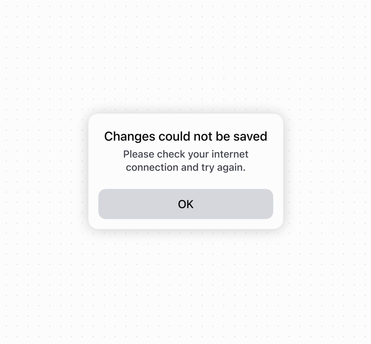
Display content in a modal overlay
Anchor to Best practicesBest practices
- Use for focused interactions: Reserve modals for confirmations, critical information, or tasks requiring immediate attention.
- Write clear headings: Use concise titles that communicate the purpose or action.
- Choose appropriate button tones: The primary-action button's
tonedetermines the modal's overall tone. Usecriticalfor destructive actions,successfor confirmations. - Include secondary actions: Provide options like "Cancel" or "Go Back" to give merchants flexibility.
- Keep content focused: Limit to essential information and actions. For complex workflows, break into multiple steps.
Anchor to LimitationsLimitations
Multiple modals can't be displayed simultaneously—showing a new modal while another is visible may cause unexpected behavior or poor user experience.