Badge
The badge component uses color and text to communicate status information for orders, products, customers, and other business data. Use badges to create visual hierarchy and help merchants quickly identify important information or status changes.
Badges aren't interactive elements. They display information but don't respond to user interactions like clicks or taps.
Supported targets
- pos.
cart. line-item-details. action. render - pos.
customer-details. action. render - pos.
customer-details. block. render - pos.
draft-order-details. action. render - pos.
draft-order-details. block. render - pos.
home. modal. render - pos.
order-details. action. render - pos.
order-details. block. render - pos.
product-details. action. render - pos.
product-details. block. render - pos.
purchase. post. action. render - pos.
purchase. post. block. render
Supported targets
- pos.
cart. line-item-details. action. render - pos.
customer-details. action. render - pos.
customer-details. block. render - pos.
draft-order-details. action. render - pos.
draft-order-details. block. render - pos.
home. modal. render - pos.
order-details. action. render - pos.
order-details. block. render - pos.
product-details. action. render - pos.
product-details. block. render - pos.
purchase. post. action. render - pos.
purchase. post. block. render
Anchor to Use casesUse cases
- Order status: Display status indicators like "Paid," "Pending," or "Refunded" for quick visibility.
- Inventory states: Show availability like "In Stock," "Low Stock," or "Out of Stock."
- Customer status: Indicate account status like "VIP," "New Customer," or "Loyalty Member."
- Labels: Categorize items with labels like "Featured," "Sale," or "New."
Anchor to PropertiesProperties
Configure the following properties on the Badge component.
- Anchor to idididstringstring
A unique identifier for the element used for targeting with CSS, JavaScript, or accessibility features.
- Anchor to tonetonetone| 'auto' | 'neutral' | 'info' | 'success' | 'caution' | 'warning' | 'critical'| 'auto' | 'neutral' | 'info' | 'success' | 'caution' | 'warning' | 'critical'Default: 'auto'Default: 'auto'
Determines the visual appearance and semantic meaning of the badge. Badges rely on the tone system for semantic meaning, so using custom styling may not clearly convey meaning to merchants. Available options:
'auto'- Lets the system automatically choose the appropriate tone based on context.'neutral'- Gray styling for general status information that doesn't require emphasis.'info'- Blue styling for informational content and neutral updates.'success'- Green styling for positive states, completed actions, and successful operations.'caution'- Yellow styling for situations that need attention but aren't urgent.'warning'- Orange styling for important notices that require merchant awareness.'critical'- Red styling for errors, failures, and urgent issues requiring immediate action.
Anchor to ExamplesExamples
Anchor to Display status information with a badgeDisplay status information with a badge
Display status information using a badge component with customizable tone and content. This example shows a basic badge with a tone property to indicate status through color.Display status information with a badge
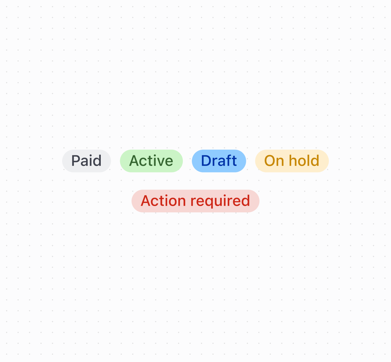
Display status information with a badge
Anchor to Best practicesBest practices
- Apply appropriate tones: Use
successfor positive states,criticalfor urgent issues,warningfor attention-needed states,infofor neutral information. - Keep text brief: Use single words or short phrases. Avoid lengthy descriptions that don't fit the compact design.
- Position near related content: Place badges next to the items they describe for clear associations.
- Use for status, not actions: Badges display information only. For interactive elements, use buttons or clickable components.
Anchor to LimitationsLimitations
Very long text content may be truncated or cause layout issues depending on the container and screen size.