Button
The button component triggers actions or events, such as opening dialogs or navigating to other pages. Use button to let merchants perform specific tasks or to initiate interactions throughout the POS interface.
Buttons support various visual styles, tones, and interaction patterns to communicate intent and hierarchy within the interface.
Supported targets
- pos.
cart. line-item-details. action. menu-item. render - pos.
cart. line-item-details. action. render - pos.
customer-details. action. menu-item. render - pos.
customer-details. action. render - pos.
customer-details. block. render - pos.
draft-order-details. action. menu-item. render - pos.
draft-order-details. action. render - pos.
draft-order-details. block. render - pos.
home. modal. render - pos.
order-details. action. menu-item. render - pos.
order-details. action. render - pos.
order-details. block. render - pos.
product-details. action. menu-item. render - pos.
product-details. action. render - pos.
product-details. block. render - pos.
purchase. post. action. menu-item. render - pos.
purchase. post. action. render - pos.
purchase. post. block. render
Supported targets
- pos.
cart. line-item-details. action. menu-item. render - pos.
cart. line-item-details. action. render - pos.
customer-details. action. menu-item. render - pos.
customer-details. action. render - pos.
customer-details. block. render - pos.
draft-order-details. action. menu-item. render - pos.
draft-order-details. action. render - pos.
draft-order-details. block. render - pos.
home. modal. render - pos.
order-details. action. menu-item. render - pos.
order-details. action. render - pos.
order-details. block. render - pos.
product-details. action. menu-item. render - pos.
product-details. action. render - pos.
product-details. block. render - pos.
purchase. post. action. menu-item. render - pos.
purchase. post. action. render - pos.
purchase. post. block. render
Anchor to Use casesUse cases
- Primary actions: Create actions like "Save changes," "Add customer," or "Process payment" that complete workflows.
- Secondary actions: Provide supporting actions such as "Cancel," "Edit," or "View details."
- Navigation: Enable screen transitions or launch modal experiences for complex operations.
- Loading states: Display loading indicators during asynchronous operations while preventing duplicate submissions.
Anchor to PropertiesProperties
Configure the following properties on the Button component.
- '--auto' | '--show' | '--hide' | '--toggle''--auto' | '--show' | '--hide' | '--toggle'Default: '--auto'Default: '--auto'
The action to perform on the target element specified by
:'--auto': Execute the target's default action'--show': Display the target element'--hide': Hide the target element'--toggle': Switch the target's visibility state
Learn more about
commandon MDN.- stringstring
The ID of the target element that should respond to interactions (such as clicks) on this element. Used with
commandto control other components. Learn more aboutcommandforon MDN.- booleanbooleanDefault: falseDefault: false
Whether the field is disabled, preventing user interaction. Use when the field is temporarily unavailable due to application state, permissions, or dependencies.
- stringstring
A unique identifier for the element used for targeting with CSS, JavaScript, or accessibility features.
- booleanbooleanDefault: falseDefault: false
Indicates whether the button action is currently in progress. When
true, typically displays a loading indicator and may disable interaction.- 'auto' | 'neutral' | 'caution' | 'warning' | 'critical''auto' | 'neutral' | 'caution' | 'warning' | 'critical'Default: 'auto'Default: 'auto'
Sets the tone of the button, based on the intention of the information being conveyed.
'auto'- Automatically determines the appropriate tone based on context.'neutral'- The standard tone for general actions and interactions.'caution'- Indicates actions that require careful consideration.'warning'- Alerts users to potential issues or important information.'critical'- Used for destructive actions like deleting or removing content.
- 'auto' | 'primary' | 'secondary''auto' | 'primary' | 'secondary'Default: 'auto'Default: 'auto'
The visual appearance and prominence of the button:
'auto': The variant is automatically determined by context'primary': High visual emphasis for the most important action'secondary': Less prominent appearance for supporting actions
Anchor to EventsEvents
The button component provides event callbacks for handling user interactions. Learn more about handling events.
- (event: CallbackEvent<"s-button">) => void(event: CallbackEvent<"s-button">) => void
The callback when the element is activated.
CallbackEvent
Represents the event object passed to callback functions when interactive events occur. Contains metadata about the event, including the target element, event phase, and propagation behavior.
- bubbles
Whether the event bubbles up through the DOM tree.
boolean - cancelable
Whether the event can be canceled.
boolean - composed
Whether the event will trigger listeners outside of a shadow root.
boolean - currentTarget
The element that the event listener is attached to.
HTMLElementTagNameMap[T] - detail
Additional data associated with the event.
any - eventPhase
The current phase of the event flow.
number - target
The element that triggered the event.
HTMLElementTagNameMap[T] | null
Anchor to ExamplesExamples
Trigger actions using a button component with customizable visual styles and tones. This example shows a basic button with text content.
Trigger actions with a button
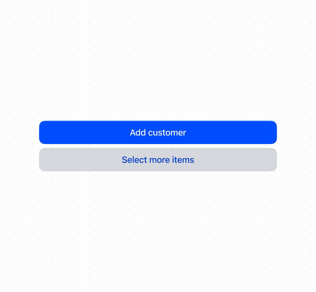
Trigger actions with a button
Anchor to Best practicesBest practices
- Write action-oriented text: Use specific, actionable language like "Save customer" or "Process payment" rather than generic terms like "OK" or "Submit."
- Choose appropriate variants and tones: Use
primaryfor the main action andsecondaryfor supporting actions. Usecriticalfor destructive actions,cautionorwarningfor actions requiring attention. - Show loading states: Set
loadingtotrueduring async operations to prevent duplicate submissions. - Use command system for component control: Use
commandForandcommandto control modals and overlays declaratively. - Structure hierarchies clearly: Group related actions together. Separate destructive actions to prevent accidental activation.