Image
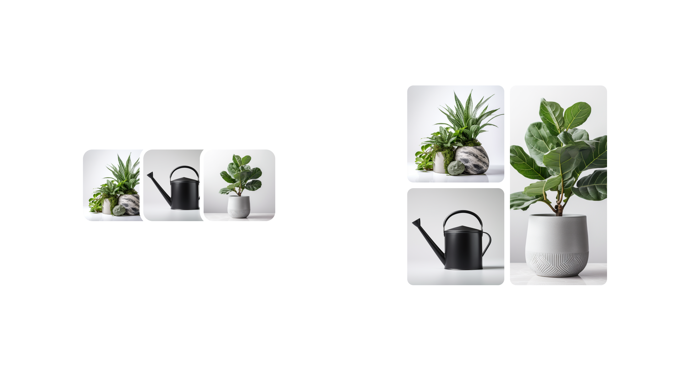
Display up to 4 images in a grid or stacked layout. For example, images of products in a wishlist or subscription. When there are more than 4 images, the component indicates how many more images are not displayed.
Anchor to imagegrouppropsImageGroupProps
Anchor to accessibilityLabel
accessibilityLabel
string
A label that describes the purpose or contents of the image group. When set, it will be announced to users using assistive technologies and will provide them with more context.
Anchor to loading
loading
boolean
Default: false
Indicates that the image group is in a loading state.
When true, the image group show a loading indicator.
Anchor to totalItems
totalItems
number
Indicates the total number of items that could be displayed in the image group. It is used to determine the remaining number to show when all the available image slots have been filled.
Anchor to variant
variant
'grid' | 'inline-stack'
Default: "grid"
Changes the layout of the images.
Was this section helpful?
Basic ImageGroup
import {
Image,
ImageGroup,
View,
reactExtension,
} from '@shopify/ui-extensions-react/customer-account';
import React from 'react';
export default reactExtension('customer-account.page.render', () => <App />);
function App() {
return (
<View maxInlineSize={300}>
<ImageGroup>
<Image source="../assets/flower.jpg" />
<Image source="../assets/flower.jpg" />
<Image source="../assets/flower.jpg" />
</ImageGroup>
</View>
);
}
Preview
Anchor to best-practicesBest Practices
- Use with the ResourceItem component
- Optimize image file sizes and consider lazy loading for performance.
Was this section helpful?