Details
The details component creates a collapsible content area that customers can expand or collapse to reveal additional information. Use details to keep secondary content like policies, instructions, or settings out of the main flow until needed.
Details works with the summary component to provide an accessible disclosure control. For static content that's always visible, use text or paragraph instead.
Nested s-details elements aren't officially supported and might cause inconsistent expand or collapse behavior across browsers.
Supported targets
- customer-account.
footer. render-after - customer-account.
order-index. announcement. render - customer-account.
order-index. block. render - customer-account.
order-status. announcement. render - customer-account.
order-status. block. render - customer-account.
order-status. cart-line-item. render-after - customer-account.
order-status. cart-line-list. render-after - customer-account.
order-status. customer-information. render-after - customer-account.
order-status. fulfillment-details. render-after - customer-account.
order-status. payment-details. render-after - customer-account.
order-status. return-details. render-after - customer-account.
order-status. unfulfilled-items. render-after - customer-account.
order. action. menu-item. render - customer-account.
order. action. render - customer-account.
order. page. render - customer-account.
page. render - customer-account.
profile. addresses. render-after - customer-account.
profile. announcement. render - customer-account.
profile. block. render - customer-account.
profile. company-details. render-after - customer-account.
profile. company-location-addresses. render-after - customer-account.
profile. company-location-payment. render-after - customer-account.
profile. company-location-staff. render-after - customer-account.
profile. payment. render-after
Supported targets
- customer-account.
footer. render-after - customer-account.
order-index. announcement. render - customer-account.
order-index. block. render - customer-account.
order-status. announcement. render - customer-account.
order-status. block. render - customer-account.
order-status. cart-line-item. render-after - customer-account.
order-status. cart-line-list. render-after - customer-account.
order-status. customer-information. render-after - customer-account.
order-status. fulfillment-details. render-after - customer-account.
order-status. payment-details. render-after - customer-account.
order-status. return-details. render-after - customer-account.
order-status. unfulfilled-items. render-after - customer-account.
order. action. menu-item. render - customer-account.
order. action. render - customer-account.
order. page. render - customer-account.
page. render - customer-account.
profile. addresses. render-after - customer-account.
profile. announcement. render - customer-account.
profile. block. render - customer-account.
profile. company-details. render-after - customer-account.
profile. company-location-addresses. render-after - customer-account.
profile. company-location-payment. render-after - customer-account.
profile. company-location-staff. render-after - customer-account.
profile. payment. render-after
Anchor to Use casesUse cases
- Pickup instructions: Hide store-specific pickup details behind a toggle to keep the customer account layout clean.
- Return policies: Let customers expand a collapsible summary to read full return and refund terms.
- Shipping options: Present delivery method breakdowns inside a disclosure so customers expand them on demand.
- Order notes: Provide an expandable section for gift messages or special instructions without cluttering the page.
Anchor to PropertiesProperties
Configure the following properties on the details component.
- Anchor to defaultOpendefault
Opendefault Open booleanbooleanDefault: falseDefault: false Whether the element should be open when it first renders. Use this for uncontrolled behavior where the component manages its own open state after the initial render.
- Anchor to idididstringstring
A unique identifier for the element. Use this to reference the element in JavaScript, link labels to form controls, or target specific elements for styling or scripting.
- Anchor to openopenopenbooleanbooleanDefault: falseDefault: false
Whether the element is currently open and showing its content. Use this for controlled behavior where you manage the open state yourself.
- Anchor to toggleTransitiontoggle
Transitiontoggle Transition 'none' | 'auto''none' | 'auto'Default: 'auto'Default: 'auto' Sets the animation transition between the open and closed states.
none: Disables all transition animations.auto: Uses the default transition animation.
Anchor to EventsEvents
The details component provides event callbacks for handling user interactions. Learn more about handling events.
- Anchor to aftertoggleaftertoggleaftertoggleCallbackEventListener<typeof tagName, ToggleArgumentsEvent>CallbackEventListener<typeof tagName, ToggleArgumentsEvent>
A callback fired when the element state changes, after any toggle animations have finished.
- If the element transitioned from hidden to showing, the
property will be set toclosedand theproperty will be set toopen. - If the element transitioned from showing to hidden, the
property will be set toopenand thewill beclosed.
- If the element transitioned from hidden to showing, the
- Anchor to toggletoggletoggleCallbackEventListener<typeof tagName, ToggleArgumentsEvent>CallbackEventListener<typeof tagName, ToggleArgumentsEvent>
A callback fired immediately when the element state changes, before any animations.
- If the element is transitioning from hidden to showing, the
property will be set toclosedand theproperty will be set toopen. - If the element is transitioning from showing to hidden, then the
property will be set toopenand thewill beclosed.
Learn more about the
toggleevent, theproperty, and theproperty.- If the element is transitioning from hidden to showing, the
CallbackEventListener
A typed event listener for custom element events. The listener receives a `CallbackEvent` with the correct `currentTarget` type for the associated custom element tag.
(EventListener & {
      (event: CallbackEvent<TTagName, TEvent>): void;
    }) | null
CallbackEvent
An event type that narrows the `currentTarget` to the specific HTML element associated with the custom element tag. This provides type-safe event handling in callback listeners.
TEvent & {
  currentTarget: HTMLElementTagNameMap[TTagName];
}
ToggleArgumentsEvent
The event data provided to toggle-related callbacks. Contains the previous and next visibility states of the element.
- newState
The visibility state of the element after the toggle occurred.
ToggleState - oldState
The visibility state of the element before the toggle occurred.
ToggleState
ToggleState
The visibility state of a toggleable element. - `open`: The element is visible and showing its content. - `closed`: The element is hidden and its content is not visible.
'open' | 'closed'Anchor to SummarySummary
Represents the visible heading of a details disclosure. Use only as a child of s-details components.
- Anchor to idididstringstring
A unique identifier for the element. Use this to reference the element in JavaScript, link labels to form controls, or target specific elements for styling or scripting.
Anchor to ExamplesExamples
Anchor to Create a collapsible sectionCreate a collapsible section
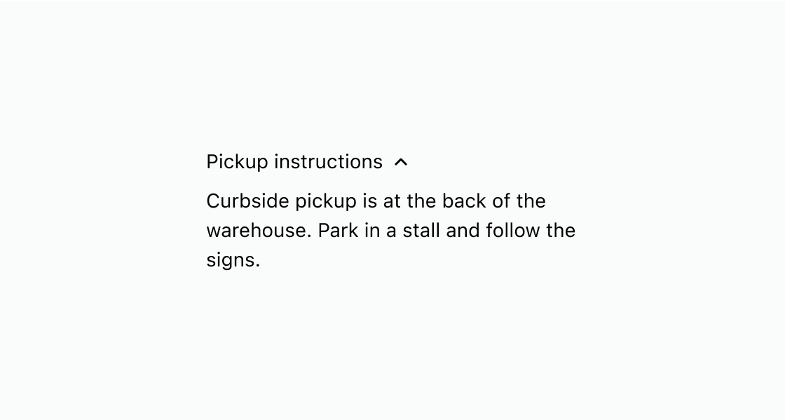
Hide supplementary content until the customer chooses to expand it. This example wraps pickup instructions in s-details with an s-summary label.
Create a collapsible section
html
Anchor to Nest lines inside one disclosureNest lines inside one disclosure
Group several related lines under a single expandable label. This example wraps standard, express, and overnight rates in one s-details with stacked text inside.
html
Anchor to Best practicesBest practices
- Write a clear summary label: Make the
s-summarytext descriptive enough that customers know what they'll find when they expand the section. - Default to collapsed: Keep
s-detailsclosed unless the content is critical to the customer account, so the page stays uncluttered. - Don't nest disclosures: Avoid placing disclosures inside other disclosures, as this can cause inconsistent behavior.
- Use for supplementary content: Reserve collapsible sections for information customers may want but don't need to see upfront.