Scroll box
The scroll box component provides a scrollable container for long content that exceeds the available space. Use scroll box to display lists, order summaries, or other lengthy content while maintaining a constrained layout.
Scroll box supports maximum height constraints, background styling, and border properties to create bounded content areas. For layouts where all content should be visible without scrolling, use stack or box.
Scroll box defaults to vertical scrolling and doesn't emit scroll position events. To enable horizontal scrolling, use the two-value overflow syntax (for example, hidden auto). If you need scroll-position events, consider the React-based ScrollView component in the 2025-07 API.
Supported targets
- customer-account.
footer. render-after - customer-account.
order-index. announcement. render - customer-account.
order-index. block. render - customer-account.
order-status. announcement. render - customer-account.
order-status. block. render - customer-account.
order-status. cart-line-item. render-after - customer-account.
order-status. cart-line-list. render-after - customer-account.
order-status. customer-information. render-after - customer-account.
order-status. fulfillment-details. render-after - customer-account.
order-status. payment-details. render-after - customer-account.
order-status. return-details. render-after - customer-account.
order-status. unfulfilled-items. render-after - customer-account.
order. action. menu-item. render - customer-account.
order. action. render - customer-account.
order. page. render - customer-account.
page. render - customer-account.
profile. addresses. render-after - customer-account.
profile. announcement. render - customer-account.
profile. block. render - customer-account.
profile. company-details. render-after - customer-account.
profile. company-location-addresses. render-after - customer-account.
profile. company-location-payment. render-after - customer-account.
profile. company-location-staff. render-after - customer-account.
profile. payment. render-after
Supported targets
- customer-account.
footer. render-after - customer-account.
order-index. announcement. render - customer-account.
order-index. block. render - customer-account.
order-status. announcement. render - customer-account.
order-status. block. render - customer-account.
order-status. cart-line-item. render-after - customer-account.
order-status. cart-line-list. render-after - customer-account.
order-status. customer-information. render-after - customer-account.
order-status. fulfillment-details. render-after - customer-account.
order-status. payment-details. render-after - customer-account.
order-status. return-details. render-after - customer-account.
order-status. unfulfilled-items. render-after - customer-account.
order. action. menu-item. render - customer-account.
order. action. render - customer-account.
order. page. render - customer-account.
page. render - customer-account.
profile. addresses. render-after - customer-account.
profile. announcement. render - customer-account.
profile. block. render - customer-account.
profile. company-details. render-after - customer-account.
profile. company-location-addresses. render-after - customer-account.
profile. company-location-payment. render-after - customer-account.
profile. company-location-staff. render-after - customer-account.
profile. payment. render-after
Anchor to Use casesUse cases
- Order line items: Display a long list of products in a scrollable area so the order summary doesn't push other content off-screen.
- Activity history: Show a scrollable timeline of account activity, order history, or reward transactions within a fixed-height container.
- Terms and conditions: Present lengthy legal text in a constrained scroll area alongside a checkbox.
- Product lists: Display a scrollable catalog or wish list preview within a section of the customer account page.
Anchor to PropertiesProperties
Configure the following properties on the scroll box component.
- Anchor to accessibilityLabelaccessibility
Labelaccessibility Label stringstring A label announced by assistive technologies that describes the purpose or contents of the element. Only set this when the element's visible content doesn't provide enough context on its own.
- Anchor to accessibilityRoleaccessibility
Roleaccessibility Role AccessibilityRoleAccessibilityRoleDefault: 'generic'Default: 'generic' The semantic meaning of the component's content. When set, assistive technologies use this role to help users navigate the page.
- Anchor to accessibilityVisibilityaccessibility
Visibilityaccessibility Visibility 'visible' | 'hidden' | 'exclusive''visible' | 'hidden' | 'exclusive'Default: 'visible'Default: 'visible' Controls how the element is exposed to sighted users and to assistive technologies such as screen readers.
visible: The element is visible to all users (both sighted users and screen readers).hidden: The element is visually visible but hidden from screen readers. Use this for decorative elements that don't provide meaningful information.exclusive: The element is visually hidden but announced by screen readers. Use this for screen-reader-only content like skip links or additional context.
- Anchor to backgroundbackgroundbackground'base' | 'subdued' | 'transparent''base' | 'subdued' | 'transparent'Default: 'transparent'Default: 'transparent'
The background color of the scroll box.
base: The standard background color for general content areas.subdued: A muted background for secondary or supporting content.transparent: No background color (the default).
- Anchor to blockSizeblock
Sizeblock Size MaybeResponsive<SizeUnitsOrAuto>MaybeResponsive<SizeUnitsOrAuto>Default: 'auto'Default: 'auto' The block size of the element (height in horizontal writing modes). Learn more about the block-size property.
: Specific size values in pixels, percentages, or zero for precise control.auto: Automatically sizes based on content and layout constraints.
- Anchor to borderborderborderBorderShorthandBorderShorthandDefault: 'none'Default: 'none'
A shorthand for setting the border width, color, and style in a single property. Individual border properties (
,,) can override values set here.- Anchor to borderColorborder
Colorborder Color '' | 'base''' | 'base'Default: '' - meaning no overrideDefault: '' - meaning no override The color of the border using the design system's color scale. Overrides the color value set by
border.- Anchor to borderRadiusborder
Radiusborder Radius MaybeAllValuesShorthandProperty<Extract<ScrollBoxProps$1['borderRadius'], 'none' | 'small-100' | 'small' | 'base' | 'large' | 'large-100' | 'max'>>MaybeAllValuesShorthandProperty<Extract<ScrollBoxProps$1['borderRadius'], 'none' | 'small-100' | 'small' | 'base' | 'large' | 'large-100' | 'max'>>Default: 'none'Default: 'none' The roundedness of the scroll box's corners.
none: Sharp corners with no rounding.small-100/small: Subtle rounding for compact elements.base: Standard rounding for most use cases.large/large-100: More pronounced rounding for prominent containers.max: Maximum rounding, creating a pill or circular shape.
Supports 1-to-4-value shorthand syntax for specifying different radii per corner.
- Anchor to borderStyleborder
Styleborder Style MaybeAllValuesShorthandProperty<BorderStyleKeyword> | ""MaybeAllValuesShorthandProperty<BorderStyleKeyword> | ""Default: '' - meaning no overrideDefault: '' - meaning no override Controls the visual style of the border on all sides, such as solid, dashed, or dotted.
When set, this overrides the style value specified in the
borderproperty.Supports 1-to-4-value syntax for specifying different styles per side:
- One value: applies to all sides
- Two values: applies to block sides (top/bottom) and inline sides (left/right) respectively
- Three values: applies to block-start (top), inline sides (left/right), and block-end (bottom) respectively
- Four values: applies to block-start (top), inline-end (right), block-end (bottom), and inline-start (left) respectively
- Anchor to borderWidthborder
Widthborder Width MaybeAllValuesShorthandProperty<ReducedBorderSizeKeyword> | ''MaybeAllValuesShorthandProperty<ReducedBorderSizeKeyword> | ''Default: '' - meaning no overrideDefault: '' - meaning no override The thickness of the border on all sides. Supports 1-to-4-value shorthand syntax for specifying different widths per side. Overrides the width value set by
border.- Anchor to displaydisplaydisplayMaybeResponsive<"auto" | "none">MaybeResponsive<"auto" | "none">Default: 'auto'Default: 'auto'
Sets the outer display type of the component. The outer type sets a component’s participation in flow layout.
auto: The component’s initial value. The actual value depends on the component and context.none: Hides the component from display and removes it from the accessibility tree, making it invisible to screen readers.
Learn more about the display property.
- Anchor to idididstringstring
A unique identifier for the element. Use this to reference the element in JavaScript, link labels to form controls, or target specific elements for styling or scripting.
- Anchor to inlineSizeinline
Sizeinline Size MaybeResponsive<SizeUnitsOrAuto>MaybeResponsive<SizeUnitsOrAuto>Default: 'auto'Default: 'auto' The inline size of the element (width in horizontal writing modes). Learn more about the inline-size property.
: Specific size values in pixels, percentages, or zero for precise control.auto: Automatically sizes based on content and layout constraints.
- Anchor to maxBlockSizemax
Block Sizemax Block Size MaybeResponsive<SizeUnitsOrNone>MaybeResponsive<SizeUnitsOrNone>Default: 'none'Default: 'none' The maximum block size of the element (maximum height in horizontal writing modes). Learn more about the max-block-size property.
- Anchor to maxInlineSizemax
Inline Sizemax Inline Size MaybeResponsive<SizeUnitsOrNone>MaybeResponsive<SizeUnitsOrNone>Default: 'none'Default: 'none' The maximum inline size of the element (maximum width in horizontal writing modes). Learn more about the max-inline-size property.
- Anchor to minBlockSizemin
Block Sizemin Block Size MaybeResponsive<SizeUnits>MaybeResponsive<SizeUnits>Default: '0'Default: '0' The minimum block size of the element (minimum height in horizontal writing modes). Learn more about the min-block-size property.
- Anchor to minInlineSizemin
Inline Sizemin Inline Size MaybeResponsive<SizeUnits>MaybeResponsive<SizeUnits>Default: '0'Default: '0' The minimum inline size of the element (minimum width in horizontal writing modes). Learn more about the min-inline-size property.
- Anchor to overflowoverflowoverflowOverflowKeyword | `${OverflowKeyword} ${OverflowKeyword}`OverflowKeyword | `${OverflowKeyword} ${OverflowKeyword}`Default: 'auto'Default: 'auto'
The overflow behavior of the scroll box, controlling whether content that exceeds the container is scrollable or clipped. Learn more about
overflow.hidden: Content is clipped and the element is not scrollable in that axis.auto: Content is clipped and becomes scrollable in that axis.
Supports 1-to-2-value syntax using flow-relative axes. Two values are ordered as
block inline(for example,hidden autoclips vertically and scrolls horizontally).- Anchor to paddingpaddingpaddingMaybeResponsive<MaybeAllValuesShorthandProperty<PaddingKeyword>>MaybeResponsive<MaybeAllValuesShorthandProperty<PaddingKeyword>>Default: 'none'Default: 'none'
The padding applied to all edges of the component.
Supports 1-to-4-value syntax using flow-relative values:
- 1 value applies to all sides
- 2 values apply to block (top/bottom) and inline (left/right)
- 3 values apply to block-start (top), inline (left/right), and block-end (bottom)
- 4 values apply to block-start (top), inline-end (right), block-end (bottom), and inline-start (left)
Examples:
base,large none,base large-100 base smallUse
autoto inherit padding from the nearest container with removed padding.- Anchor to paddingBlockpadding
Blockpadding Block MaybeResponsive<MaybeTwoValuesShorthandProperty<PaddingKeyword> | "">MaybeResponsive<MaybeTwoValuesShorthandProperty<PaddingKeyword> | "">Default: '' - meaning no overrideDefault: '' - meaning no override The block-direction padding (top and bottom in horizontal writing modes).
Accepts a single value for both sides or two space-separated values for block-start and block-end.
Example:
large noneapplieslargeto the top andnoneto the bottom.Overrides the block value from
padding.- Anchor to paddingBlockEndpadding
Block Endpadding Block End MaybeResponsive<PaddingKeyword | "">MaybeResponsive<PaddingKeyword | "">Default: '' - meaning no overrideDefault: '' - meaning no override The block-end padding (bottom in horizontal writing modes).
Overrides the block-end value from
.- Anchor to paddingBlockStartpadding
Block Startpadding Block Start MaybeResponsive<PaddingKeyword | "">MaybeResponsive<PaddingKeyword | "">Default: '' - meaning no overrideDefault: '' - meaning no override The block-start padding (top in horizontal writing modes).
Overrides the block-start value from
.- Anchor to paddingInlinepadding
Inlinepadding Inline MaybeResponsive<MaybeTwoValuesShorthandProperty<PaddingKeyword> | "">MaybeResponsive<MaybeTwoValuesShorthandProperty<PaddingKeyword> | "">Default: '' - meaning no overrideDefault: '' - meaning no override The inline-direction padding (left and right in horizontal writing modes).
Accepts a single value for both sides or two space-separated values for inline-start and inline-end.
Example:
large noneapplieslargeto the left andnoneto the right.Overrides the inline value from
padding.- Anchor to paddingInlineEndpadding
Inline Endpadding Inline End MaybeResponsive<PaddingKeyword | "">MaybeResponsive<PaddingKeyword | "">Default: '' - meaning no overrideDefault: '' - meaning no override The inline-end padding (right in LTR writing modes, left in RTL).
Overrides the inline-end value from
.- Anchor to paddingInlineStartpadding
Inline Startpadding Inline Start MaybeResponsive<PaddingKeyword | "">MaybeResponsive<PaddingKeyword | "">Default: '' - meaning no overrideDefault: '' - meaning no override The inline-start padding (left in LTR writing modes, right in RTL).
Overrides the inline-start value from
.
AccessibilityRole
The semantic role of a component, used by assistive technologies to convey the element’s purpose to users. Each role maps to a specific HTML element or ARIA role. - `main`: The primary content of the page. - `header`: A page or section header. - `footer`: Information such as copyright, navigation links, and privacy statements. - `section`: A generic section that should have a heading or `accessibilityLabel`. - `aside`: Supporting content related to the main content. - `navigation`: A major group of navigation links. - `ordered-list`: A list of ordered items. - `list-item`: An item inside a list. - `list-item-separator`: A divider between list items. - `unordered-list`: A list of unordered items. - `separator`: A divider that separates sections of content. - `status`: A live region with advisory information that is not urgent. - `alert`: Important, usually time-sensitive information. - `generic`: A nameless container with no semantic meaning (renders a `<div>`). - `presentation`: Strips semantic meaning while keeping visual styling. Synonym for `none`. - `none`: Strips semantic meaning while keeping visual styling. Synonym for `presentation`.
"main" | "header" | "footer" | "section" | "aside" | "navigation" | "ordered-list" | "list-item" | "list-item-separator" | "unordered-list" | "separator" | "status" | "alert" | "generic" | "presentation" | "none"MaybeResponsive
Makes a property responsive by allowing it to be set conditionally based on container query conditions. The value can be either a base value or a container query string. - `T`: Base value that applies in all conditions. - `@container${string}`: Container query string for conditional responsive styling based on container size.
T | `@container${string}`SizeUnitsOrAuto
Represents size values that can also be set to `auto` for automatic sizing. - `SizeUnits`: Specific size values in pixels, percentages, or zero for precise control. - `auto`: Automatically sizes based on content and layout constraints. Learn more about the [auto value](https://developer.mozilla.org/en-US/docs/Web/CSS/width#auto).
SizeUnits | "auto"SizeUnits
Represents size values in pixels, percentages, or zero. - `` `${number}px` ``: Absolute size in pixels for fixed dimensions (such as `100px`, `24px`). - `` `${number}%` ``: Relative size as a percentage of the parent container (such as `50%`, `100%`). - `0`: Zero size, equivalent to no dimension.
`${number}px` | `${number}%` | `0`BorderShorthand
A shorthand string for specifying border properties. Accepts a size alone (`'base'`), size with color (`'base base'`), or size with color and style (`'base base dashed'`). Omitted values use their defaults.
ReducedBorderSizeKeyword | `${ReducedBorderSizeKeyword} ${ReducedColorKeyword}` | `${ReducedBorderSizeKeyword} ${ReducedColorKeyword} ${BorderStyleKeyword}`ReducedBorderSizeKeyword
The subset of border size values available for this component. - `base`: Standard border width. - `large`: Thick border for strong emphasis. - `large-100`: Extra thick border for maximum prominence. - `large-200`: The thickest available border. - `none`: No border.
'base' | 'large' | 'large-100' | 'large-200' | 'none'ReducedColorKeyword
The subset of border color values available for this component. - `base`: The standard border color for most contexts.
'base'BorderStyleKeyword
The visual style of a border. Learn more about [border-style](https://developer.mozilla.org/en-US/docs/Web/CSS/border-style). - `none`: No border is rendered. - `solid`: A single continuous line. - `dashed`: A series of short dashes. - `dotted`: A series of round dots. - `auto`: The border style is determined automatically based on the surface's design system.
"none" | "solid" | "dashed" | "dotted" | "auto"MaybeAllValuesShorthandProperty
Represents CSS shorthand properties that accept one to four values, following the [CSS shorthand syntax](https://developer.mozilla.org/en-US/docs/Web/CSS/Shorthand_properties#edges_of_a_box). Supports specifying values for all four sides: top, right, bottom, and left. - `T`: Single value that applies to all four sides. - `${T} ${T}`: Two values for block axis (top/bottom) and inline axis (left/right). - `${T} ${T} ${T}`: Three values for block-start (top), inline axis (left/right), and block-end (bottom). - `${T} ${T} ${T} ${T}`: Four values for block-start (top), inline-end (right), block-end (bottom), and inline-start (left).
T | `${T} ${T}` | `${T} ${T} ${T}` | `${T} ${T} ${T} ${T}`ScrollBoxProps
- accessibilityLabel
A label announced by assistive technologies that describes the purpose or contents of the element. Only set this when the element's visible content doesn't provide enough context on its own.
string - accessibilityRole
The semantic meaning of the component's content. When set, assistive technologies use this role to help users navigate the page.
AccessibilityRole - accessibilityVisibility
Controls how the element is exposed to sighted users and to assistive technologies such as screen readers. - `visible`: The element is visible to all users (both sighted users and screen readers). - `hidden`: The element is visually visible but hidden from screen readers. Use this for decorative elements that don't provide meaningful information. - `exclusive`: The element is visually hidden but announced by screen readers. Use this for screen-reader-only content like skip links or additional context.
'visible' | 'hidden' | 'exclusive' - background
The background color of the scroll box. - `base`: The standard background color for general content areas. - `subdued`: A muted background for secondary or supporting content. - `transparent`: No background color (the default).
'base' | 'subdued' | 'transparent' - blockSize
The block size of the element (height in horizontal writing modes). Learn more about the [block-size property](https://developer.mozilla.org/en-US/docs/Web/CSS/block-size). - `SizeUnits`: Specific size values in pixels, percentages, or zero for precise control. - `auto`: Automatically sizes based on content and layout constraints.
MaybeResponsive<SizeUnitsOrAuto> - border
A shorthand for setting the border width, color, and style in a single property. Individual border properties (`borderWidth`, `borderStyle`, `borderColor`) can override values set here.
BorderShorthand - borderColor
The color of the border using the design system's color scale. Overrides the color value set by `border`.
'' | 'base' - borderRadius
The roundedness of the scroll box's corners. - `none`: Sharp corners with no rounding. - `small-100` / `small`: Subtle rounding for compact elements. - `base`: Standard rounding for most use cases. - `large` / `large-100`: More pronounced rounding for prominent containers. - `max`: Maximum rounding, creating a pill or circular shape. Supports 1-to-4-value shorthand syntax for specifying different radii per corner.
MaybeAllValuesShorthandProperty<Extract<ScrollBoxProps$1['borderRadius'], 'none' | 'small-100' | 'small' | 'base' | 'large' | 'large-100' | 'max'>> - borderStyle
Controls the visual style of the border on all sides, such as solid, dashed, or dotted. When set, this overrides the style value specified in the `border` property. Supports [1-to-4-value syntax](https://developer.mozilla.org/en-US/docs/Web/CSS/Shorthand_properties#edges_of_a_box) for specifying different styles per side: - One value: applies to all sides - Two values: applies to block sides (top/bottom) and inline sides (left/right) respectively - Three values: applies to block-start (top), inline sides (left/right), and block-end (bottom) respectively - Four values: applies to block-start (top), inline-end (right), block-end (bottom), and inline-start (left) respectively
MaybeAllValuesShorthandProperty<BorderStyleKeyword> | "" - borderWidth
The thickness of the border on all sides. Supports 1-to-4-value shorthand syntax for specifying different widths per side. Overrides the width value set by `border`.
MaybeAllValuesShorthandProperty<ReducedBorderSizeKeyword> | '' - display
Sets the outer display type of the component. The outer type sets a component’s participation in [flow layout](https://developer.mozilla.org/en-US/docs/Web/CSS/CSS_flow_layout). - `auto`: The component’s initial value. The actual value depends on the component and context. - `none`: Hides the component from display and removes it from the accessibility tree, making it invisible to screen readers. Learn more about the [display property](https://developer.mozilla.org/en-US/docs/Web/CSS/display).
MaybeResponsive<"auto" | "none"> - id
A unique identifier for the element. Use this to reference the element in JavaScript, link labels to form controls, or target specific elements for styling or scripting.
string - inlineSize
The inline size of the element (width in horizontal writing modes). Learn more about the [inline-size property](https://developer.mozilla.org/en-US/docs/Web/CSS/inline-size). - `SizeUnits`: Specific size values in pixels, percentages, or zero for precise control. - `auto`: Automatically sizes based on content and layout constraints.
MaybeResponsive<SizeUnitsOrAuto> - maxBlockSize
The maximum block size of the element (maximum height in horizontal writing modes). Learn more about the [max-block-size property](https://developer.mozilla.org/en-US/docs/Web/CSS/max-block-size).
MaybeResponsive<SizeUnitsOrNone> - maxInlineSize
The maximum inline size of the element (maximum width in horizontal writing modes). Learn more about the [max-inline-size property](https://developer.mozilla.org/en-US/docs/Web/CSS/max-inline-size).
MaybeResponsive<SizeUnitsOrNone> - minBlockSize
The minimum block size of the element (minimum height in horizontal writing modes). Learn more about the [min-block-size property](https://developer.mozilla.org/en-US/docs/Web/CSS/min-block-size).
MaybeResponsive<SizeUnits> - minInlineSize
The minimum inline size of the element (minimum width in horizontal writing modes). Learn more about the [min-inline-size property](https://developer.mozilla.org/en-US/docs/Web/CSS/min-inline-size).
MaybeResponsive<SizeUnits> - overflow
The overflow behavior of the scroll box, controlling whether content that exceeds the container is scrollable or clipped. Learn more about [`overflow`](https://developer.mozilla.org/en-US/docs/Web/CSS/overflow). - `hidden`: Content is clipped and the element is not scrollable in that axis. - `auto`: Content is clipped and becomes scrollable in that axis. Supports 1-to-2-value syntax using flow-relative axes. Two values are ordered as `block inline` (for example, `hidden auto` clips vertically and scrolls horizontally).
OverflowKeyword | `${OverflowKeyword} ${OverflowKeyword}` - padding
The padding applied to all edges of the component. Supports [1-to-4-value syntax](https://developer.mozilla.org/en-US/docs/Web/CSS/Shorthand_properties#edges_of_a_box) using flow-relative values: - 1 value applies to all sides - 2 values apply to block (top/bottom) and inline (left/right) - 3 values apply to block-start (top), inline (left/right), and block-end (bottom) - 4 values apply to block-start (top), inline-end (right), block-end (bottom), and inline-start (left) **Examples:** `base`, `large none`, `base large-100 base small` Use `auto` to inherit padding from the nearest container with removed padding.
MaybeResponsive<MaybeAllValuesShorthandProperty<PaddingKeyword>> - paddingBlock
The block-direction padding (top and bottom in horizontal writing modes). Accepts a single value for both sides or two space-separated values for block-start and block-end. **Example:** `large none` applies `large` to the top and `none` to the bottom. Overrides the block value from `padding`.
MaybeResponsive<MaybeTwoValuesShorthandProperty<PaddingKeyword> | ""> - paddingBlockEnd
The block-end padding (bottom in horizontal writing modes). Overrides the block-end value from `paddingBlock`.
MaybeResponsive<PaddingKeyword | ""> - paddingBlockStart
The block-start padding (top in horizontal writing modes). Overrides the block-start value from `paddingBlock`.
MaybeResponsive<PaddingKeyword | ""> - paddingInline
The inline-direction padding (left and right in horizontal writing modes). Accepts a single value for both sides or two space-separated values for inline-start and inline-end. **Example:** `large none` applies `large` to the left and `none` to the right. Overrides the inline value from `padding`.
MaybeResponsive<MaybeTwoValuesShorthandProperty<PaddingKeyword> | ""> - paddingInlineEnd
The inline-end padding (right in LTR writing modes, left in RTL). Overrides the inline-end value from `paddingInline`.
MaybeResponsive<PaddingKeyword | ""> - paddingInlineStart
The inline-start padding (left in LTR writing modes, right in RTL). Overrides the inline-start value from `paddingInline`.
MaybeResponsive<PaddingKeyword | "">
SizeUnitsOrNone
Represents size values that can also be set to `none` to remove the size constraint. - `SizeUnits`: Specific size values in pixels, percentages, or zero for precise control. - `none`: No size constraint, allowing unlimited growth. Learn more about the [none value](https://developer.mozilla.org/en-US/docs/Web/CSS/max-width#none).
SizeUnits | "none"OverflowKeyword
"auto" | "hidden"PaddingKeyword
Defines the padding size for elements, using the standard size scale or `none` for no padding. - `SizeKeyword`: Standard padding sizes from the size scale for consistent spacing. - `none`: No padding.
SizeKeyword | "none"SizeKeyword
The design system's size scale, used to control the dimensions of components like avatars, icons, and thumbnails. Values range from `"small-500"` (smallest) through `"base"` (standard) to `"large-500"` (largest). Not all components support every size — check the component's `size` property type for its available options.
"small-500" | "small-400" | "small-300" | "small-200" | "small-100" | "small" | "base" | "large" | "large-100" | "large-200" | "large-300" | "large-400" | "large-500"MaybeTwoValuesShorthandProperty
Represents CSS shorthand properties that accept one or two values. Supports specifying the same value for both dimensions or different values. - `T`: Single value that applies to both dimensions. - `${T} ${T}`: Two values for block axis (vertical) and inline axis (horizontal).
T | `${T} ${T}`Anchor to ExamplesExamples
Anchor to Display a scrollable listDisplay a scrollable list
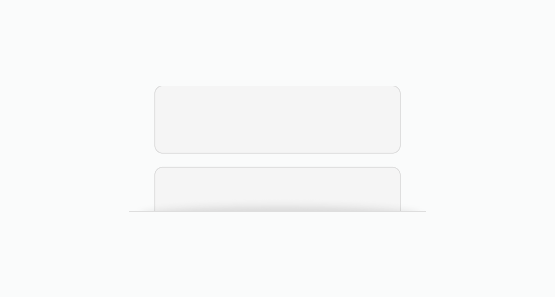
Set maxBlockSize to constrain the container height and enable scrolling. This example shows a list of order line items that scrolls when the content exceeds 120px.
Display a scrollable list
html
Anchor to Constrain tall contentConstrain tall content
Use scroll box to prevent tall content blocks from dominating the page layout. This example constrains three colored boxes within a 100px scrollable area.
html
Anchor to Add an accessible scrollable regionAdd an accessible scrollable region
Set accessibilityLabel to describe the scrollable content for screen reader users. This example shows an order activity timeline with delivery tracking events.
html
Anchor to Best practicesBest practices
- Set a reasonable max height: Choose a
maxBlockSizethat shows enough content for context while keeping the page layout manageable. Showing 2-3 visible items before scrolling gives customers a clear indication that more content is available. - Provide an accessibility label: Set
accessibilityLabelto describe the scrollable region so screen reader users understand what content is scrollable. - Don't nest scroll boxes: Avoid placing scroll boxes inside other scroll boxes. Nested scrollable regions create confusing navigation, especially for keyboard and assistive technology users.