Switch
The switch component provides a clear way for users to toggle options or settings on and off. Use switch for binary controls that take effect immediately, like enabling features, activating settings, or controlling visibility.
Switches provide instant visual feedback and are ideal for settings that don't require a save action to apply changes. For selections that require explicit submission, use checkbox instead.
Switch doesn't support error or required props. For a toggle that needs validation, use checkbox instead.
Supported targets
- customer-account.
footer. render-after - customer-account.
order-index. announcement. render - customer-account.
order-index. block. render - customer-account.
order-status. announcement. render - customer-account.
order-status. block. render - customer-account.
order-status. cart-line-item. render-after - customer-account.
order-status. cart-line-list. render-after - customer-account.
order-status. customer-information. render-after - customer-account.
order-status. fulfillment-details. render-after - customer-account.
order-status. payment-details. render-after - customer-account.
order-status. return-details. render-after - customer-account.
order-status. unfulfilled-items. render-after - customer-account.
order. action. menu-item. render - customer-account.
order. action. render - customer-account.
order. page. render - customer-account.
page. render - customer-account.
profile. addresses. render-after - customer-account.
profile. announcement. render - customer-account.
profile. block. render - customer-account.
profile. company-details. render-after - customer-account.
profile. company-location-addresses. render-after - customer-account.
profile. company-location-payment. render-after - customer-account.
profile. company-location-staff. render-after - customer-account.
profile. payment. render-after
Supported targets
- customer-account.
footer. render-after - customer-account.
order-index. announcement. render - customer-account.
order-index. block. render - customer-account.
order-status. announcement. render - customer-account.
order-status. block. render - customer-account.
order-status. cart-line-item. render-after - customer-account.
order-status. cart-line-list. render-after - customer-account.
order-status. customer-information. render-after - customer-account.
order-status. fulfillment-details. render-after - customer-account.
order-status. payment-details. render-after - customer-account.
order-status. return-details. render-after - customer-account.
order-status. unfulfilled-items. render-after - customer-account.
order. action. menu-item. render - customer-account.
order. action. render - customer-account.
order. page. render - customer-account.
page. render - customer-account.
profile. addresses. render-after - customer-account.
profile. announcement. render - customer-account.
profile. block. render - customer-account.
profile. company-details. render-after - customer-account.
profile. company-location-addresses. render-after - customer-account.
profile. company-location-payment. render-after - customer-account.
profile. company-location-staff. render-after - customer-account.
profile. payment. render-after
Anchor to Use casesUse cases
- Feature toggles: Let customers enable or disable optional features like order notifications or marketing preferences.
- Notification preferences: Allow customers to toggle order updates or marketing communications on or off.
- Pre-enabled defaults: Set commonly chosen options to on by default using
defaultChecked. - Disabled states: Show a non-interactive toggle when the option is locked or depends on another selection.
Anchor to PropertiesProperties
Configure the following properties on the switch component.
- Anchor to accessibilityLabelaccessibility
Labelaccessibility Label stringstring A label used for users using assistive technologies like screen readers. When set, any children or
labelsupplied will not be announced. This can also be used to display a control without a visual label, while still providing context to users using screen readers.- Anchor to checkedcheckedcheckedbooleanbooleanDefault: falseDefault: false
Whether the control is currently checked.
- Anchor to commandcommandcommand'--auto' | '--show' | '--hide' | '--toggle''--auto' | '--show' | '--hide' | '--toggle'Default: '--auto'Default: '--auto'
Sets the action the
target should take when this component is activated. Available options:'--auto': Performs the default action appropriate for the target component.'--show': Displays the target component if it's currently hidden.'--hide': Conceals the target component from view.'--toggle': Alternates the target component between visible and hidden states.'--copy': Copies the target clipboard item.
The supported actions vary by target component type. Learn more about the
commandattribute.- Anchor to commandForcommand
Forcommand For stringstring The ID of the component to control when this component is activated. Pair with the
commandproperty to specify what action to perform on the target component. Learn more about theattribute.When both
andhrefare set,takes precedence. The command runs and the link doesn't navigate.- Anchor to defaultCheckeddefault
Checkeddefault Checked booleanbooleanDefault: falseDefault: false Whether the control is checked by default.
- Anchor to disableddisableddisabledbooleanbooleanDefault: falseDefault: false
Whether the control is disabled, preventing any user interaction.
- Anchor to idididstringstring
A unique identifier for the element. Use this to reference the element in JavaScript, link labels to form controls, or target specific elements for styling or scripting.
- Anchor to labellabellabelstringstring
The text displayed as the control label, which identifies the purpose of the control to users. This label is associated with the control for accessibility.
- Anchor to namenamenamestringstring
The name attribute for the control, used to identify its value when the form is submitted. Must be unique within the nearest containing form.
- Anchor to valuevaluevaluestringstring
The value used in form data when the control is checked.
Anchor to EventsEvents
The switch component provides event callbacks for handling user interactions. Learn more about handling events.
- Anchor to changechangechangeCallbackEventListener<typeof tagName>CallbackEventListener<typeof tagName>
A callback fired when the switch value changes.
Learn more about the change event.
CallbackEventListener
A typed event listener for custom element events. The listener receives a `CallbackEvent` with the correct `currentTarget` type for the associated custom element tag.
(EventListener & {
      (event: CallbackEvent<TTagName, TEvent>): void;
    }) | null
CallbackEvent
An event type that narrows the `currentTarget` to the specific HTML element associated with the custom element tag. This provides type-safe event handling in callback listeners.
TEvent & {
  currentTarget: HTMLElementTagNameMap[TTagName];
}
Anchor to ExamplesExamples
Anchor to Toggle a settingToggle a setting
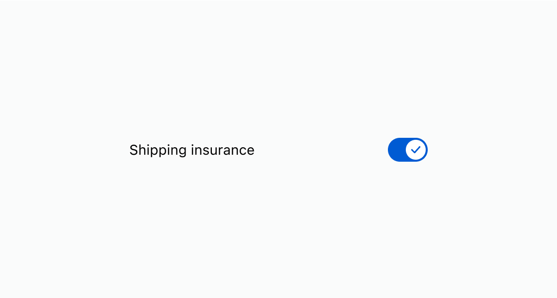
Give customers a clear way to turn a feature on or off. This example shows a switch with a descriptive label.Toggle a setting
html
Indicate when a setting isn't available. This example locks a switch to prevent interaction while displaying its current state.
html
Anchor to Group multiple settingsGroup multiple settings
Organize related preferences together in a settings panel. This example arranges switches in a stack to display notification preferences.html
Anchor to Best practicesBest practices
- Use for immediate effects: Reserve switches for settings that take effect immediately without a save or submit action.
- Write clear labels: Describe the setting being toggled, such as "Order notifications" rather than "Toggle" or "On/Off."
- Use checkbox for deferred actions: If the setting requires form submission to apply, use checkbox instead.
- Pre-enable thoughtfully: Only use
defaultCheckedfor options that benefit the customer by default.