Phone field
The phone field component captures phone number input. Use it to collect contact numbers for order updates, support follow-ups, or account verification.
Phone field supports validation, default values, and autocomplete for streamlined entry. For general text input, use text field.
Phone field doesn't include built-in formatting or country-code selection, and doesn't verify that a number is reachable or belongs to the customer. Implement validation in your extension and use the error prop to display results.
Supported targets
- customer-account.
footer. render-after - customer-account.
order-index. announcement. render - customer-account.
order-index. block. render - customer-account.
order-status. announcement. render - customer-account.
order-status. block. render - customer-account.
order-status. cart-line-item. render-after - customer-account.
order-status. cart-line-list. render-after - customer-account.
order-status. customer-information. render-after - customer-account.
order-status. fulfillment-details. render-after - customer-account.
order-status. payment-details. render-after - customer-account.
order-status. return-details. render-after - customer-account.
order-status. unfulfilled-items. render-after - customer-account.
order. action. menu-item. render - customer-account.
order. action. render - customer-account.
order. page. render - customer-account.
page. render - customer-account.
profile. addresses. render-after - customer-account.
profile. announcement. render - customer-account.
profile. block. render - customer-account.
profile. company-details. render-after - customer-account.
profile. company-location-addresses. render-after - customer-account.
profile. company-location-payment. render-after - customer-account.
profile. company-location-staff. render-after - customer-account.
profile. payment. render-after
Supported targets
- customer-account.
footer. render-after - customer-account.
order-index. announcement. render - customer-account.
order-index. block. render - customer-account.
order-status. announcement. render - customer-account.
order-status. block. render - customer-account.
order-status. cart-line-item. render-after - customer-account.
order-status. cart-line-list. render-after - customer-account.
order-status. customer-information. render-after - customer-account.
order-status. fulfillment-details. render-after - customer-account.
order-status. payment-details. render-after - customer-account.
order-status. return-details. render-after - customer-account.
order-status. unfulfilled-items. render-after - customer-account.
order. action. menu-item. render - customer-account.
order. action. render - customer-account.
order. page. render - customer-account.
page. render - customer-account.
profile. addresses. render-after - customer-account.
profile. announcement. render - customer-account.
profile. block. render - customer-account.
profile. company-details. render-after - customer-account.
profile. company-location-addresses. render-after - customer-account.
profile. company-location-payment. render-after - customer-account.
profile. company-location-staff. render-after - customer-account.
profile. payment. render-after
Anchor to Use casesUse cases
- Contact collection: Collect a phone number for order updates or support follow-ups.
- Pre-filled numbers: Display a default phone number for returning customers to confirm without retyping.
- Required validation: Enforce that a phone number is provided and display a message explaining why it's needed.
- Autocomplete support: Speed up entry by enabling browser autocomplete with the
autocompleteattribute.
Anchor to PropertiesProperties
Configure the following properties on the phone field component.
- Anchor to autocompleteautocompleteautocompleteAutocompleteField | `${AutocompleteSection} ${AutocompleteField}` | `${AutocompleteGroup} ${AutocompleteField}` | `${AutocompleteSection} ${AutocompleteGroup} ${AutocompleteField}` | "on" | "off"AutocompleteField | `${AutocompleteSection} ${AutocompleteField}` | `${AutocompleteGroup} ${AutocompleteField}` | `${AutocompleteSection} ${AutocompleteGroup} ${AutocompleteField}` | "on" | "off"Default: 'on'Default: 'on'
A hint about the intended content of the field for browser autofill.
When set to
on(the default), this property indicates that the field should support autofill, but you do not have any more semantic information on the intended contents.When set to
off, you are indicating that this field contains sensitive information, or contents that are never saved, like one-time codes.Alternatively, you can provide value which describes the specific data you would like to be entered into this field during autofill.
Learn more about the set of autocomplete values supported in browsers.
- Anchor to defaultValuedefault
Valuedefault Value stringstring The initial value of the field when it first loads. Unlike
placeholder, this is a real value that the user can edit and that gets submitted with the form. Once the user starts typing, their input replaces this value.- Anchor to disableddisableddisabledbooleanbooleanDefault: falseDefault: false
Whether the field is disabled, preventing any user interaction.
- Anchor to errorerrorerrorstringstring
An error message displayed below the field to indicate validation problems. When set, the field is styled with error indicators and the message is announced to screen readers.
- Anchor to idididstringstring
A unique identifier for the element. Use this to reference the element in JavaScript, link labels to form controls, or target specific elements for styling or scripting.
- Anchor to labellabellabelstringstring
The text displayed as the field label, which identifies the purpose of the field to users. This label is associated with the field for accessibility and helps users understand what information to provide.
- Anchor to labelAccessibilityVisibilitylabel
Accessibility Visibilitylabel Accessibility Visibility 'visible' | 'exclusive''visible' | 'exclusive'Default: 'visible'Default: 'visible' Controls whether the label is visible to all users or only to screen readers.
visible: The label is shown to everyone.exclusive: The label is visually hidden but still announced by screen readers.
- Anchor to namenamenamestringstring
The name attribute for the field, used to identify the field's value when the form is submitted. Must be unique within the nearest containing form.
- Anchor to readOnlyread
Onlyread Only booleanbooleanDefault: falseDefault: false Whether the field is read-only and can't be edited. Read-only fields remain focusable and their content is announced by screen readers.
- Anchor to requiredrequiredrequiredbooleanbooleanDefault: falseDefault: false
Whether the field needs a value. This requirement adds semantic value to the field, but it will not cause an error to appear automatically. If you want to present an error when this field is empty, you can do so with the
errorproperty.- Anchor to typetypetype'mobile' | '''mobile' | ''Default: ''Default: ''
The type of phone number to collect. Specific styling may be applied to each type to provide extra guidance to users. No additional validation is performed based on the type.
Styling hint for the input keyboard. Doesn't validate the phone number format. Implement validation in your extension and use the
errorprop to show results.- Anchor to valuevaluevaluestringstring
The current value for the field. If omitted, the field will be empty.
AutocompleteSection
The “section” scopes the autocomplete data that should be inserted to a specific area of the page. Commonly used when there are multiple fields with the same autocomplete needs in the same page. For example: 2 shipping address forms in the same page.
`section-${string}`AutocompleteGroup
The contact information group the autocomplete data should be sourced from.
"shipping" | "billing"Anchor to EventsEvents
The phone field component provides event callbacks for handling user interactions. Learn more about handling events.
- Anchor to blurblurblurCallbackEventListener<typeof tagName>CallbackEventListener<typeof tagName>
A callback fired when the phone field loses focus.
Learn more about the blur event.
- Anchor to changechangechangeCallbackEventListener<typeof tagName>CallbackEventListener<typeof tagName>
A callback fired when the phone field value changes.
Learn more about the change event.
- Anchor to focusfocusfocusCallbackEventListener<typeof tagName>CallbackEventListener<typeof tagName>
A callback fired when the phone field receives focus.
Learn more about the focus event.
- Anchor to inputinputinputCallbackEventListener<typeof tagName>CallbackEventListener<typeof tagName>
A callback fired when the user inputs data into the phone field.
Learn more about the input event.
CallbackEventListener
A typed event listener for custom element events. The listener receives a `CallbackEvent` with the correct `currentTarget` type for the associated custom element tag.
(EventListener & {
      (event: CallbackEvent<TTagName, TEvent>): void;
    }) | null
CallbackEvent
An event type that narrows the `currentTarget` to the specific HTML element associated with the custom element tag. This provides type-safe event handling in callback listeners.
TEvent & {
  currentTarget: HTMLElementTagNameMap[TTagName];
}
Anchor to SlotsSlots
The phone field component supports slots for additional content placement within the component. Learn more about using slots.
- Anchor to accessoryaccessoryaccessoryHTMLElementHTMLElement
Additional interactive content displayed within the field. Accepts button and clickable components with text content only. Other component types or complex layouts are not supported.
Anchor to ExamplesExamples
Anchor to Collect a phone numberCollect a phone number
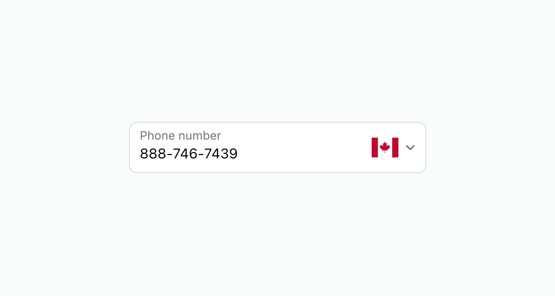
Display a phone input with country code formatting and a pre-filled value. This example shows a phone field with a label and defaultValue.Collect a phone number
html
Anchor to Require a phone number with validationRequire a phone number with validation
Enforce that a phone number is provided before the form can be submitted. This example shows a phone field with required and an error message.html
Anchor to Enable browser autocompleteEnable browser autocomplete
Speed up phone number entry by enabling browser autocomplete suggestions. This example shows an s-phone-field with autocomplete set to tel.html
Anchor to Best practicesBest practices
- Label with context: Use labels like "Contact number" or "Mobile number" to clarify the expected type of phone number.
- Explain why it's needed: When requiring a phone number, use the
errorprop to explain why, such as "Required for delivery updates." - Use autocomplete: Set the
autocompleteattribute totelto help customers fill in the field faster.