Menu
The menu component displays a list of actions that can be performed on a resource or within a specific context. Use menu to present multiple related actions in a compact dropdown format, reducing visual clutter while maintaining discoverability.
Menus support action grouping and keyboard navigation for efficient interaction.
Menu accepts only s-button elements as direct children, and doesn't support nested submenus. All actions appear in a single flat list.
Supported targets
- customer-account.
footer. render-after - customer-account.
order-index. announcement. render - customer-account.
order-index. block. render - customer-account.
order-status. announcement. render - customer-account.
order-status. block. render - customer-account.
order-status. cart-line-item. render-after - customer-account.
order-status. cart-line-list. render-after - customer-account.
order-status. customer-information. render-after - customer-account.
order-status. fulfillment-details. render-after - customer-account.
order-status. payment-details. render-after - customer-account.
order-status. return-details. render-after - customer-account.
order-status. unfulfilled-items. render-after - customer-account.
order. action. menu-item. render - customer-account.
order. action. render - customer-account.
order. page. render - customer-account.
page. render - customer-account.
profile. addresses. render-after - customer-account.
profile. announcement. render - customer-account.
profile. block. render - customer-account.
profile. company-details. render-after - customer-account.
profile. company-location-addresses. render-after - customer-account.
profile. company-location-payment. render-after - customer-account.
profile. company-location-staff. render-after - customer-account.
profile. payment. render-after
Supported targets
- customer-account.
footer. render-after - customer-account.
order-index. announcement. render - customer-account.
order-index. block. render - customer-account.
order-status. announcement. render - customer-account.
order-status. block. render - customer-account.
order-status. cart-line-item. render-after - customer-account.
order-status. cart-line-list. render-after - customer-account.
order-status. customer-information. render-after - customer-account.
order-status. fulfillment-details. render-after - customer-account.
order-status. payment-details. render-after - customer-account.
order-status. return-details. render-after - customer-account.
order-status. unfulfilled-items. render-after - customer-account.
order. action. menu-item. render - customer-account.
order. action. render - customer-account.
order. page. render - customer-account.
page. render - customer-account.
profile. addresses. render-after - customer-account.
profile. announcement. render - customer-account.
profile. block. render - customer-account.
profile. company-details. render-after - customer-account.
profile. company-location-addresses. render-after - customer-account.
profile. company-location-payment. render-after - customer-account.
profile. company-location-staff. render-after - customer-account.
profile. payment. render-after
Anchor to Use casesUse cases
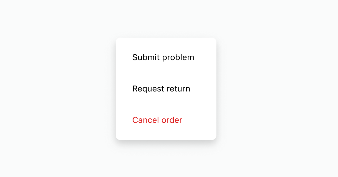
- Order actions: Consolidate order management actions like "Submit problem," "Request return," and "Cancel order" in a popover menu.
- Subscription management: Provide subscription actions like "Skip order," "Change frequency," and "Cancel" in a compact menu.
- Help and support: Group help-related actions like "Visit help center" and "Contact support" in a menu.
Anchor to PropertiesProperties
Configure the following properties on the menu component.
- stringstring
A label that describes the purpose of the menu for users of assistive technologies such as screen readers. Use this to provide context about the available actions, such as "Order actions" or "Account settings."
- stringstring
A unique identifier for the element. Use this to target the element with CSS, JavaScript, or accessibility attributes. The
idmust be unique within the document.
Configure the following properties on buttons placed inside the menu component.
- stringstring
A label that describes the purpose or contents of the Button. It will be read to users using assistive technologies such as screen readers.
Use this when using only an icon or the button text is not enough context for users using assistive technologies.
- ((event: CallbackEventListener<typeof buttonTagName>) => void) | null((event: CallbackEventListener<typeof buttonTagName>) => void) | null
Callback when the button is activated. This will be called before the action indicated by
type.- '--auto' | '--show' | '--hide' | '--toggle' | '--copy''--auto' | '--show' | '--hide' | '--toggle' | '--copy'Default: '--auto'Default: '--auto'
Sets the action the
target should take when this component is activated.--auto: A default action for the target component.--show: Shows the target component.--hide: Hides the target component.--toggle: Toggles the target component.--copy: Copies the target clipboard item.
Learn more about the
commandattribute.- stringstring
The ID of the component to control when this component is activated. Pair with the
commandproperty to specify what action to perform on the target component. Learn more about theattribute.- booleanbooleanDefault: falseDefault: false
Disables the button, disallowing any interaction.
- stringstring
The URL to link to.
- If set, it will navigate to the location specified by
hrefafter executing thecallback. - If a
is set, thecommandwill be executed instead of the navigation.
- If set, it will navigate to the location specified by
- stringstring
A unique identifier for the element.
- booleanbooleanDefault: falseDefault: false
Replaces content with a loading indicator.
- 'auto' | '_self' | '_blank''auto' | '_self' | '_blank'Default: 'auto'Default: 'auto'
Specifies where to display the linked URL.
- 'auto' | 'neutral' | 'critical''auto' | 'neutral' | 'critical'Default: 'auto'Default: 'auto'
Sets the tone of the Button, based on the intention of the information being conveyed.
- 'button' | 'submit''button' | 'submit'Default: 'button'Default: 'button'
The behavior of the button.
'submit': Submits the nearest containing form.'button': Performs no default action, relying on theclickevent handler for behavior.
This property is ignored if the component supports
hrefor/commandand one of them is set.
CallbackEventListener
A typed event listener for custom element events. The listener receives a `CallbackEvent` with the correct `currentTarget` type for the associated custom element tag.
(EventListener & {
      (event: CallbackEvent<TTagName, TEvent>): void;
    }) | null
CallbackEvent
An event type that narrows the `currentTarget` to the specific HTML element associated with the custom element tag. This provides type-safe event handling in callback listeners.
TEvent & {
  currentTarget: HTMLElementTagNameMap[TTagName];
}
Anchor to ExamplesExamples
Anchor to Add order management actionsAdd order management actions
Display a menu with actions for managing an order. This example shows an s-menu with buttons for submitting a problem, requesting a return, and canceling an order.Add order management actions
html
Anchor to Organize items into sectionsOrganize items into sections
Organize menu items into labeled sections. This example shows an s-menu with s-section headings separating help resources from support options.html
Use a menu to group subscription management actions, including a critical action. This example shows a secondary button that opens a menu with actions for managing a subscription.
html
Anchor to Best practicesBest practices
- Place menus consistently: Position menus in the upper-right of full-page extensions to match account pages like order status.
- Group related actions: Keep related actions in a single menu rather than scattering buttons across the page.
- Limit items to what's relevant: Include only actions that matter for the current page to reduce decision fatigue.
- Order by frequency and risk: List the most common or least risky actions at the top so they're easy to reach.
- Write concise labels: Use short labels that start with a verb and use sentence case, such as "Edit address" or "Cancel order."