Customer account action
The customer account action component displays a modal to complete an order action flow. This component can only be used to populate the order action extension target, which renders as a result of the customer clicking the order action button rendered via the order action menu item extension target.
Customer account action renders only within the customer-account.order.action.render extension target. The modal supports a single-step interaction only — multi-step flows aren't supported.
Supported targets
- customer-account.
footer. render-after - customer-account.
order-index. announcement. render - customer-account.
order-index. block. render - customer-account.
order-status. announcement. render - customer-account.
order-status. block. render - customer-account.
order-status. cart-line-item. render-after - customer-account.
order-status. cart-line-list. render-after - customer-account.
order-status. customer-information. render-after - customer-account.
order-status. fulfillment-details. render-after - customer-account.
order-status. payment-details. render-after - customer-account.
order-status. return-details. render-after - customer-account.
order-status. unfulfilled-items. render-after - customer-account.
order. action. menu-item. render - customer-account.
order. action. render - customer-account.
order. page. render - customer-account.
page. render - customer-account.
profile. addresses. render-after - customer-account.
profile. announcement. render - customer-account.
profile. block. render - customer-account.
profile. company-details. render-after - customer-account.
profile. company-location-addresses. render-after - customer-account.
profile. company-location-payment. render-after - customer-account.
profile. company-location-staff. render-after - customer-account.
profile. payment. render-after
Supported targets
- customer-account.
footer. render-after - customer-account.
order-index. announcement. render - customer-account.
order-index. block. render - customer-account.
order-status. announcement. render - customer-account.
order-status. block. render - customer-account.
order-status. cart-line-item. render-after - customer-account.
order-status. cart-line-list. render-after - customer-account.
order-status. customer-information. render-after - customer-account.
order-status. fulfillment-details. render-after - customer-account.
order-status. payment-details. render-after - customer-account.
order-status. return-details. render-after - customer-account.
order-status. unfulfilled-items. render-after - customer-account.
order. action. menu-item. render - customer-account.
order. action. render - customer-account.
order. page. render - customer-account.
page. render - customer-account.
profile. addresses. render-after - customer-account.
profile. announcement. render - customer-account.
profile. block. render - customer-account.
profile. company-details. render-after - customer-account.
profile. company-location-addresses. render-after - customer-account.
profile. company-location-payment. render-after - customer-account.
profile. company-location-staff. render-after - customer-account.
profile. payment. render-after
Anchor to Use casesUse cases
- Order modifications: Let customers request returns, edit shipping addresses, or cancel orders through a focused modal.
- Confirmation flows: Present confirmation dialogs for destructive actions that require explicit customer consent.
- Quick actions: Collect minimal information from customers to complete a task without leaving the current page.
Anchor to PropertiesProperties
Configure the following properties on the customer account action component.
- Anchor to headingheadingheadingstringstringrequiredrequired
The main title displayed at the top of the action modal, rendered in the header alongside the close button. Use a short, descriptive phrase that tells the customer what the action does, such as "Request a return" or "Edit shipping address."
- Anchor to idididstringstring
A unique identifier for the element. Use this to target the element with CSS, JavaScript, or accessibility attributes. The
idmust be unique within the document.
Anchor to SlotsSlots
The customer account action component supports slots for additional content placement within the component. Learn more about using slots.
- Anchor to primary-actionprimary-actionprimary-actionHTMLElementHTMLElement
The primary action for the modal. Accepts a single button element. Use this for the main confirmation action, such as "Submit" or "Confirm."
- Anchor to secondary-actionssecondary-actionssecondary-actionsHTMLElementHTMLElement
The secondary actions for the modal. Accepts multiple button elements. Use this for dismissive actions like "Cancel" or alternative actions.
Configure the following properties on slot action buttons.
- stringstring
A label that describes the purpose or contents of the Button. It will be read to users using assistive technologies such as screen readers.
Use this when using only an icon or the button text is not enough context for users using assistive technologies.
- ((event: CallbackEventListener<typeof buttonTagName>) => void) | null((event: CallbackEventListener<typeof buttonTagName>) => void) | null
Callback when the button is activated. This will be called before the action indicated by
type.- '--auto' | '--show' | '--hide' | '--toggle' | '--copy''--auto' | '--show' | '--hide' | '--toggle' | '--copy'Default: '--auto'Default: '--auto'
Sets the action the
target should take when this component is activated.--auto: A default action for the target component.--show: Shows the target component.--hide: Hides the target component.--toggle: Toggles the target component.--copy: Copies the target clipboard item.
Learn more about the
commandattribute.- stringstring
The ID of the component to control when this component is activated. Pair with the
commandproperty to specify what action to perform on the target component. Learn more about theattribute.- booleanbooleanDefault: falseDefault: false
Disables the button, disallowing any interaction.
- stringstring
The URL to link to.
- If set, it will navigate to the location specified by
hrefafter executing thecallback. - If a
is set, thecommandwill be executed instead of the navigation.
- If set, it will navigate to the location specified by
- booleanbooleanDefault: falseDefault: false
Replaces content with a loading indicator.
CallbackEventListener
A typed event listener for custom element events. The listener receives a `CallbackEvent` with the correct `currentTarget` type for the associated custom element tag.
(EventListener & {
      (event: CallbackEvent<TTagName, TEvent>): void;
    }) | null
CallbackEvent
An event type that narrows the `currentTarget` to the specific HTML element associated with the custom element tag. This provides type-safe event handling in callback listeners.
TEvent & {
  currentTarget: HTMLElementTagNameMap[TTagName];
}
Anchor to ExamplesExamples
Anchor to Create a basic action modalCreate a basic action modal
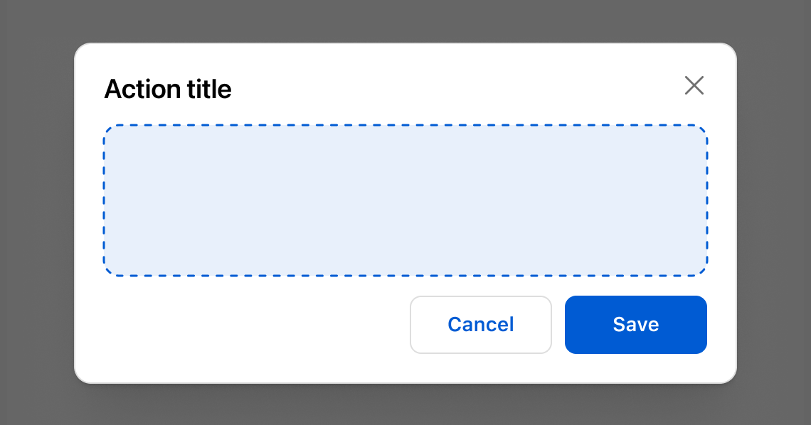
Display a basic action modal with a heading and action buttons. This example shows an s-customer-account-action with a title, primary Save button, and secondary Cancel button.Create a basic action modal
html
Anchor to Add a form to the modalAdd a form to the modal
Collect input within the action modal using form fields. This example shows an s-customer-account-action with text fields for editing a shipping address.html
Anchor to Show a loading stateShow a loading state
Display a loading indicator on the primary action while an operation completes. This example shows an s-customer-account-action with a loading attribute on the primary button.html
Anchor to Best practicesBest practices
- Highlight the key decision: Present the essential details and actions needed to confirm or complete an order task.
- Collect only what's necessary: Request the minimum information required to finish the task so the flow stays quick and friction-free.
- Keep forms simple: Use clear labels, intuitive actions, and concise copy so customers know what's required and what happens next.
- Use full-page extensions for complex flows: If the task spans multiple steps or needs extensive input, switch to a full-page extension instead of a modal.