Scroll
ScrollView is a container for long form content, such as order summary line items, that allows for scrolling so customers can expose more content as they view.
Anchor to scrollviewpropsScrollViewProps
- Anchor to accessibilityLabelaccessibilityLabelstring
A label that describes the purpose or contents of the element. When set, it will be announced to buyers using assistive technologies and will provide them with more context.
- Anchor to backgroundbackgroundMaybeConditionalStyle<Background>Default: 'transparent'
Adjust the background.
- Anchor to borderborderMaybeResponsiveConditionalStyle<MaybeShorthandProperty<BorderStyle>>
Adjust the border style.
To shorten the code, it is possible to specify all the border style properties in one property.
For example:
basemeans blockStart, inlineEnd, blockEnd and inlineStart border styles arebase['base', 'none']means blockStart and blockEnd border styles arebase, inlineStart and inlineEnd border styles arenone['base', 'none', 'dotted', 'base']means blockStart border style isbase, inlineEnd border style isnone, blockEnd border style isdottedand blockStart border style isbase
- Anchor to borderWidthborderWidthMaybeResponsiveConditionalStyle< MaybeShorthandProperty<BorderWidth> >
Adjust the border width.
To shorten the code, it is possible to specify all the border width properties in one property.
For example:
basemeans blockStart, inlineEnd, blockEnd and inlineStart border widths arebase['base', 'medium']means blockStart and blockEnd border widths arebase, inlineStart and inlineEnd border widths aremedium['base', 'medium', 'medium', 'base']means blockStart border width isbase, inlineEnd border width ismedium, blockEnd border width ismediumand blockStart border width isbase
- Anchor to cornerRadiuscornerRadiusMaybeResponsiveConditionalStyle< MaybeShorthandProperty<CornerRadius> >
Adjust the corner radius.
Provide a single value to apply the same corner radius to all four corners, two values to apply different corner radii to opposing corners, or four values to apply different corner radii to each individual corner.
For example:
basemeans all 4 corner radii arebase['base', 'none']means the StartStart and EndEnd corner radii arebase, StartEnd and EndStart corner radii arenone. When the context’s language direction is left to right, StartStart and EndEnd corners are the top left and bottom right corners while StartEnd and EndStart corners are the top right and bottom left corners.['base', 'none', 'small', 'base']means StartStart corner radius isbase, StartEnd corner radius isnone, EndEnd corner radius issmalland EndStart corner radius isbase
A
alias is available for this property. When both are specified,takes precedence.- Anchor to directiondirection'block' | 'inline'Default: block
The direction on which the content is scrollable.
block: Indicates that the content is scrollable on the main axis.inline: Indicates that the content is scrollable on the cross axis.- Anchor to displaydisplayMaybeResponsiveConditionalStyle<'auto' | 'none'>Default: 'auto'
Changes the display of the component.
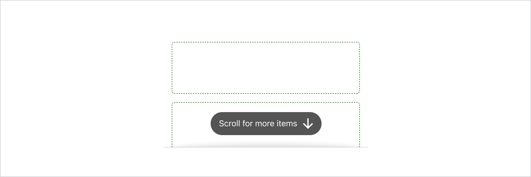
autothe component's initial value. The actual value depends on the component and context.nonehides the component and removes it from the accessibility tree, making it invisible to screen readers.- Anchor to hinthint'innerShadow' | {type: 'pill'; content: string}
Provides a hint to the user that the area is scrollable.
pill: renders a pill with a message at the end of the the scrollable area. It disappear as soon as the user starts scrolling.: renders an inner visual hint to indicate that the content is scrollable.- string
A unique identifier for the component.
- Anchor to maxBlockSizemaxBlockSizeMaybeResponsiveConditionalStyle< number | `${number}%` | 'fill' >
Adjust the maximum block size.
number: size in pixels.`${number}%`: size in percentages.fill: takes all the available space.- Anchor to maxInlineSizemaxInlineSizeMaybeResponsiveConditionalStyle< number | `${number}%` | 'fill' >
Adjust the maximum inline size.
number: size in pixels.`${number}%`: size in percentages.fill: takes all the available space.- Anchor to minBlockSizeminBlockSizeMaybeResponsiveConditionalStyle< number | `${number}%` | 'fill' >
Adjust the block size.
number: size in pixels.`${number}%`: size in percentages.fill: takes all the available space.- Anchor to minInlineSizeminInlineSizeMaybeResponsiveConditionalStyle< number | `${number}%` | 'fill' >
Adjust the minimum inline size.
number: size in pixels.`${number}%`: size in percentages.fill: takes all the available space.\- Anchor to onScrollonScroll(args: ScrollViewEvent) => void
Callback function that is called when the scroll position changes. Allows to listen to events inside the component returning the position of the scroll.
Note: On touch devices, the onScroll event is fired only when the user finishes scrolling which differs from non touch devices, where the onScroll event is fired when the user scrolls
- Anchor to onScrolledToEdgeonScrolledToEdge(args: ScrollViewEvent) => void
Callback function that is called when the scroll position reaches one of the edges.
- Anchor to paddingpaddingMaybeResponsiveConditionalStyle<MaybeShorthandProperty<Spacing>>
Adjust the padding.
To shorten the code, it is possible to specify all the padding properties in one property.
Examples:
basemeans blockStart, inlineEnd, blockEnd and inlineStart paddings arebase[
base,none] means blockStart and blockEnd paddings arebase, inlineStart and inlineEnd paddings arenone[
base,none,loose,tight] means blockStart padding isbase, inlineEnd padding isnone, blockEnd padding islooseand blockStart padding istight
- Anchor to scrollToscrollTonumber | HTMLElement
Scroll to a specific position or to an element when the component is first rendered.
This property allows you to set an initial scroll position or scroll to a specific element when the
component mounts. Note that this action will only be performed once, during the initial render of the component.
MaybeConditionalStyle
A type that represents a value that can be a conditional style. We highly recommend using the `Style` helper which simplifies the creation of conditional styles. To learn more check out the [conditional styles](/api/checkout-ui-extensions/components/utilities/stylehelper) documentation.
T | ConditionalStyle<T, AcceptedConditions>ConditionalStyle
- conditionals
An array of conditional values.
ConditionalValue<T, AcceptedConditions>[] - default
The default value applied when none of the conditional values specified in `conditionals` are met.
T
export interface ConditionalStyle<
  T,
  AcceptedConditions extends BaseConditions = Conditions,
> {
  /**
   * The default value applied when none of the conditional values
   * specified in `conditionals` are met.
   */
  default?: T;
  /**
   * An array of conditional values.
   */
  conditionals: ConditionalValue<T, AcceptedConditions>[];
}
ConditionalValue
- conditions
The conditions that must be met for the value to be applied. At least one condition must be specified.
AcceptedConditions - value
The value that will be applied if the conditions are met.
T
export interface ConditionalValue<
  T,
  AcceptedConditions extends BaseConditions = Conditions,
> {
  /**
   * The conditions that must be met for the value to be applied. At least one
   * condition must be specified.
   */
  conditions: AcceptedConditions;
  /**
   * The value that will be applied if the conditions are met.
   */
  value: T;
}
Background
'transparent' | 'base' | 'subdued'MaybeResponsiveConditionalStyle
A type that represents a value that can be a conditional style. The conditions are based on the viewport size. We highly recommend using the `Style` helper which simplifies the creation of conditional styles. To learn more check out the [conditional styles](/api/checkout-ui-extensions/components/utilities/stylehelper) documentation.
T | ConditionalStyle<T, ViewportSizeCondition>ViewportSizeCondition
- viewportInlineSize
{ min: T; }
export interface ViewportSizeCondition<T = ViewportInlineSize> {
  viewportInlineSize: {min: T};
}
MaybeShorthandProperty
T | ShorthandProperty<T>ShorthandProperty
[T, T] | [T, T, T, T]BorderStyle
'base' | 'dashed' | 'dotted' | 'none'BorderWidth
'base' | 'medium' | 'thick'CornerRadius
'base' | 'small' | 'large' | 'fullyRounded' | 'none' | CornerRadiusDeprecatedCornerRadiusDeprecated
'tight' | 'loose'ScrollViewEvent
- position
The current scroll position, in pixels.
{ inline: number; block: number; } - scrolledTo
A flag to indicate if the scroll is at the start or end of an axis.
{ inline: "start" | "end"; block: "start" | "end"; }
export interface ScrollViewEvent {
  /**
   * The current scroll position, in pixels.
   */
  position: {
    /** The current scroll horizontal position, in pixels.*/
    inline: number;
    /** The current scroll vertical position, in pixels.*/
    block: number;
  };
  /**
   * A flag to indicate if the scroll is at the start or end of an axis.
   */
  scrolledTo: {
    /** A flag to indicate if the scroll is at the start or end of cross axis. */
    inline: 'start' | 'end' | null;
    /** A flag to indicate if the scroll is at the start or end of main axis. */
    block: 'start' | 'end' | null;
  };
}
Spacing
'none' | 'extraTight' | 'tight' | 'base' | 'loose' | 'extraLoose'Basic Scrollview
Examples
Basic Scrollview
React
import {
  reactExtension,
  ScrollView,
  View,
} from '@shopify/ui-extensions-react/checkout';

export default reactExtension(
  'purchase.checkout.block.render',
  () => <Extension />,
);

function Extension() {
  return (
    <ScrollView maxBlockSize={300}>
      <View
        border="base"
        padding="base"
        minBlockSize={50}
      >
        View
      </View>
      <View
        border="base"
        padding="base"
        minBlockSize={50}
      >
        View
      </View>
      <View
        border="base"
        padding="base"
        minBlockSize={50}
      >
        View
      </View>
      <View
        border="base"
        padding="base"
        minBlockSize={50}
      >
        View
      </View>
      <View
        border="base"
        padding="base"
        minBlockSize={50}
      >
        View
      </View>
    </ScrollView>
  );
}
JS
import {extension, ScrollView, View} from '@shopify/ui-extensions/checkout';

export default extension('purchase.checkout.block.render', (root) => {
  const scrollView = root.createComponent(ScrollView, {maxBlockSize: 400}, [
    root.createComponent(
      View,
      {border: 'base', padding: 'base', minBlockSize: 50},
      'View',
    ),
    root.createComponent(
      View,
      {border: 'base', padding: 'base', minBlockSize: 50},
      'View',
    ),
    root.createComponent(
      View,
      {border: 'base', padding: 'base', minBlockSize: 50},
      'View',
    ),
    root.createComponent(
      View,
      {border: 'base', padding: 'base', minBlockSize: 50},
      'View',
    ),
    root.createComponent(
      View,
      {border: 'base', padding: 'base', minBlockSize: 50},
      'View',
    ),
    root.createComponent(
      View,
      {border: 'base', padding: 'base', minBlockSize: 50},
      'View',
    ),
  ]);

  root.appendChild(scrollView);
});
Preview