Inline
InlineLayout is used to lay out content over multiple columns.
By default, all columns are of equal size and fill the available inline space. Content does not wrap on new rows when not enough columns have been explicitly set, instead they are added as new column and fill the remaining inline space.
Anchor to inlinelayoutpropsInlineLayoutProps
- Anchor to accessibilityLabelaccessibilityLabelstring
A label that describes the purpose or contents of the element. When set, it will be announced to buyers using assistive technologies and will provide them with more context.
- Anchor to accessibilityRoleaccessibilityRoleViewLikeAccessibilityRole
Sets the semantic meaning of the component’s content. When set, the role will be used by assistive technologies to help buyers navigate the page.
For example:
In an HTML host a
tuple will render:<li role='separator'>In an HTML host a
string will render:<li>
- Anchor to blockAlignmentblockAlignmentMaybeResponsiveConditionalStyle<BlockAlignment>
Position children along the cross axis.
- Anchor to borderborderMaybeResponsiveConditionalStyle<MaybeShorthandProperty<BorderStyle>>
Adjust the border style.
To shorten the code, it is possible to specify all the border style properties in one property.
For example:
basemeans blockStart, inlineEnd, blockEnd and inlineStart border styles arebase['base', 'none']means blockStart and blockEnd border styles arebase, inlineStart and inlineEnd border styles arenone['base', 'none', 'dotted', 'base']means blockStart border style isbase, inlineEnd border style isnone, blockEnd border style isdottedand blockStart border style isbase
- Anchor to borderWidthborderWidthMaybeResponsiveConditionalStyle< MaybeShorthandProperty<BorderWidth> >
Adjust the border width.
To shorten the code, it is possible to specify all the border width properties in one property.
For example:
basemeans blockStart, inlineEnd, blockEnd and inlineStart border widths arebase['base', 'medium']means blockStart and blockEnd border widths arebase, inlineStart and inlineEnd border widths aremedium['base', 'medium', 'medium', 'base']means blockStart border width isbase, inlineEnd border width ismedium, blockEnd border width ismediumand blockStart border width isbase
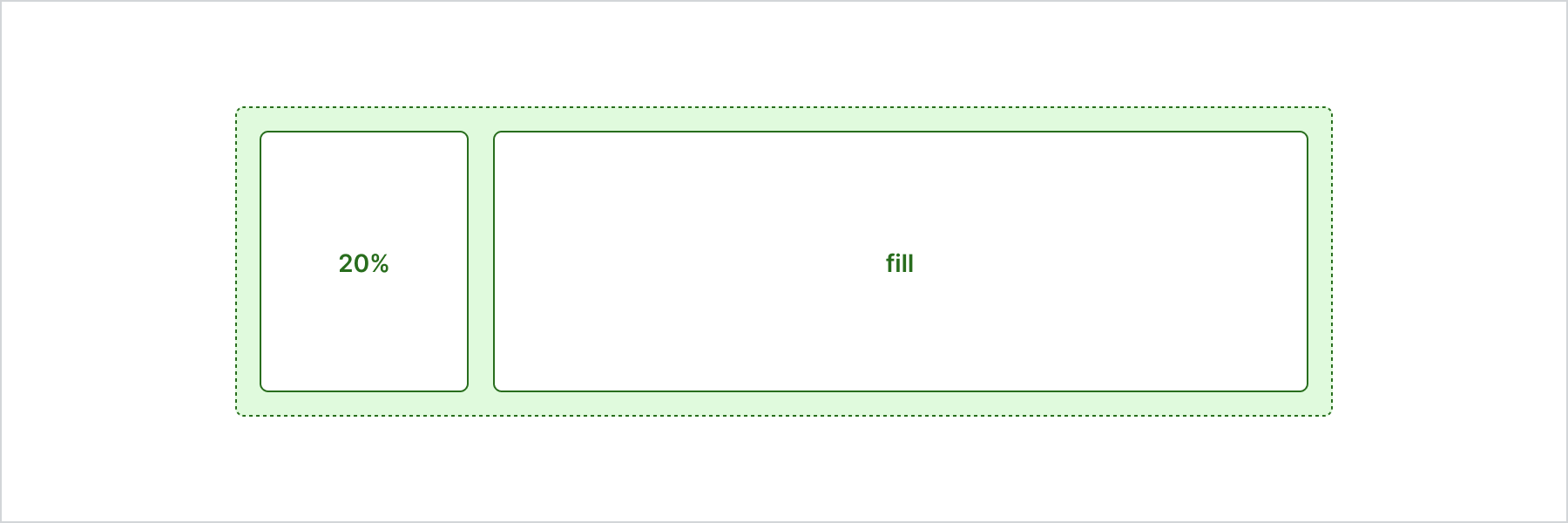
- Anchor to columnscolumnsMaybeResponsiveConditionalStyle<Columns>Default: 'fill'
Sizes for each column of the layout.
auto: intrinsic size of the element.fill: fills the remaining available space. When multiple elements are set tofill, the remaining space is shared equally.`${number}%`: size in percentages.`${number}fr`: size in fractions.number: size in pixels.When the sum of the defined sizes is larger than the available space, elements will shrink to avoid overflow.
When the size of an element is not explicitly set, it will fill the remaining space available.
When only one size is set and outside of an array, all elements of the layout will take that size.
- Anchor to cornerRadiuscornerRadiusMaybeResponsiveConditionalStyle< MaybeShorthandProperty<CornerRadius> >
Adjust the corner radius.
Provide a single value to apply the same corner radius to all four corners, two values to apply different corner radii to opposing corners, or four values to apply different corner radii to each individual corner.
For example:
basemeans all 4 corner radii arebase['base', 'none']means the StartStart and EndEnd corner radii arebase, StartEnd and EndStart corner radii arenone. When the context’s language direction is left to right, StartStart and EndEnd corners are the top left and bottom right corners while StartEnd and EndStart corners are the top right and bottom left corners.['base', 'none', 'small', 'base']means StartStart corner radius isbase, StartEnd corner radius isnone, EndEnd corner radius issmalland EndStart corner radius isbase
A
alias is available for this property. When both are specified,takes precedence.- Anchor to displaydisplayMaybeResponsiveConditionalStyle<'auto' | 'none'>Default: 'auto'
Changes the display of the component.
autothe component's initial value. The actual value depends on the component and context.nonehides the component and removes it from the accessibility tree, making it invisible to screen readers.- string
A unique identifier for the component.
- Anchor to inlineAlignmentinlineAlignmentMaybeResponsiveConditionalStyle<InlineAlignment>
Position children along the main axis.
- Anchor to maxBlockSizemaxBlockSizeMaybeResponsiveConditionalStyle< number | `${number}%` | 'fill' >
Adjust the maximum block size.
number: size in pixels.`${number}%`: size in percentages.fill: takes all the available space.- Anchor to maxInlineSizemaxInlineSizeMaybeResponsiveConditionalStyle< number | `${number}%` | 'fill' >
Adjust the maximum inline size.
number: size in pixels.`${number}%`: size in percentages.fill: takes all the available space.- Anchor to minBlockSizeminBlockSizeMaybeResponsiveConditionalStyle< number | `${number}%` | 'fill' >
Adjust the block size.
number: size in pixels.`${number}%`: size in percentages.fill: takes all the available space.- Anchor to minInlineSizeminInlineSizeMaybeResponsiveConditionalStyle< number | `${number}%` | 'fill' >
Adjust the minimum inline size.
number: size in pixels.`${number}%`: size in percentages.fill: takes all the available space.\- Anchor to overflowoverflow'hidden' | 'visible'Default: 'visible'
Sets the overflow behavior of the element.
hidden: clips the content when it is larger than the element’s container. The element will not be scrollable and the users will not be able to access the clipped content by dragging or using a scroll wheel.visible: the content that extends beyond the element’s container is visible.- Anchor to paddingpaddingMaybeResponsiveConditionalStyle<MaybeShorthandProperty<Spacing>>
Adjust the padding.
To shorten the code, it is possible to specify all the padding properties in one property.
Examples:
basemeans blockStart, inlineEnd, blockEnd and inlineStart paddings arebase[
base,none] means blockStart and blockEnd paddings arebase, inlineStart and inlineEnd paddings arenone[
base,none,loose,tight] means blockStart padding isbase, inlineEnd padding isnone, blockEnd padding islooseand blockStart padding istight
- Anchor to spacingspacingMaybeResponsiveConditionalStyle<Spacing | [Spacing, Spacing]>Default: 'none'
Adjust spacing between children.
basemeans the space between rows and columns isbase.[
base,none] means the space between rows isbase, space between columns isnone.
ViewLikeAccessibilityRole
NonPresentationalAccessibilityRole | [NonPresentationalAccessibilityRole, NonPresentationalAccessibilityRole]NonPresentationalAccessibilityRole
'main' | 'header' | 'footer' | 'section' | 'complementary' | 'navigation' | 'orderedList' | 'listItem' | 'unorderedList' | 'separator' | 'status' | 'alert'MaybeResponsiveConditionalStyle
A type that represents a value that can be a conditional style. The conditions are based on the viewport size. We highly recommend using the `Style` helper which simplifies the creation of conditional styles. To learn more check out the [conditional styles](/api/checkout-ui-extensions/components/utilities/stylehelper) documentation.
T | ConditionalStyle<T, ViewportSizeCondition>ConditionalStyle
- conditionals
An array of conditional values.
ConditionalValue<T, AcceptedConditions>[] - default
The default value applied when none of the conditional values specified in `conditionals` are met.
T
export interface ConditionalStyle<
  T,
  AcceptedConditions extends BaseConditions = Conditions,
> {
  /**
   * The default value applied when none of the conditional values
   * specified in `conditionals` are met.
   */
  default?: T;
  /**
   * An array of conditional values.
   */
  conditionals: ConditionalValue<T, AcceptedConditions>[];
}
ConditionalValue
- conditions
The conditions that must be met for the value to be applied. At least one condition must be specified.
AcceptedConditions - value
The value that will be applied if the conditions are met.
T
export interface ConditionalValue<
  T,
  AcceptedConditions extends BaseConditions = Conditions,
> {
  /**
   * The conditions that must be met for the value to be applied. At least one
   * condition must be specified.
   */
  conditions: AcceptedConditions;
  /**
   * The value that will be applied if the conditions are met.
   */
  value: T;
}
ViewportSizeCondition
- viewportInlineSize
{ min: T; }
export interface ViewportSizeCondition<T = ViewportInlineSize> {
  viewportInlineSize: {min: T};
}
BlockAlignment
Alignment | 'baseline'Alignment
'start' | 'center' | 'end'MaybeShorthandProperty
T | ShorthandProperty<T>ShorthandProperty
[T, T] | [T, T, T, T]BorderStyle
'base' | 'dashed' | 'dotted' | 'none'BorderWidth
'base' | 'medium' | 'thick'Columns
GridItemSize[] | GridItemSizeGridItemSize
'auto' | 'fill' | number | `${number}fr` | `${number}%`CornerRadius
'base' | 'small' | 'large' | 'fullyRounded' | 'none' | CornerRadiusDeprecatedCornerRadiusDeprecated
'tight' | 'loose'InlineAlignment
'start' | 'center' | 'end'Spacing
'none' | 'extraTight' | 'tight' | 'base' | 'loose' | 'extraLoose'Basic InlineLayout
Examples
Basic InlineLayout
React
import {
  reactExtension,
  InlineLayout,
  View,
} from '@shopify/ui-extensions-react/checkout';

export default reactExtension(
  'purchase.checkout.block.render',
  () => <Extension />,
);

function Extension() {
  return (
    <InlineLayout columns={['20%', 'fill']}>
      <View border="base" padding="base">
        20%
      </View>
      <View border="base" padding="base">
        fill
      </View>
    </InlineLayout>
  );
}
JS
import {extension, InlineLayout, View} from '@shopify/ui-extensions/checkout';

export default extension('purchase.checkout.block.render', (root) => {
  const inlineLayout = root.createComponent(
    InlineLayout,
    {
      columns: ['20%', 'fill'],
    },
    [
      root.createComponent(View, {border: 'base', padding: 'base'}, '20%'),
      root.createComponent(View, {border: 'base', padding: 'base'}, 'fill'),
    ],
  );

  root.appendChild(inlineLayout);
});
Preview
Anchor to accessibility-rolesAccessibility roles
| Value | Description |
|---|---|
"main" | Used to indicate the primary content. |
"header" | Used to indicate the component is a header. |
"footer" | Used to display information such as copyright information, navigation links, and privacy statements. |
"section" | Used to indicate a generic section. |
"complementary" | Used to designate a supporting section that relates to the main content. |
"navigation" | Used to identify major groups of links used for navigating. |
"orderedList" | Used to identify a list of ordered items. |
"listItem" | Used to identify an item inside a list of items. |
"unorderedList" | Used to identify a list of unordered items. |
"separator" | Used to indicates the component acts as a divider that separates and distinguishes sections of content. |
"status" | Used to define a live region containing advisory information for the user that is not important enough to be an alert. |
"alert" | Used for important, and usually time-sensitive, information. |
Anchor to examplesExamples
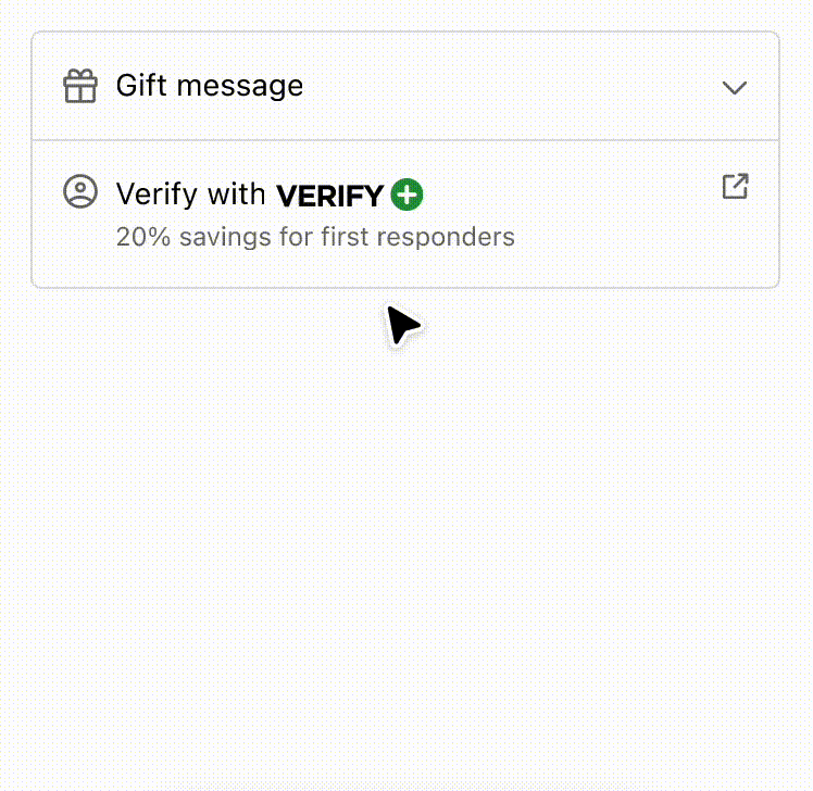
Anchor to example-strategies-for-simplifying-layout-and-aligning-content-using-disclosure-and-inline/block-layout-components.Strategies for simplifying layout and aligning content using Disclosure and Inline/Block Layout components.
Use the Disclosure component to simplify the user experience and reveal interfaces only when the customer requests it. It also demonstrates how a combination of inline and block layout components can improve the readability of information. By employing these strategies, users can easily scan and comprehend the content, making for a better user experience overall.
Strategies for simplifying layout and aligning content using Disclosure and Inline/Block Layout components.
Examples
Strategies for simplifying layout and aligning content using Disclosure and Inline/Block Layout components.
Description
Use the Disclosure component to simplify the user experience and reveal interfaces only when the customer requests it. It also demonstrates how a combination of inline and block layout components can improve the readability of information. By employing these strategies, users can easily scan and comprehend the content, making for a better user experience overall.
React
import {
  reactExtension,
  View,
  Image,
  Icon,
  Pressable,
  Disclosure,
  InlineLayout,
  BlockStack,
  Text,
  Form,
  TextField,
  Button,
  Divider,
  InlineStack,
} from '@shopify/ui-extensions-react/checkout';

export default reactExtension(
  'purchase.checkout.block.render',
  () => <DisclosureAndAlignment />,
);

export const DisclosureAndAlignment = () => {
  const openIds = ['one'];
  return (
    <View
      maxInlineSize={400}
      cornerRadius="large"
      border="base"
    >
      <BlockStack spacing="none">
        <Disclosure
          defaultOpen="one"
          onToggle={(open) =>
            console.log('onToggle event', open)
          }
        >
          <Pressable toggles="one" padding="base">
            <InlineLayout
              blockAlignment="center"
              spacing="base"
              columns={['auto', 'fill', 'auto']}
            >
              <Icon
                source="gift"
                appearance="subdued"
              />
              Gift message
              <Icon
                source={
                  openIds.includes('one')
                    ? 'chevronUp'
                    : 'chevronDown'
                }
                appearance="subdued"
              />
            </InlineLayout>
          </Pressable>
          <View
            id="one"
            padding={[
              'none',
              'base',
              'base',
              'base',
            ]}
          >
            <Form
              onSubmit={() =>
                console.log('onSubmit event')
              }
            >
              <BlockStack>
                <InlineLayout
                  columns={['fill', 'fill']}
                  spacing="base"
                >
                  <TextField
                    label="From"
                    name="from0"
                    id="from0"
                  />
                  <TextField
                    label="To"
                    name="to0"
                    id="to0"
                  />
                </InlineLayout>
                <TextField
                  label="Message"
                  name="message0"
                  id="message0"
                />
                <View>
                  <Button
                    accessibilityRole="submit"
                    kind="secondary"
                  >
                    Save
                  </Button>
                </View>
              </BlockStack>
            </Form>
          </View>
        </Disclosure>
        <Divider />
        <InlineLayout
          blockAlignment="baseline"
          spacing="base"
          columns={['auto', 'fill', 'auto']}
          padding="base"
        >
          <Icon
            source="profile"
            appearance="subdued"
          />
          <BlockStack spacing="none">
            <InlineStack blockAlignment="center">
              <Text>Verify with</Text>
              <Image source="https://via.placeholder.com/50x15" />
            </InlineStack>
            <Text
              appearance="subdued"
              size="small"
            >
              15% savings for students and
              military
            </Text>
          </BlockStack>
          <Pressable to="https://www.shopify.com">
            <Icon
              source="external"
              appearance="subdued"
            />
          </Pressable>
        </InlineLayout>
      </BlockStack>
    </View>
  );
};
JavaScript
import {
  extension,
  BlockStack,
  View,
  InlineLayout,
  InlineStack,
  Image,
  Pressable,
  Icon,
  Text,
  TextField,
  Form,
  Button,
  Disclosure,
  Divider,
} from '@shopify/ui-extensions/checkout';

export default extension(
  'purchase.checkout.block.render',
  (root) => {
    const openIds = ['one'];

    const pressable = root.createComponent(
      Pressable,
      {
        toggles: 'one',
        padding: 'base',
      },
      [
        root.createComponent(
          InlineLayout,
          {
            blockAlignment: 'center',
            spacing: 'base',
            columns: ['auto', 'fill', 'auto'],
          },
          [
            root.createComponent(Icon, {
              source: 'gift',
              appearance: 'subdued',
            }),
            'Gift message',
            root.createComponent(Icon, {
              source: openIds.includes('one')
                ? 'chevronUp'
                : 'chevronDown',
              size: 'small',
            }),
          ],
        ),
      ],
    );

    const disclosureView = root.createComponent(
      View,
      {
        id: 'one',
        padding: ['none', 'base', 'base', 'base'],
      },
      [
        root.createComponent(
          Form,
          {
            onSubmit: () =>
              console.log('onSubmit event'),
          },
          [
            root.createComponent(BlockStack, {}, [
              root.createComponent(
                InlineLayout,
                {
                  columns: ['fill', 'fill'],
                  spacing: 'base',
                },
                [
                  root.createComponent(
                    TextField,
                    {
                      label: 'From',
                      name: 'from0',
                      id: 'from0',
                    },
                  ),
                  root.createComponent(
                    TextField,
                    {
                      label: 'To',
                      name: 'to0',
                      id: 'to0',
                    },
                  ),
                ],
              ),
              root.createComponent(TextField, {
                label: 'Message',
                name: 'message0',
                id: 'message0',
              }),
              root.createComponent(View, {}, [
                root.createComponent(
                  Button,
                  {
                    accessibilityRole: 'submit',
                    kind: 'secondary',
                  },
                  'Save',
                ),
              ]),
            ]),
          ],
        ),
      ],
    );

    const disclosure = root.createComponent(
      Disclosure,
      {
        defaultOpen: 'one',
        onToggle: (open) =>
          console.log('onToggle event', open),
      },
      [pressable, disclosureView],
    );

    const inlineLayout = root.createComponent(
      InlineLayout,
      {
        blockAlignment: 'baseline',
        spacing: 'base',
        columns: ['auto', 'fill', 'auto'],
        padding: 'base',
      },
      [
        root.createComponent(Icon, {
          source: 'profile',
          appearance: 'subdued',
        }),
        root.createComponent(
          BlockStack,
          {
            spacing: 'none',
          },
          [
            root.createComponent(
              InlineStack,
              {
                blockAlignment: 'center',
              },
              [
                root.createComponent(
                  Text,
                  {},
                  'Verify with',
                ),
                root.createComponent(Image, {
                  source:
                    'https://via.placeholder.com/50x15',
                }),
              ],
            ),
            root.createComponent(
              Text,
              {
                appearance: 'subdued',
                size: 'small',
              },
              '15% savings for students and military',
            ),
          ],
        ),
        root.createComponent(
          Pressable,
          {
            to: 'https://www.shopify.com',
          },
          [
            root.createComponent(Icon, {
              source: 'external',
              appearance: 'subdued',
            }),
          ],
        ),
      ],
    );
    const view = root.createComponent(
      View,
      {
        maxInlineSize: 400,
        cornerRadius: 'large',
        border: 'base',
      },
      [
        root.createComponent(
          BlockStack,
          {
            spacing: 'none',
          },
          [
            disclosure,
            root.createComponent(Divider),
            inlineLayout,
          ],
        ),
      ],
    );

    root.appendChild(view);
  },
);
Preview