Text
Text block is used to render a block of text that occupies the full width available, like a paragraph.
Anchor to textblockpropsTextBlockProps
- Anchor to appearanceappearanceExtract< Appearance, | 'accent' | 'subdued' | 'info' | 'success' | 'warning' | 'critical' | 'decorative' >
Changes the visual appearance
- Anchor to emphasisemphasisEmphasis
Use to emphasize a word or a group of words.
- string
A unique identifier for the component.
- Anchor to inlineAlignmentinlineAlignmentInlineAlignment
Align text along the main axis.
- Anchor to sizesizeTextSize
Size of the text
Appearance
'base' | 'accent' | 'decorative' | 'interactive' | 'subdued' | 'info' | 'success' | 'warning' | 'critical' | 'monochrome'Emphasis
Use to emphasize a word or a group of words.
'italic' | 'bold'InlineAlignment
'start' | 'center' | 'end'TextSize
Extract<Size, 'extraSmall' | 'small' | 'base' | 'large' | 'extraLarge'> | 'medium'Size
'extraSmall' | 'small' | 'base' | 'large' | 'extraLarge' | 'fill'Was this section helpful?
Basic TextBlock
import {
reactExtension,
TextBlock,
BlockStack,
} from '@shopify/ui-extensions-react/checkout';
export default reactExtension(
'purchase.checkout.block.render',
() => <Extension />,
);
function Extension() {
return (
<BlockStack>
<TextBlock>
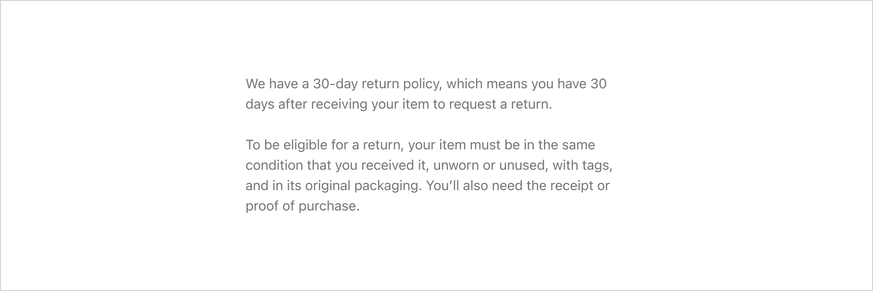
We have a 30-day return policy, which
means you have 30 days after receiving
your item to request a return.
</TextBlock>
<TextBlock>
To be eligible for a return, your item
must be in the same condition that you
received it, unworn or unused, with tags,
and in its original packaging. You’ll also
need the receipt or proof of purchase.
</TextBlock>
</BlockStack>
);
}
Examples
Basic TextBlock
React
import { reactExtension, TextBlock, BlockStack, } from '@shopify/ui-extensions-react/checkout'; export default reactExtension( 'purchase.checkout.block.render', () => <Extension />, ); function Extension() { return ( <BlockStack> <TextBlock> We have a 30-day return policy, which means you have 30 days after receiving your item to request a return. </TextBlock> <TextBlock> To be eligible for a return, your item must be in the same condition that you received it, unworn or unused, with tags, and in its original packaging. You’ll also need the receipt or proof of purchase. </TextBlock> </BlockStack> ); }JS
import {
  extension,
  TextBlock,
  BlockStack,
} from '@shopify/ui-extensions/checkout';

export default extension('purchase.checkout.block.render', (root) => {
  const textBlock = root.createComponent(BlockStack, undefined, [
    root.createComponent(
      TextBlock,
      undefined,
      'We have a 30-day return policy, which means you have 30 days after receiving your item to request a return.',
    ),
    root.createComponent(
      TextBlock,
      undefined,
      'To be eligible for a return, your item must be in the same condition that you received it, unworn or unused, with tags, and in its original packaging. You’ll also need the receipt or proof of purchase.',
    ),
  ]);

  root.appendChild(textBlock);
});
Preview
Anchor to appearanceAppearance
| Value | Description |
|---|---|
"accent" | Conveys emphasis and draws attention to the element. |
"subdued" | Conveys a subdued or disabled state for the element. |
"info" | Conveys that the element is informative or has information. |
"success" | Convey a successful interaction. |
"warning" | Convey something needs attention or an action needs to be taken. |
"critical" | Conveys a problem has arisen. |
Was this section helpful?
Anchor to best-practicesBest Practices
- Create contrast between more and less important text with properties such as
size,emphasis, andappearance.
Was this section helpful?