Icon
Icons are pictograms or graphic symbols. They can act as wayfinding tools or as a means of communicating functionality.
Anchor to iconpropsIconProps
- Anchor to sourcesourceIconSourcerequired
Specifies which icon to display
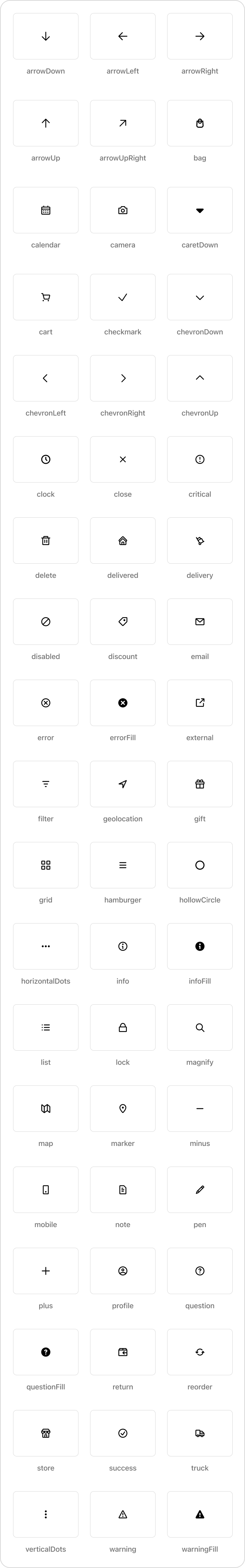
Check the list of available icons here
- Anchor to accessibilityLabelaccessibilityLabelstring
A label that describes the purpose or contents of the icon. When set, it will be announced to buyers using assistive technologies and will provide them with more context.
- Anchor to appearanceappearanceAppearanceDefault: 'base'
Sets the appearance (color) of the icon.
- string
A unique identifier for the component.
- Anchor to sizesizeExtract<Size, 'extraSmall' | 'small' | 'base' | 'large' | 'fill'>Default: 'base'
Adjusts the size of the icon.
Appearance
'base' | 'accent' | 'decorative' | 'interactive' | 'subdued' | 'info' | 'success' | 'warning' | 'critical' | 'monochrome'Size
'extraSmall' | 'small' | 'base' | 'large' | 'extraLarge' | 'fill'IconSource
'arrowLeft' | 'arrowRight' | 'arrowUp' | 'arrowUpRight' | 'arrowDown' | 'bag' | 'bullet' | 'calendar' | 'camera' | 'caretDown' | 'cart' | 'cashDollar' | 'categories' | 'checkmark' | 'chevronLeft' | 'chevronRight' | 'chevronUp' | 'chevronDown' | 'clipboard' | 'clock' | 'close' | 'creditCard' | 'critical' | 'delete' | 'delivered' | 'delivery' | 'disabled' | 'discount' | 'email' | 'error' | 'errorFill' | 'external' | 'filter' | 'geolocation' | 'gift' | 'giftFill' | 'grid' | 'hamburger' | 'hollowCircle' | 'horizontalDots' | 'image' | 'info' | 'infoFill' | 'list' | 'lock' | 'magnify' | 'map' | 'marker' | 'minus' | 'mobile' | 'note' | 'orderBox' | 'pen' | 'plus' | 'profile' | 'question' | 'questionFill' | 'reorder' | 'reset' | 'return' | 'savings' | 'settings' | 'star' | 'starFill' | 'starHalf' | 'store' | 'success' | 'truck' | 'upload' | 'verticalDots' | 'warning' | 'warningFill'Was this section helpful?
Basic Icon
import {
  reactExtension,
  Icon,
} from '@shopify/ui-extensions-react/checkout';

export default reactExtension(
  'purchase.checkout.block.render',
  () => <Extension />,
);

function Extension() {
  return <Icon source="discount" />;
}
Examples
Basic Icon
React
import { reactExtension, Icon, } from '@shopify/ui-extensions-react/checkout'; export default reactExtension( 'purchase.checkout.block.render', () => <Extension />, ); function Extension() { return <Icon source="discount" />; }JS
import {extension, Icon} from '@shopify/ui-extensions/checkout';

export default extension('purchase.checkout.block.render', (root) => {
  const icon = root.createComponent(Icon, {source: 'discount'});

  root.appendChild(icon);
});
Preview
Anchor to appearanceAppearance
| Value | Description |
|---|---|
"accent" | Conveys emphasis and draws attention to the element. |
"interactive" | Conveys that the element is pressable, hoverable or otherwise interactive. |
"subdued" | Conveys a subdued or disabled state for the element. |
"info" | Conveys that the element is informative or has information. |
"success" | Convey a successful interaction. |
"warning" | Convey something needs attention or an action needs to be taken. |
"critical" | Conveys a problem has arisen. |
"monochrome" | Takes the color of its parent. |
Was this section helpful?