Section
The section component groups related content into clearly-defined thematic areas with consistent styling and structure. Use section to organize page content into logical blocks, each with its own heading and visual container.
Sections automatically adapt their styling based on nesting depth and adjust heading levels to maintain meaningful, accessible page hierarchies. For simple visual separation without headings, use divider.
Section heading levels and visual styling (borders, backgrounds) are determined automatically by nesting depth and can't be overridden. Only buttons and links are supported in the primary-action and secondary-actions slots.
Supported targets
- purchase.
checkout. actions. render-before - purchase.
checkout. block. render - purchase.
checkout. cart-line-item. render-after - purchase.
checkout. cart-line-list. render-after - purchase.
checkout. contact. render-after - purchase.
checkout. delivery-address. render-after - purchase.
checkout. delivery-address. render-before - purchase.
checkout. footer. render-after - purchase.
checkout. header. render-after - purchase.
checkout. payment-method-list. render-after - purchase.
checkout. payment-method-list. render-before - purchase.
checkout. pickup-location-list. render-after - purchase.
checkout. pickup-location-list. render-before - purchase.
checkout. pickup-location-option-item. render-after - purchase.
checkout. pickup-point-list. render-after - purchase.
checkout. pickup-point-list. render-before - purchase.
checkout. reductions. render-after - purchase.
checkout. reductions. render-before - purchase.
checkout. shipping-option-item. details. render - purchase.
checkout. shipping-option-item. render-after - purchase.
checkout. shipping-option-list. render-after - purchase.
checkout. shipping-option-list. render-before - purchase.
thank-you. announcement. render - purchase.
thank-you. block. render - purchase.
thank-you. cart-line-item. render-after - purchase.
thank-you. cart-line-list. render-after - purchase.
thank-you. customer-information. render-after - purchase.
thank-you. footer. render-after - purchase.
thank-you. header. render-after
Supported targets
- purchase.
checkout. actions. render-before - purchase.
checkout. block. render - purchase.
checkout. cart-line-item. render-after - purchase.
checkout. cart-line-list. render-after - purchase.
checkout. contact. render-after - purchase.
checkout. delivery-address. render-after - purchase.
checkout. delivery-address. render-before - purchase.
checkout. footer. render-after - purchase.
checkout. header. render-after - purchase.
checkout. payment-method-list. render-after - purchase.
checkout. payment-method-list. render-before - purchase.
checkout. pickup-location-list. render-after - purchase.
checkout. pickup-location-list. render-before - purchase.
checkout. pickup-location-option-item. render-after - purchase.
checkout. pickup-point-list. render-after - purchase.
checkout. pickup-point-list. render-before - purchase.
checkout. reductions. render-after - purchase.
checkout. reductions. render-before - purchase.
checkout. shipping-option-item. details. render - purchase.
checkout. shipping-option-item. render-after - purchase.
checkout. shipping-option-list. render-after - purchase.
checkout. shipping-option-list. render-before - purchase.
thank-you. announcement. render - purchase.
thank-you. block. render - purchase.
thank-you. cart-line-item. render-after - purchase.
thank-you. cart-line-list. render-after - purchase.
thank-you. customer-information. render-after - purchase.
thank-you. footer. render-after - purchase.
thank-you. header. render-after
Anchor to Use casesUse cases
- Logical page structure: Organize checkout content into headed groups that adapt styling based on nesting depth
- Accessible landmarks: Add
accessibilityLabelto create named regions that assistive technologies can navigate - Nested grouping: Nest sections to build multi-level content hierarchies with automatically adjusted heading levels
Anchor to PropertiesProperties
Configure the following properties on the section component.
- Anchor to accessibilityLabelaccessibility
Labelaccessibility Label stringstring A label used to describe the section that will be announced by assistive technologies.
When no
headingproperty is provided or included as a child of the section, you must provide anto describe the section. This is important as it allows assistive technologies to provide the right context to users.- Anchor to headingheadingheadingstringstring
A title displayed at the top of the section. When provided, it serves as both a visible heading and the accessible name for the section. If omitted, you must provide an
instead.- Anchor to idididstringstring
A unique identifier for the element. Use this to reference the element in JavaScript, link labels to form controls, or target specific elements for styling or scripting.
Anchor to ExamplesExamples
Anchor to Group content under a headingGroup content under a heading
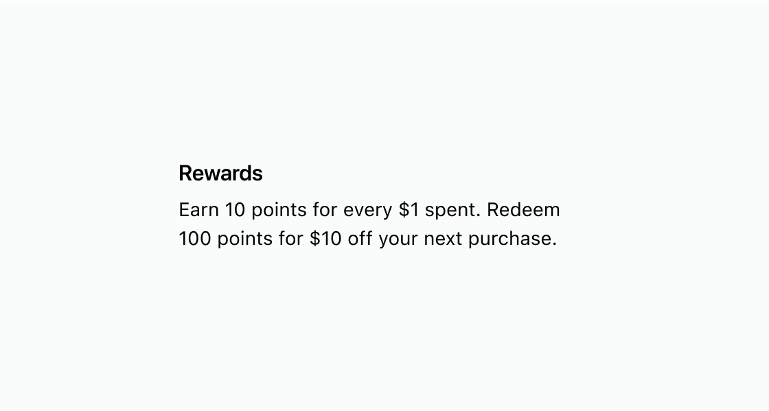
Wrap related content in a headed section. This example places a paragraph inside s-section with a heading attribute so the group gets a visible title and semantic structure.
Group content under a heading
html
Anchor to Create an accessible landmark without a visible headingCreate an accessible landmark without a visible heading
Define an accessible region without a visible heading. This example uses accessibilityLabel on s-section so screen readers can identify the content group.
html
Anchor to Nest sections to create a content hierarchyNest sections to create a content hierarchy
Build a multi-level content hierarchy with nested sections. This example nests s-section elements so headings automatically adjust their level based on depth.
html
Anchor to Best practicesBest practices
- Describe each section with a clear heading: Use concise, sentence-case headings that reflect the section's purpose so buyers can scan the page quickly.
- Provide an accessible name when no heading exists: If a visual heading isn't appropriate, set
accessibilityLabelso assistive technologies can identify the section. - Prefer divider for decoration: Use
s-dividerwhen you only need a visual line between content groups. - Keep layout consistent: Maintain consistent spacing and structure between sections across the page for a coherent experience.