Details
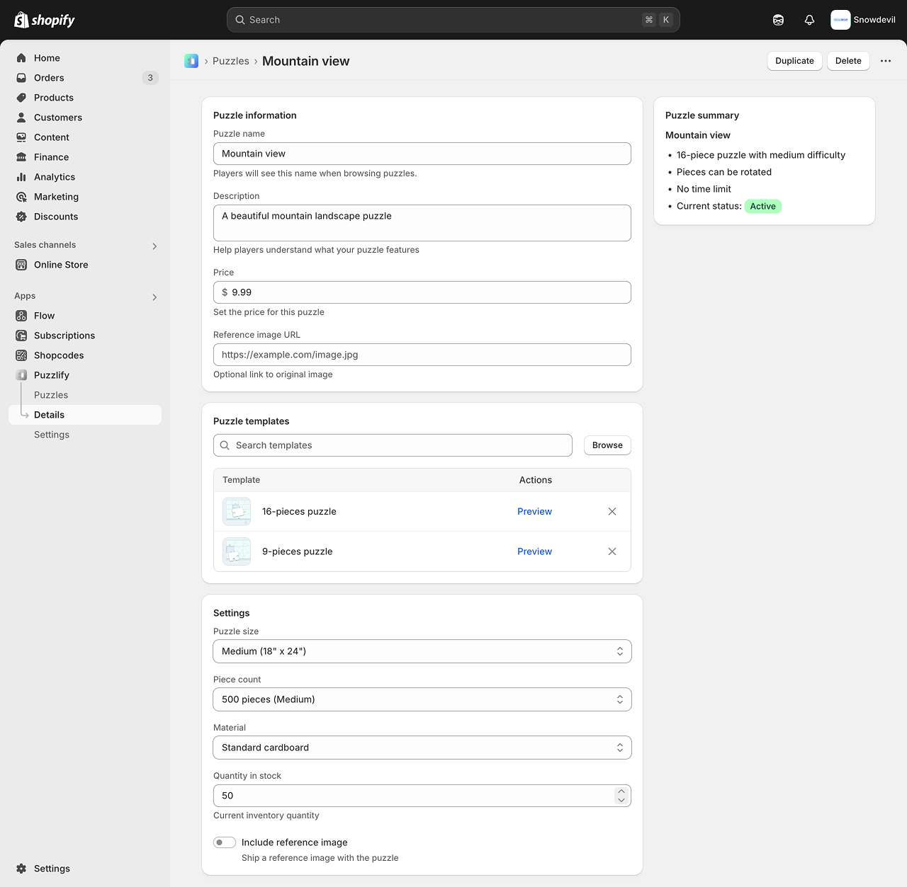
The details page allows merchants to view, create and edit objects. Use the right column to provide editable fields, and the right column for supporting information such as status, metadata, and summaries.
| Used to | Examples |
|---|---|
| View, edit and create objects | Discounts, shipping labels, newsletters, templates. |
This pattern uses Badge, Box, Button, Grid, Heading, Image, Link, , , , Section, Select, Stack, Switch, Table, , , , and components.
Design guidelines
Design details pages that enable users to create, view, and edit resource objects.
Navigation
- Users must be able to return to the previous page without using the browser button. To achieve this, your app can provide breadcrumbs or a Back button on the page.
- Use tabs sparingly for secondary navigation purposes when the nav menu isn't sufficient.
- Clicking a tab should only change the content below it, not above.
- Tabs should never wrap onto multiple lines.
- Navigating between tabs shouldn't cause the tabs to change position or move.
- Offer users clear and predictable action labels.
Layout
- Design your app to be responsive and adapt to different screen sizes and devices. This ensures a seamless user experience across various platforms.
- Use looser spacing for low-density layouts. Use tighter spacing for high-density layouts.
- Always use the default width. Full width tends to waste space and make the page harder to parse
- In the primary column: Put information that defines the resource object
- In the secondary column: Put supporting information such as status, metadata, and summaries
- Arrange content in order of importance
- Group similar content in the same card
- Place unique page actions at the top of the actions list and typical object actions at the bottom
Forms
- For more than five inputs, use sections with titles in one card or use multiple cards with headers.
- Form inputs should be saved using the App Bridge Contextual Save Bar API. This also applies to forms within max modals. Continuous data validation or auto-save for forms is consistent with the standard Shopify admin save UX.
Was this section helpful?
Details
// ===
// Details page pattern
// ===
export default function DetailsPage() {
const handleFormReset = (event) => {
console.log("Handle discarded changes if necessary");
};
const handleFormSubmit = (event) => {
event.preventDefault();
const formData = new FormData(event.target);
const formEntries = Object.fromEntries(formData);
console.log("Form data", formEntries);
};
return (
<form data-save-bar onSubmit={handleFormSubmit} onReset={handleFormReset}>
<s-page>
{/* === */}
{/* Title Bar */}
{/* Note: ui-title-bar requires AppBridge to render correctly */}
{/* === */}
<ui-title-bar title="Mountain view">
<button variant="breadcrumb" href="/app/puzzles">
Puzzles
</button>
<button>Duplicate</button>
<button tone="critical">Delete</button>
</ui-title-bar>
{/* === */}
{/* Puzzle information */}
{/* === */}
<s-section heading="Puzzle information">
<s-grid gap="base">
<s-text-field
Examples
Details
JSX
// ===
// Details page pattern
// ===

export default function DetailsPage() {
  const handleFormReset = (event) => {
    console.log("Handle discarded changes if necessary");
  };

  const handleFormSubmit = (event) => {
    event.preventDefault();
    const formData = new FormData(event.target);
    const formEntries = Object.fromEntries(formData);
    console.log("Form data", formEntries);
  };

  return (
    <form data-save-bar onSubmit={handleFormSubmit} onReset={handleFormReset}>
      <s-page>
        {/* === */}
        {/* Title Bar */}
        {/* Note: ui-title-bar requires AppBridge to render correctly */}
        {/* === */}
        <ui-title-bar title="Mountain view">
          <button variant="breadcrumb" href="/app/puzzles">
            Puzzles
          </button>
          <button>Duplicate</button>
          <button tone="critical">Delete</button>
        </ui-title-bar>
        {/* === */}
        {/* Puzzle information */}
        {/* === */}
        <s-section heading="Puzzle information">
          <s-grid gap="base">
            <s-text-field
              label="Puzzle name"
              name="name"
              labelAccessibilityVisibility="visible"
              placeholder="Enter puzzle name"
              value="Mountain view"
              details="Players will see this name when browsing puzzles."
            ></s-text-field>
            <s-text-area
              label="Description"
              name="description"
              labelAccessibilityVisibility="visible"
              placeholder="Brief description of your puzzle"
              value="A beautiful mountain landscape puzzle"
              details="Help players understand what your puzzle features"
            ></s-text-area>
            <s-money-field
              label="Price"
              name="price"
              labelAccessibilityVisibility="visible"
              placeholder="0.00"
              value="9.99"
              details="Set the price for this puzzle"
            ></s-money-field>
            <s-url-field
              label="Reference image URL"
              name="reference-image-url"
              labelAccessibilityVisibility="visible"
              placeholder="https://example.com/image.jpg"
              details="Optional link to original image"
            ></s-url-field>
          </s-grid>
        </s-section>

        {/* === */}
        {/* Puzzle templates */}
        {/* === */}
        <s-section heading="Puzzle templates">
          <s-grid gap="base">
            <s-grid
              gridTemplateColumns="1fr auto"
              gap="base"
              alignItems="center"
            >
              <s-grid-item>
                <s-search-field
                  label="Search templates"
                  labelAccessibilityVisibility="exclusive"
                  placeholder="Search templates"
                ></s-search-field>
              </s-grid-item>
              <s-grid-item>
                <s-button>Browse</s-button>
              </s-grid-item>
            </s-grid>
            <s-box
              background="strong"
              border="base"
              borderRadius="base"
              borderStyle="solid"
              overflow="hidden"
            >
              <s-table
                fullwidth
                border="base"
                borderRadius="base"
                borderStyle="solid"
              >
                <s-table-header-row>
                  <s-table-header listSlot="primary">Template</s-table-header>
                  <s-table-header>
                    <s-stack alignItems="end">Actions</s-stack>
                  </s-table-header>
                  <s-table-header listSlot="secondary">
                    <s-stack direction="inline" alignItems="end"></s-stack>
                  </s-table-header>
                </s-table-header-row>
                <s-table-body>
                  <s-table-row>
                    <s-table-cell listSlot="primary">
                      <s-stack
                        direction="inline"
                        gap="base"
                        alignItems="center"
                      >
                        <s-box
                          border="base"
                          borderRadius="base"
                          overflow="hidden"
                          maxInlineSize="40px"
                          maxBlockSize="40px"
                        >
                          <s-image src="https://cdn.shopify.com/static/images/polaris/patterns/16-pieces.png"></s-image>
                        </s-box>
                        16-pieces puzzle
                      </s-stack>
                    </s-table-cell>
                    <s-table-cell>
                      <s-stack alignItems="end">
                        <s-link>Preview</s-link>
                      </s-stack>
                    </s-table-cell>
                    <s-table-cell>
                      <s-stack alignItems="end">
                        <s-button
                          icon="x"
                          tone="neutral"
                          variant="tertiary"
                          accessibilityLabel="Remove 16-Pieces Puzzle template"
                        ></s-button>
                      </s-stack>
                    </s-table-cell>
                  </s-table-row>
                  <s-table-row>
                    <s-table-cell listSlot="primary">
                      <s-stack
                        direction="inline"
                        gap="base"
                        alignItems="center"
                      >
                        <s-box
                          border="base"
                          borderRadius="base"
                          overflow="hidden"
                          maxInlineSize="40px"
                          maxBlockSize="40px"
                        >
                          <s-image src="https://cdn.shopify.com/static/images/polaris/patterns/9-pieces.png"></s-image>
                        </s-box>
                        9-pieces puzzle
                      </s-stack>
                    </s-table-cell>
                    <s-table-cell>
                      <s-stack
                        direction="inline"
                        gap="base"
                        justifyContent="end"
                      >
                        <s-link>Preview</s-link>
                      </s-stack>
                    </s-table-cell>
                    <s-table-cell listSlot="secondary">
                      <s-stack alignItems="end">
                        <s-button
                          icon="x"
                          tone="neutral"
                          variant="tertiary"
                          accessibilityLabel="Remove 9-Pieces Puzzle template"
                        ></s-button>
                      </s-stack>
                    </s-table-cell>
                  </s-table-row>
                  {/* Add more rows as needed here */}
                  {/* If more than 10 rows are needed, details page tables should use the paginate, hasPreviousPage, hasNextPage, onPreviousPage, and onNextPage attributes to display and handle pagination) */}
                </s-table-body>
              </s-table>
            </s-box>
          </s-grid>
        </s-section>

        {/* === */}
        {/* Settings */}
        {/* === */}
        <s-section heading="Settings">
          <s-grid gap="base">
            <s-select label="Puzzle size" name="puzzle-size">
              <s-option value="small">Small (9" x 9")</s-option>
              <s-option value="medium" selected>
                Medium (18" x 24")
              </s-option>
              <s-option value="large">Large (24" x 36")</s-option>
            </s-select>
            <s-select label="Piece count" name="piece-count">
              <s-option value="250">250 pieces (Easy)</s-option>
              <s-option value="500" selected>
                500 pieces (Medium)
              </s-option>
              <s-option value="1000">1000 pieces (Hard)</s-option>
              <s-option value="2000">2000 pieces (Expert)</s-option>
            </s-select>
            <s-select label="Material" name="material">
              <s-option value="standard" selected>
                Standard cardboard
              </s-option>
              <s-option value="premium">Premium cardboard</s-option>
              <s-option value="wooden">Wooden pieces</s-option>
            </s-select>
            <s-number-field
              label="Quantity in stock"
              name="quantity-in-stock"
              labelAccessibilityVisibility="visible"
              value="50"
              min="0"
              placeholder="0"
              details="Current inventory quantity"
            ></s-number-field>
            <s-switch
              label="Include reference image"
              name="include-reference-image"
              details="Ship a reference image with the puzzle"
            ></s-switch>
          </s-grid>
        </s-section>
        {/* Use the aside slot for sidebar content */}
        <s-box slot="aside">
          {/* === */}
          {/* Puzzle summary */}
          {/* === */}
          <s-section heading="Puzzle summary">
            <s-heading>Mountain view</s-heading>
            <s-unordered-list>
              <s-list-item>16-piece puzzle with medium difficulty</s-list-item>
              <s-list-item>Pieces can be rotated</s-list-item>
              <s-list-item>No time limit</s-list-item>
              <s-list-item>
                Current status:{" "}
                <s-badge color="base" tone="success">
                  Active
                </s-badge>
              </s-list-item>
            </s-unordered-list>
          </s-section>
        </s-box>
      </s-page>
    </form>
  );
}
HTML
<!DOCTYPE html>
<html lang="en">
  <head>
    <meta charset="UTF-8" />
    <meta name="viewport" content="width=device-width, initial-scale=1.0" />
    <script src="https://cdn.shopify.com/shopifycloud/app-bridge-ui-experimental.js"></script>
    <title>Pattern</title>
  </head>
  <body>
    <!-- === -->
    <!-- Details page pattern -->
    <!-- === -->
    <form data-save-bar onSubmit="" onReset="">
      <s-page>
        <!-- === -->
        <!-- Title Bar -->
        <!-- Note: ui-title-bar requires AppBridge to render correctly -->
        <!-- === -->
        <ui-title-bar title="Mountain view">
          <button variant="breadcrumb" href="/app/puzzles">Puzzles</button>
          <button>Duplicate</button>
          <button tone="critical">Delete</button>
        </ui-title-bar>
        <!-- === -->
        <!-- Puzzle information -->
        <!-- === -->
        <s-section heading="Puzzle information">
          <s-grid gap="base">
            <s-text-field
              label="Puzzle name"
              name="name"
              labelAccessibilityVisibility="visible"
              placeholder="Enter puzzle name"
              value="Mountain view"
              details="Players will see this name when browsing puzzles."
            ></s-text-field>
            <s-text-area
              label="Description"
              name="description"
              labelAccessibilityVisibility="visible"
              placeholder="Brief description of your puzzle"
              value="A beautiful mountain landscape puzzle"
              details="Help players understand what your puzzle features"
            ></s-text-area>
            <s-money-field
              label="Price"
              name="price"
              labelAccessibilityVisibility="visible"
              placeholder="0.00"
              value="9.99"
              details="Set the price for this puzzle"
            ></s-money-field>
            <s-url-field
              label="Reference image URL"
              name="reference-image-url"
              labelAccessibilityVisibility="visible"
              placeholder="https://example.com/image.jpg"
              details="Optional link to original image"
            ></s-url-field>
          </s-grid>
        </s-section>
        <!-- === -->
        <!-- Puzzle templates -->
        <!-- === -->
        <s-section heading="Puzzle templates">
          <s-grid gap="base">
            <s-grid gridTemplateColumns="1fr auto" gap="base" alignItems="center">
              <s-grid-item>
                <s-search-field
                  label="Search templates"
                  labelAccessibilityVisibility="exclusive"
                  placeholder="Search templates"
                ></s-search-field>
              </s-grid-item>
              <s-grid-item>
                <s-button>Browse</s-button>
              </s-grid-item>
            </s-grid>
            <s-box
              background="strong"
              border="base"
              borderRadius="base"
              borderStyle="solid"
              overflow="hidden"
            >
              <s-table fullwidth border="base" borderRadius="base" borderStyle="solid">
                <s-table-header-row>
                  <s-table-header listSlot="primary">Template</s-table-header>
                  <s-table-header>
                    <s-stack alignItems="end">Actions</s-stack>
                  </s-table-header>
                  <s-table-header listSlot="secondary">
                    <s-stack direction="inline" alignItems="end"></s-stack>
                  </s-table-header>
                </s-table-header-row>
                <s-table-body>
                  <s-table-row>
                    <s-table-cell listSlot="primary">
                      <s-stack direction="inline" gap="base" alignItems="center">
                        <s-box
                          border="base"
                          borderRadius="base"
                          overflow="hidden"
                          maxInlineSize="40px"
                          maxBlockSize="40px"
                        >
                          <s-image
                            src="https://cdn.shopify.com/static/images/polaris/patterns/16-pieces.png"
                          ></s-image>
                        </s-box>
                        16-pieces puzzle
                      </s-stack>
                    </s-table-cell>
                    <s-table-cell>
                      <s-stack alignItems="end">
                        <s-link>Preview</s-link>
                      </s-stack>
                    </s-table-cell>
                    <s-table-cell>
                      <s-stack alignItems="end">
                        <s-button
                          icon="x"
                          tone="neutral"
                          variant="tertiary"
                          accessibilityLabel="Remove 16-Pieces Puzzle template"
                        ></s-button>
                      </s-stack>
                    </s-table-cell>
                  </s-table-row>
                  <s-table-row>
                    <s-table-cell listSlot="primary">
                      <s-stack direction="inline" gap="base" alignItems="center">
                        <s-box
                          border="base"
                          borderRadius="base"
                          overflow="hidden"
                          maxInlineSize="40px"
                          maxBlockSize="40px"
                        >
                          <s-image
                            src="https://cdn.shopify.com/static/images/polaris/patterns/9-pieces.png"
                          ></s-image>
                        </s-box>
                        9-pieces puzzle
                      </s-stack>
                    </s-table-cell>
                    <s-table-cell>
                      <s-stack direction="inline" gap="base" justifyContent="end">
                        <s-link>Preview</s-link>
                      </s-stack>
                    </s-table-cell>
                    <s-table-cell listSlot="secondary">
                      <s-stack alignItems="end">
                        <s-button
                          icon="x"
                          tone="neutral"
                          variant="tertiary"
                          accessibilityLabel="Remove 9-Pieces Puzzle template"
                        ></s-button>
                      </s-stack>
                    </s-table-cell>
                  </s-table-row>
                  <!-- Add more rows as needed here -->
                  <!-- If more than 10 rows are needed, details page tables should use the paginate, hasPreviousPage, hasNextPage, onPreviousPage, and onNextPage attributes to display and handle pagination) -->
                </s-table-body>
              </s-table>
            </s-box>
          </s-grid>
        </s-section>
        <!-- === -->
        <!-- Settings -->
        <!-- === -->
        <s-section heading="Settings">
          <s-grid gap="base">
            <s-select label="Puzzle size" name="puzzle-size">
              <s-option value="small">Small (9" x 9")</s-option>
              <s-option value="medium" selected> Medium (18" x 24") </s-option>
              <s-option value="large">Large (24" x 36")</s-option>
            </s-select>
            <s-select label="Piece count" name="piece-count">
              <s-option value="250">250 pieces (Easy)</s-option>
              <s-option value="500" selected> 500 pieces (Medium) </s-option>
              <s-option value="1000">1000 pieces (Hard)</s-option>
              <s-option value="2000">2000 pieces (Expert)</s-option>
            </s-select>
            <s-select label="Material" name="material">
              <s-option value="standard" selected> Standard cardboard </s-option>
              <s-option value="premium">Premium cardboard</s-option>
              <s-option value="wooden">Wooden pieces</s-option>
            </s-select>
            <s-number-field
              label="Quantity in stock"
              name="quantity-in-stock"
              labelAccessibilityVisibility="visible"
              value="50"
              min="0"
              placeholder="0"
              details="Current inventory quantity"
            ></s-number-field>
            <s-switch
              label="Include reference image"
              name="include-reference-image"
              details="Ship a reference image with the puzzle"
            ></s-switch>
          </s-grid>
        </s-section>
        <!-- Use the aside slot for sidebar content -->
        <s-box slot="aside">
          <!-- === -->
          <!-- Puzzle summary -->
          <!-- === -->
          <s-section heading="Puzzle summary">
            <s-heading>Mountain view</s-heading>
            <s-unordered-list>
              <s-list-item>16-piece puzzle with medium difficulty</s-list-item>
              <s-list-item>Pieces can be rotated</s-list-item>
              <s-list-item>No time limit</s-list-item>
              <s-list-item>
                Current status:
                <s-badge color="base" tone="success"> Active </s-badge>
              </s-list-item>
            </s-unordered-list>
          </s-section>
        </s-box>
      </s-page>
    </form>
  </body>
</html>