Card
Group related content and functionality together in a familiar and consistent style, for customers to scan, read, and get things done.
Anchor to cardpropsCardProps
- Anchor to paddingpaddingboolean
Adjust the padding of all edges.
trueapplies a default padding that is appropriate for the component.
Was this section helpful?
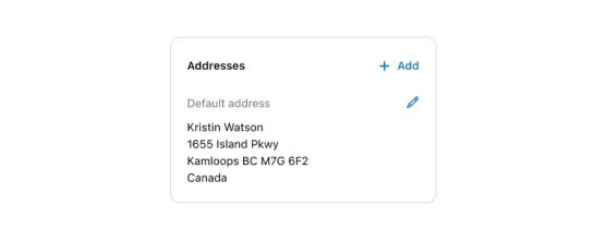
Basic Card
import {
  Card,
  Grid,
  BlockStack,
  Heading,
  Text,
  TextBlock,
  View,
  Icon,
  InlineLayout,
  reactExtension,
} from '@shopify/ui-extensions-react/customer-account';
import React from 'react';

export default reactExtension(
  'customer-account.page.render',
  () => <App />,
);

function App() {
  return (
    <Card padding>
      <Grid
        columns={['fill', 'auto']}
        spacing="base"
        minInlineSize="fill"
        blockAlignment="start"
      >
        <BlockStack spacing="loose">
          <Heading>Addresses</Heading>
          <BlockStack spacing="base">
            <Text appearance="subdued">
              Default address
            </Text>
            <BlockStack spacing="extraTight">
              <TextBlock>
                Kristin Watson
              </TextBlock>
              <TextBlock>
                1655 Island Pkwy
              </TextBlock>
              <TextBlock>
                Kamloops BC M7G 672
              </TextBlock>
              <TextBlock>Canada</TextBlock>
            </BlockStack>
          </BlockStack>
        </BlockStack>
        <BlockStack spacing="loose">
          <InlineLayout blockAlignment="center">
            <Icon
              source="plus"
              size="small"
              appearance="accent"
            />
            <Text appearance="accent">Add</Text>
          </InlineLayout>
          <View inlineAlignment="end">
            <Icon
              source="pen"
              size="small"
              appearance="accent"
            />
          </View>
        </BlockStack>
      </Grid>
    </Card>
  );
}
Examples
Basic Card
React
import { Card, Grid, BlockStack, Heading, Text, TextBlock, View, Icon, InlineLayout, reactExtension, } from '@shopify/ui-extensions-react/customer-account'; import React from 'react'; export default reactExtension( 'customer-account.page.render', () => <App />, ); function App() { return ( <Card padding> <Grid columns={['fill', 'auto']} spacing="base" minInlineSize="fill" blockAlignment="start" > <BlockStack spacing="loose"> <Heading>Addresses</Heading> <BlockStack spacing="base"> <Text appearance="subdued"> Default address </Text> <BlockStack spacing="extraTight"> <TextBlock> Kristin Watson </TextBlock> <TextBlock> 1655 Island Pkwy </TextBlock> <TextBlock> Kamloops BC M7G 672 </TextBlock> <TextBlock>Canada</TextBlock> </BlockStack> </BlockStack> </BlockStack> <BlockStack spacing="loose"> <InlineLayout blockAlignment="center"> <Icon source="plus" size="small" appearance="accent" /> <Text appearance="accent">Add</Text> </InlineLayout> <View inlineAlignment="end"> <Icon source="pen" size="small" appearance="accent" /> </View> </BlockStack> </Grid> </Card> ); }JS
import {
  Card,
  Grid,
  extension,
} from '@shopify/ui-extensions/customer-account';

export default extension(
  'customer-account.page.render',
  (root, api) => {
    renderApp(root, api);
  },
)

function renderApp(root, api) {
  const card = root.createComponent(
    Card,
    {padding: true},
    [
      root.createComponent(Grid, {columns: ['1fr', 'auto'],
        spacing: "base",
        minInlineSize: "fill",
        blockAlignment: "start"}, [
        root.createComponent('BlockStack', {spacing: 'loose'}, [
          root.createComponent('Heading', undefined, 'Addresses'),
          root.createComponent('BlockStack', {spacing: 'base'}, [
            root.createComponent('Text', {appearance: "subdued"}, 'Default address'),
            root.createComponent('BlockStack', {spacing: 'extraTight'}, [
                root.createComponent('TextBlock',{}, 'Kristin Watson'),
                root.createComponent('TextBlock', {}, '1655 Island Pkwy'),
                root.createComponent('TextBlock', {}, 'Kamloops BC M7G 672'),
                root.createComponent('TextBlock', {}, 'Canada'),
            ]),
          ]),
        ]),
        root.createComponent('BlockStack', {spacing: 'loose'}, [
          root.createComponent('InlineLayout',  {blockAlignment: "center"}, [
            root.createComponent('Icon', {source: "plus", size: "small", appearance: "accent"}),
            root.createComponent('Text', {appearance: "accent"}, 'Add'),
          ]),
          root.createComponent('View', {inlineAlignment: "end"}, [
            root.createComponent('Icon', {source: "pen", size: "small", appearance: "accent"}),
          ]),
        ]),
      ]),
    ])
  root.append(card);
}
Preview
Anchor to best-practicesBest Practices
- Group related information.
- Use headings that set clear expectations about the card’s purpose.
- Display information in a way that emphasizes and prioritizes what the customer needs to know first.
Was this section helpful?