Page
The outer wrapper of the page—including the page title, subtitle, and page-level actions—displayed in a familiar and consistent style that sets expectations about the purpose of the page.
Anchor to pagepropsPageProps
- Anchor to titletitlestringrequired
The text to be used as title.
- Anchor to loadingloadingbooleanDefault: false
Indicates that the page is in a loading state.
When
true, the page shows loading indicators for the UI elements that it is owns. The page is not responsible for the loading indicators of any content that is passed aschildren.- Anchor to primaryActionprimaryActionRemoteFragment
The action grouping, provided as button(s), that is placed in the primary position of the page.
- Anchor to primaryActionAccessibilityLabelprimaryActionAccessibilityLabelstringDefault: "More actions"
Accessibility label for the primary action grouping. If an accessibility label is not provided, default text is used.
- Anchor to primaryActionLabelprimaryActionLabelstringDefault: "More actions"
Label for the primary action grouping. If a label is not provided, default text is used.
- Anchor to secondaryActionsecondaryActionRemoteFragment
The action grouping, provided as button(s), that is placed in the secondary position of the page.
- Anchor to subtitlesubtitlestring
The text to be used as subtitle.
Supported props for Buttons used inside Page prop.children only support text.
- string
A label used for buyers using assistive technologies. When set, any
childrensupplied to this component will not be announced to screen reader users.- booleanDefault: false
Disables the button, disallowing any interaction.
- booleanDefault: false
Replaces content with a loading indicator.
- string
Accessible label for the loading indicator when user prefers reduced motion. This value is only used if
loadingis true.- () => void
Callback that is run when the button is pressed.
- RemoteFragment
An overlay component to render when the user interacts with the component.
- string
Destination URL to link to.
Supported props for Button used inside Page prop.children are not supported.
Use instead.
- stringrequired
A label used for buyers using assistive technologies. Needed because
childrenpassed to this component will be discarded.- () => void
Callback that is run when the button is pressed.
- string
Destination URL to link to.
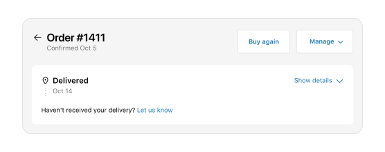
Basic Page
Examples
Basic Page
React
import {
  Page,
  Button,
  reactExtension,
} from '@shopify/ui-extensions-react/customer-account';
import React from 'react';

export default reactExtension('customer-account.page.render', () => <App />);

function App() {
  return (
    <Page
      title="Order #1411"
      subtitle="Confirmed Oct 5"
      secondaryAction={<Button accessibilityLabel="Button" onPress={() => {}}/>}
      primaryActionLabel="Manage"
      primaryAction={
        <>
          <Button onPress={() => {}}>Buy again</Button>
          <Button onPress={() => {}}>Second action</Button>
          <Button onPress={() => {}}>Third action</Button>
        </>
      }
    >
      Content
    </Page>
  );
}
JS
import {
  Page,
  Button,
  extension
} from '@shopify/ui-extensions/customer-account';

export default extension(
  'customer-account.page.render',
  (root, api) => {
    renderApp(root, api);
  },
)

async function renderApp(root, api) {
  const primaryAction = root.createFragment();
  await primaryAction.append(root.createComponent(Button, {onPress: () => {console.log("primary action 1")}}, 'Buy again primary 1'));
  await primaryAction.append(root.createComponent(Button, {onPress: () => {console.log("primary action 2")}}, 'Buy again primary 2'));
  await primaryAction.append(root.createComponent(Button, {onPress: () => {console.log("primary action 3")}}, 'Buy again primary 3'));

  const secondaryAction = root.createFragment();
  await secondaryAction.append(root.createComponent(Button, {accessibilityLabel: 'Button', onPress: () => {}}))

  const page = root.createComponent(
    Page,
    {
      title: "Order #1411",
      subtitle: "Confirmed Oct 5",
      primaryAction,
      primaryActionLabel: "Manage",
      secondaryAction,
      },
    root.createComponent('View', {}, "Content")
  )
  root.append(page);
}
Preview
Anchor to best-practicesBest Practices
Title
- Set clear expectations about the purpose and main topic of the page.
- Aim for 1-3 words.
- Use sentence case.
Subtitle
- Use to provide additional context or information that enhances the customer’s understanding of the page.
- Use subtitles sparingly and only when they add useful information that is distinct from the title.
Buttons
- Use for page-level actions only.
- If there is a single primary action for the page, display it as a primary button. Display all other page-level actions as secondary buttons.
- See UX guidelines to learn more about the button logic for order actions.