Resource Picker API
App Bridge isn't versioned with Polaris. App Bridge APIs and web components are identical in every App Home reference version.
App Bridge isn't versioned with Polaris. App Bridge APIs and web components are identical in every App Home reference version.
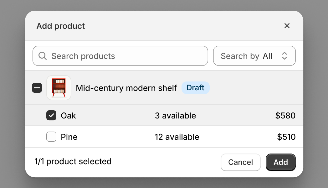
The Resource Picker API lets merchants search for and select products, collections, or product variants. Use this API when your app needs merchants to choose Shopify resources to work with. The resource picker returns detailed resource information including IDs, titles, images, and metadata.
If you need to pick app-specific resources like product reviews, email templates, or subscription options, use the Picker API instead.
If you need to pick app-specific resources like product reviews, email templates, or subscription options, use the Picker API instead.
Anchor to Use casesUse cases
- Product selection: Help users find and select products from the store catalog.
- Collection selection: Allow users to pick collections for promotions, automations, or display.
- Variant selection: Enable selection of specific product variants for targeted operations.
- Permission-aware: Select resources that both the app and the user have permissions to access.
Anchor to InputsInputs
The object defines how the resource picker behaves, including which resource type to display, selection limits, filters, and preselected items.
- Anchor to typetypetypeResourceTypeResourceTyperequiredrequired
The type of Shopify resource to select:
'product'for products,'variant'for specific product variants, or'collection'for collections. This determines what appears in the picker and what data structure is returned.- Anchor to actionactionaction'add' | 'select''add' | 'select'Default: 'add'Default: 'add'
The action verb that appears in the title as the primary action of the resource picker. "Add" prompts merchants that they are appending to an existing list, while "select" they'll choose a resource for a specific purpose or replacing selections.
- Anchor to filterfilterfilterFiltersFilters
Filtering options that control which resources appear in the resourcepicker. Use filters to restrict resources by publication status, include or exclude variants, or apply custom search criteria. This helps merchants find relevant items faster.
- Anchor to multiplemultiplemultipleboolean | numberboolean | numberDefault: falseDefault: false
Whether to allow selecting multiple items of a specific type. If a number is provided, limit selections to that maximum. When
typeis'product', merchants can still select multiple variants from a single product even whenmultipleisfalse.- Anchor to queryqueryquerystringstringDefault: ''Default: ''
Initial GraphQL search query for filtering resources available in the resource picker. See search syntax for more information. This is displayed in the search bar when the picker is opened and can be edited by users. For most use cases, you should use the
filter.queryoption instead which doesn't show the query in the UI.- Anchor to selectionIdsselection
Idsselection Ids BaseResource[]BaseResource[]Default: []Default: [] Resources that should be preselected when the picker is opened. Use this for edit workflows to show what products are already in a bundle, collection, or promotional set. Merchants can see current selections and modify them before confirming.
Filters
- archived
Whether to show [archived products](https://help.shopify.com/en/manual/products/details?shpxid=70af7d87-E0F2-4973-8B09-B972AAF0ADFD#product-availability). Only applies to the Product resource type picker. Setting this to undefined will show a badge on draft products.
boolean | undefined - draft
Whether to show [draft products](https://help.shopify.com/en/manual/products/details?shpxid=70af7d87-E0F2-4973-8B09-B972AAF0ADFD#product-availability). Only applies to the Product resource type picker. Setting this to undefined will show a badge on draft products.
boolean | undefined - hidden
Whether to show hidden resources, referring to products that are not published on any sales channels.
boolean - query
GraphQL initial search query for filtering resources available in the picker. See [search syntax](https://shopify.dev/docs/api/usage/search-syntax) for more information. This query is not visible to merchants and runs server-side. Use it to programmatically restrict results (for example, `vendor:Acme`) without exposing the filter logic.
string - variants
Whether to show product variants. Only applies to the Product resource type picker.
boolean
BaseResource
- id
in GraphQL id format, ie 'gid://shopify/Product/1'
string - variants
Resource[]
Resource
- id
in GraphQL id format, ie 'gid://shopify/Product/1'
string
Anchor to Return payloadReturn payload
The resource picker returns an array of selected resources when the merchant confirms their selection, or undefined if they cancel. The resource structure in the array varies based on the type option: products include variants and images, collections include rule sets, and variants include pricing and inventory data.
- Anchor to when type is "collection":when type is "collection":when type is "collection":Collection[]Collection[]
- Anchor to when type is "product":when type is "product":when type is "product":Product[]Product[]
- Anchor to when type is "variant":when type is "variant":when type is "variant":ProductVariant[]ProductVariant[]
Collection
- availablePublicationCount
number - description
string - descriptionHtml
string - handle
string - id
in GraphQL id format, ie 'gid://shopify/Product/1'
string - image
Image | null - productsAutomaticallySortedCount
number - productsCount
number - productsManuallySortedCount
number - publicationCount
number - ruleSet
RuleSet | null - seo
{ description?: string; title?: string; } - sortOrder
CollectionSortOrder - storefrontId
string - templateSuffix
string | null - title
string - updatedAt
string
Image
- altText
string - id
string - originalSrc
string
RuleSet
- appliedDisjunctively
boolean - rules
CollectionRule[]
CollectionRule
- column
string - condition
string - relation
string
CollectionSortOrder
- Manual
MANUAL - BestSelling
BEST_SELLING - AlphaAsc
ALPHA_ASC - AlphaDesc
ALPHA_DESC - PriceDesc
PRICE_DESC - PriceAsc
PRICE_ASC - CreatedDesc
CREATED_DESC - Created
CREATED - MostRelevant
MOST_RELEVANT
Product
- availablePublicationCount
number - createdAt
string - descriptionHtml
string - handle
string - hasOnlyDefaultVariant
boolean - id
in GraphQL id format, ie 'gid://shopify/Product/1'
string - images
Image[] - options
{ id: string; name: string; position: number; values: string[]; }[] - productType
string - publishedAt
string | null - status
ProductStatus - tags
string[] - templateSuffix
string | null - title
string - totalInventory
number - totalVariants
number - tracksInventory
boolean - updatedAt
string - variants
Partial<ProductVariant>[] - vendor
string
ProductStatus
- Active
ACTIVE - Archived
ARCHIVED - Draft
DRAFT
ProductVariant
- availableForSale
boolean - barcode
string | null - compareAtPrice
Money | null - createdAt
string - displayName
string - fulfillmentService
{ id: string; inventoryManagement: boolean; productBased: boolean; serviceName: string; type: FulfillmentServiceType; } - id
in GraphQL id format, ie 'gid://shopify/Product/1'
string - image
Image | null - inventoryItem
{ id: string; } - inventoryManagement
ProductVariantInventoryManagement - inventoryPolicy
ProductVariantInventoryPolicy - inventoryQuantity
number | null - position
number - price
Money - product
Partial<Product> - requiresShipping
boolean - selectedOptions
{ value?: string; }[] - sku
string | null - taxable
boolean - title
string - updatedAt
string - weight
number | null - weightUnit
WeightUnit
Money
stringFulfillmentServiceType
- GiftCard
GIFT_CARD - Manual
MANUAL - ThirdParty
THIRD_PARTY
ProductVariantInventoryManagement
- Shopify
SHOPIFY - NotManaged
NOT_MANAGED - FulfillmentService
FULFILLMENT_SERVICE
ProductVariantInventoryPolicy
- Deny
DENY - Continue
CONTINUE
WeightUnit
- Kilograms
KILOGRAMS - Grams
GRAMS - Pounds
POUNDS - Ounces
OUNCES
js
Preview
Examples
Select products
Description
Select products from the store catalog. This example opens a product resource picker and handles the selection response. The resource picker returns an array of product objects with GIDs, titles, and handles.
js
const selected = await shopify.resourcePicker({type: 'product'});Select collections or variants
Description
Select collections or variants. This example selects collections instead of individual products by setting `type: "collection"`, or selects specific product variants by setting `type: "variant"`. Use collection mode for choosing product groupings, such as homepage featured collection carousels, navigation menu builders, or promotional campaigns. Use variant mode for choosing individual SKUs, useful for inventory tools, variant-specific promotions, or shipment builders.
Collections
const selected = await shopify.resourcePicker({type: 'collection'});Product variants
const selected = await shopify.resourcePicker({type: 'variant'});Preselect products
Description
Preselect products. This example opens the resource picker with products already selected by passing GIDs to the `selectionIds` option. Use this to pre-populate the picker with current selections for edit workflows, showing what products are already in a bundle, collection, or promotional set. Merchants can see current selections and modify them before confirming.
js
const selected = await shopify.resourcePicker({
  type: 'product',
  selectionIds: [
    {
      id: 'gid://shopify/Product/12345',
      variants: [
        {
          id: 'gid://shopify/ProductVariant/1',
        },
      ],
    },
    {
      id: 'gid://shopify/Product/67890',
    },
  ],
});
Set action verb
Description
Set action verb. This example customizes the resource picker button text by setting the `action` option to "add" or "select". "Add" suggests appending to an existing list, while "select" implies choosing for a specific purpose or replacing selections. This subtle language difference improves clarity for different workflow contexts.
js
const selected = await shopify.resourcePicker({
  type: 'product',
  action: 'select',
});
Limit selection count
Description
Limit selection count. This example controls how many products merchants can select. Set `multiple: true` for unlimited selection useful for mass product taggers, bulk inventory tools, or export utilities. Set `multiple` to a number like `5` to limit selection count for bundle builders with item limits, featured product sections, or promotional campaigns with maximum product counts.
Unlimited selectable items
const selected = await shopify.resourcePicker({
  type: 'product',
  multiple: true,
});
Maximum selectable items
const selected = await shopify.resourcePicker({
  type: 'product',
  multiple: 5,
});
Filter resources
Description
Filter resources. This example filters the resource picker to show only specific products using the `filter` option. Use `variants: false` to hide variant information, `hidden: false` to exclude hidden products, `draft: false` to exclude draft products, or `archived: false` to exclude archived products. Combine filters to restrict the picker to live, customer-visible products.
js
const selected = await shopify.resourcePicker({
  type: 'product',
  filter: {
    hidden: true,
    variants: false,
    draft: false,
    archived: false,
  },
});
Apply a filter query
Description
Apply a filter query. This example applies a custom GraphQL search query using the `query` property in filters. The query runs server-side and is not visible to merchants. Use it to programmatically restrict results (for example, `vendor:Acme` or `tag:sale`) without exposing the filter logic.
js
const selected = await shopify.resourcePicker({
  type: 'product',
  filter: {
    query: 'Sweater',
  },
});
Handle selection payload
Description
Handle selection payload. This example handles the selection payload returned by the resource picker. When merchants confirm their selection, the picker returns an array of resource objects. When merchants cancel, it returns `undefined` rather than an empty array. Check for `undefined` explicitly to distinguish between cancellation and an empty selection.
js
const selected = await shopify.resourcePicker({type: 'product'});

if (selected) {
  console.log(selected);
} else {
  console.log('Picker was cancelled by the user');
}
Start with search query
Description
Start with search query. This example starts the resource picker with a pre-filled search query by passing the `query` option. This initializes the picker with a search term already entered, helpful when you know what merchants are likely looking for. Merchants can modify the query, but starting with relevant results saves time in large catalogs.
js
const selected = await shopify.resourcePicker({
  type: 'product',
  query: 'Sweater',
});