TitleBar
The TitleBar action set allows you to populate a standardized title bar with button actions and navigation breadcrumbs.
You can use the title bar in the following ways:
Plain JavaScript
Anchor link to section titled "Plain JavaScript"Example code
Anchor link to section titled "Example code"Import the createApp function from @shopify/app-bridge and the TitleBar from @shopify/app-bridge/actions. Then use the createApp function to create an app.
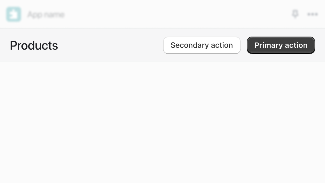
Create a title bar
Anchor link to section titled "Create a title bar"Create a title bar with the title set to My page title:
Create a title bar with a primary button
Anchor link to section titled "Create a title bar with a primary button"Set the title bar's primary button to a button. To learn more about buttons, refer to Button.
Create a title bar with secondary buttons
Anchor link to section titled "Create a title bar with secondary buttons"Set the title bar's secondary buttons to one or more buttons. The following example creates a secondary action with the label Settings, which triggers a redirect to a settings page local to the app.
To learn more about buttons and redirects, refer to Button and Redirect.
Create a title bar with grouped secondary buttons
Anchor link to section titled "Create a title bar with grouped secondary buttons"Set the title bar's secondary buttons to one or more button groups. The following example creates a grouped secondary action with the label More actions, which contains two child buttons.
To learn more about button groups, refer to ButtonGroup and Button.
Update title bar options
Anchor link to section titled "Update title bar options"Call the set method with partial title bar options to update the options of an existing title bar. This automatically triggers the update action on the title bar and merges the given options with the existing options.
Update title bar primary/secondary buttons
Anchor link to section titled "Update title bar primary/secondary buttons"You can update buttons attached to a title bar. Any updates made to the title bar's children automatically trigger an update action on the title bar:
Create a title bar with breadcrumbs
Anchor link to section titled "Create a title bar with breadcrumbs"Enable breadcrumbs in the title bar by setting a button as the breadcrumb option. You can disable it by setting the option to undefined. Note: Breadcrumbs aren't shown without a title. The following example creates a breadcrumb with the label 'My Breadcrumb', which links to '/breadcrumb-link'.
To learn more about buttons and redirects, refer to Button and Redirect.
Subscribe to title bar updates
Anchor link to section titled "Subscribe to title bar updates"You can subscribe to the title bar update action by calling subscribe. This returns a function that you can call to unsubscribe from the action:
Unsubscribe
Anchor link to section titled "Unsubscribe"You call unsubscribe to remove all subscriptions on the titlebar and its children:
Unsubscribe from titlebar actions only
Anchor link to section titled "Unsubscribe from titlebar actions only"You call unsubscribe with false to remove only titlebar subscriptions while leaving child subscriptions intact. For example, you might want to unsubscribe from the title bar but keep button listeners so that the buttons can be reused in a different actions (such as a modal).
Example code
Anchor link to section titled "Example code"Import the Provider and TitleBar component from @shopify/app-bridge-react. Only one Provider is needed for your application.
| Name | Type | Description | Required |
|---|---|---|---|
| title | string |
TitleBar title | Yes |
| breadcrumbs | Breadcrumb[] |
An array of breadcrumbs | |
| primaryAction | ActionProps |
Primary TitleBar action | |
| secondaryActions | ActionProps[] |
An array of secondary TitleBar actions | |
| actionGroups | ActionGroupProps[] |
An array of TitleBar groups of secondary actions |
| Name | Type | Description | Required |
|---|---|---|---|
| content | string |
Content the action displays | |
| url | string |
A destination to link to | |
| target | "ADMIN_PATH", "REMOTE", "APP" |
Where to display the target link | |
| onAction | () => void |
Callback when an action takes place |
ActionProps
Anchor link to section titled "ActionProps"| Name | Type | Description | Required |
|---|---|---|---|
| content | string |
Content the action displays | No |
| destructive | boolean |
Should the action be styled as destructive | No |
| disabled | boolean |
Should the action be disabled | No |
| external | boolean |
Forces url to open in a new tab | No |
| loading | boolean |
Should the action be loading | No |
| target | "ADMIN_PATH", "REMOTE", "APP" |
Where to display the target link | No |
| url | string |
A destination to link to | No |
| onAction | () => void |
Callback when an action takes place | No |
ActionGroupProps
Anchor link to section titled "ActionGroupProps"| Name | Type | Description | Required |
|---|---|---|---|
| title | string |
Action group title | Yes |
| actions | ActionProps[] |
List of actions | Yes |
Using TitleBar with Polaris
Anchor link to section titled "Using TitleBar with Polaris"When used with embedded app functionality, the Polaris <Page> component still renders important layout elements. App Bridge React’s <TitleBar> does not. Because of this, the recommended migration path is to keep the <Page> element, but pass its props to <TitleBar> instead.
The following examples show the migration path, starting with the use of deprecated Polaris embedded app functionality.
The recommended migration path uses App Bridge React along with the Polaris <Page> component.